

How to Decorate With Neutral Earth Tones Without Looking Flat
You know the rooms that feel right the moment you walk in? The ones you don't need to think about — you just want to sit down and stay a while? Most of them aren't built around a bold color choice or a trend color of the year. They're built around neutral earth tones. Beige, taupe, warm brown, clay, sage, sandy cream. The colors you'd see walking outside — in soil, sandstone, bark, dry grass, fired clay. Colors the brain processes as familiar, without registering them as statements. That's the whole secret, really.
This guide covers what they are, which specific colors belong here, how to build palettes without ending up in a beige fog, and how to use them room by room. That last part — avoiding the fog — is where most people go wrong. Done badly, this palette looks like a rental apartment that never got finished. Done right, it's why certain rooms look expensive without you being able to point at what the cost is.
What Are Neutral Earth Tones?

What "Neutral" Actually Means
Everyone assumes neutral means pale or forgettable. That's not quite right. A neutral is a color that lets the room — the furniture, the light, the textures, the people in it — be the thing you notice, rather than the walls fighting for attention. White, beige, taupe, cream, warm gray, greige, ivory. They don't disappear exactly. A good warm beige has real presence. But it recedes just enough to let everything else come forward.
Cool neutrals do this less well than warm ones. Under lamp light — which is how most rooms look for half the day — cool whites and blue-grays flatten. A warm-undertoned neutral holds its color morning to evening without needing the furniture to rescue it. That undertone, the faint yellow or tan base that makes a beige look sandy instead of pink-gray, is almost always the difference between a neutral that settles into a room and one you repaint two years later and still can't explain why you never liked it.
Where Earth Tones Actually Come From
Not from a design trend. From outside. Terracotta is fired clay. Rust is what iron looks like after rain. Olive is shade and leaf. Warm brown is soil and bark. Sand is what eroded rock looks like in afternoon light. Ochre is iron-rich earth in a dry riverbed. These colors existed before interior design did because they're the colors of the materials people built with before synthetic pigment was invented. They're not decorating choices, exactly. They're just what the world looks like at ground level.
Put one of these in a room next to a warm neutral, and the combination resolves without any effort. Cream wall and a terracotta lamp. Greige floor and walnut furniture. Taupe sofa and olive cushions. They share the same visual language. No conflict to manage. No secondary palette to figure out. That's the practical reason this combination gets used so often — it almost can't be wrong.
The Overlap Is Where the Palette Lives
Warm sandy beige. Muted walnut brown. Dusty sage. These are neutral and earthy at the same time — soft enough to work as backgrounds, warm enough to feel drawn from the natural world. That overlap is what people mean when they say "neutral earth tones," and it's where most of the useful colors in this palette actually sit. Not all the way into bold earthy territory and not all the way into sterile neutral territory. Right in the middle, where rooms feel warm without being heavy.
Which Colors Actually Belong in This Palette
The Soft Bases — Start Here

Cream. Ivory. Warm white. Beige. Sand. Mushroom. Taupe. Greige. These go on the walls, the large sofa, the curtains — wherever a room needs a quiet majority of color that doesn't demand attention. About 60 to 70 percent of the most successful earth tone rooms are made up of these, and the important thing about each of them is the undertone.
Pick one that reads pink-gray under lamp light,t and you'll have a wall color that fights the walnut furniture and the terracotta accessories every single day without you being able to name why the room feels slightly wrong. Always test warm-leaning samples. Hold them next to the actual wood in the room. If they look like they belong together, they do.
Browns — The Ones Everyone Keeps Skipping

Camel, cocoa, chestnut, walnut, coffee, chocolate, warm mocha. Brown got written off as boring for about a decade. That's decisively over. Pantone named Mocha Mousse — a warm, muted brown — its 2025 Color of the Year, which is the kind of thing that formalizes what interior designers were already doing quietly. Brown does something no other color manages quite as reliably: it makes wood look more like wood, makes warm light look golden, and makes natural textures feel more grounded. If your earth tone room feels like it's missing something weighty, it's usually a brown you removed.
Clay, Rust, Ochre — The Palette Needs These

Terracotta. Rust. Ochre. Burnt sienna. Muted copper. These are the palette's warmest edge, and they're the colors that stop the room from playing it safe the whole way through. One terracotta cushion on a linen sofa. An ochre lampshade in a room that's otherwise all taupe and walnut. A rust-colored throw somewhere specific. Each one says "someone made a decision here" in a way that beige and cream alone simply don't. Without them, the palette can be calm to the point of dull. Even one has a point of view.
Greens — More Useful Than They Get Credit For

Olive. Sage. Moss. Eucalyptus. Dusty khaki. Muted forest. Every other color in this palette has an obvious natural reference. Brown is wood. Cream is sand. Terracotta is clay. Green's reference is leaves, which means it appears naturally alongside every other earth tone, the same way leaves appear naturally in every landscape. You don't have to force an olive cushion to work beside walnut furniture — the visual logic is already built in. Use green more than you think you need to.
Stone and Mineral Tones
Slate. Charcoal. Warm pebble. Stone gray. Soft blue-gray. The cool notes that prevent the palette from going heavy. A room built entirely from beige, brown, and terracotta is pleasant for an hour, and then it starts to press. A stone gray side table, charcoal trim on the windows, a pebble-colored lamp base. These don't break the palette — they balance it. The tension between warm and cool is where the palette's visual energy actually lives.
Why These Colors Work So Well at Home

Rooms in This Palette Are Easier to Be In
Bright, saturated rooms are stimulating. Not always in a bad way — but they activate you. The brain is processing colors it doesn't encounter in the natural world at that intensity, and it registers as arousal. Earth tone rooms don't do that. The colors are familiar. The brain has been processing them long before rooms existed. After a long, loud day, beige and walnut and sage green and warm clay are genuinely restful in a way that a statement-colored room isn't.
This isn't decorating theory. It's why hotel lobbies everywhere, regardless of budget or design philosophy, almost always use variations of cream, taupe, and warm wood. Those colors are engineered to neutralize stress upon arrival. You can borrow the same principle for your living room.
They Work with Whatever Else Is Already in the Room
Buy a cream sofa, and it still works in five years when the rug changes, when the art moves around, when you repaint the walls a slightly different warm white. Buy an olive velvet sofa, and you've committed — everything you add needs to be compatible with that specific choice. Neutral earth tones forgive future decisions. Rattan, linen, leather, stone, ceramic, wool, wood, metal — all of them sit next to warm neutrals without argument. That flexibility has real practical value over the ten or fifteen years a well-furnished room tends to stay together.
They Don't Age Out the Way Trend Colors Do
All-gray peaked in 2015. It reads as dated in most rooms now. The cool Scandi-white look peaked a few years after that — same story. These colors belong to a moment, and once the moment passes, they carry the room back to it every time someone walks in. Earth tones don't have that problem. Terracotta appeared in Roman villas,s and it appears in 2026 apartments, ts and neither context looks out of place. Warm brown was fashionable a century ago, got unfashionable, and got fashionable again. The cycle keeps turning. Because it comes from nature rather than from fashion, it always has somewhere to return to.
Four Palettes Worth Actually Building

1. Beige, Warm Brown, and Cream

The simplest. Cream on the walls. A warm brown anchor piece — walnut wood furniture, a cocoa-toned sofa, something with real depth at the base. Beige rugs. Linen curtains in ivory or sand. This is the palette that sounds obvious in theory and looks effortlessly calm in a real room. The risk is single-depth flatness — everything at the same level of darkness and saturation. Fix it with texture before you add another color. A chunky knit throw. A rough ceramic lamp. A visible wood grain that hasn't been polished smooth. Physical contrast is what stops it from going flat.
2. Taupe, Olive, and Natural Wood

More interesting. Taupe on the walls — warm brown-gray, not cool gray. Olive somewhere with real presence: an armchair upholstered in it, a pair of cushions that actually show, a throw you can see from across the room. Natural ash or oak furniture with visible grain. This reads as organic modern, or "effortlessly designed" — a room where someone clearly thought about it, but the thinking isn't visible. The olive is doing most of the work. Don't reduce it to a small accent.
3. Terracotta, Sand, and Ivory

The warmest of the four. Sand as the base, ivory as the lightest note, terracotta somewhere with enough presence to actually register — a large ceramic piece, a full chair upholstered in it, a tiled surface. This palette suits Mediterranean rooms, desert-modern spaces, boho interiors, and anywhere warmth is the entire brief. Rattan and woven baskets are the natural additions. Under warm natural light at 4 p.m., this palette looks like it cost twice what it did.
4. Sage, Stone Gray, and Linen White

The coolest and the most current. Linen white on the walls — slightly warm, matte. Stone gray in the accents: side table, lamp base, window hardware. Sage is the color that connects the two without dominating. This is the palette for rooms where calmness is the whole brief — bedrooms mostly, bathrooms, and home offices where stimulation is the enemy. Requires warm 2700K lighting to keep it from tipping cold. Get the bulbs right, and this version of the earth tone palette looks like the best-designed room in the house.
Room by Room
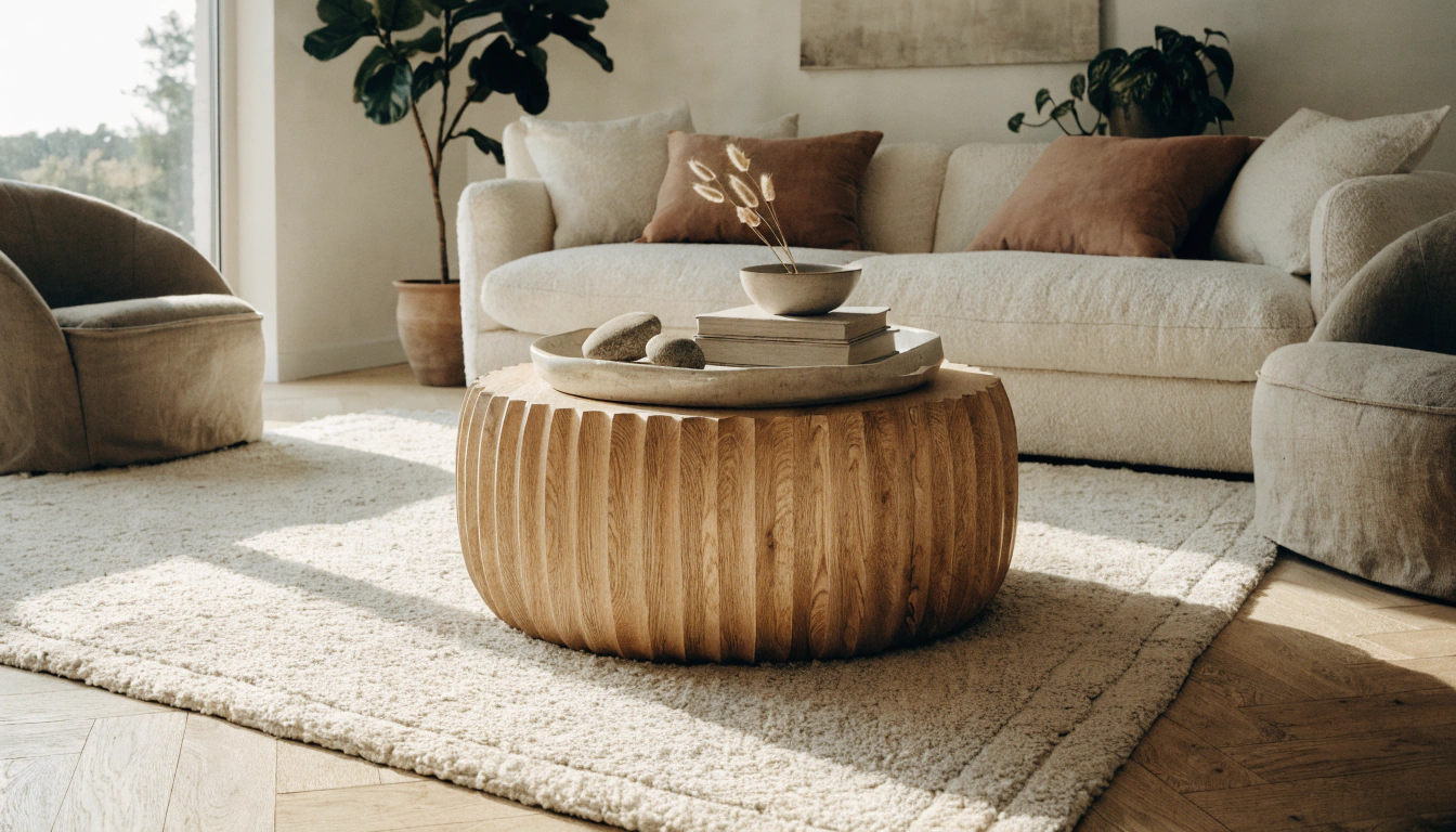
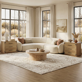
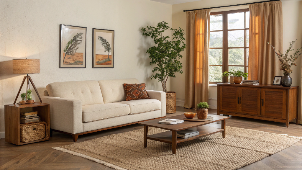
Living Room

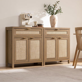
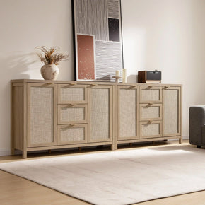
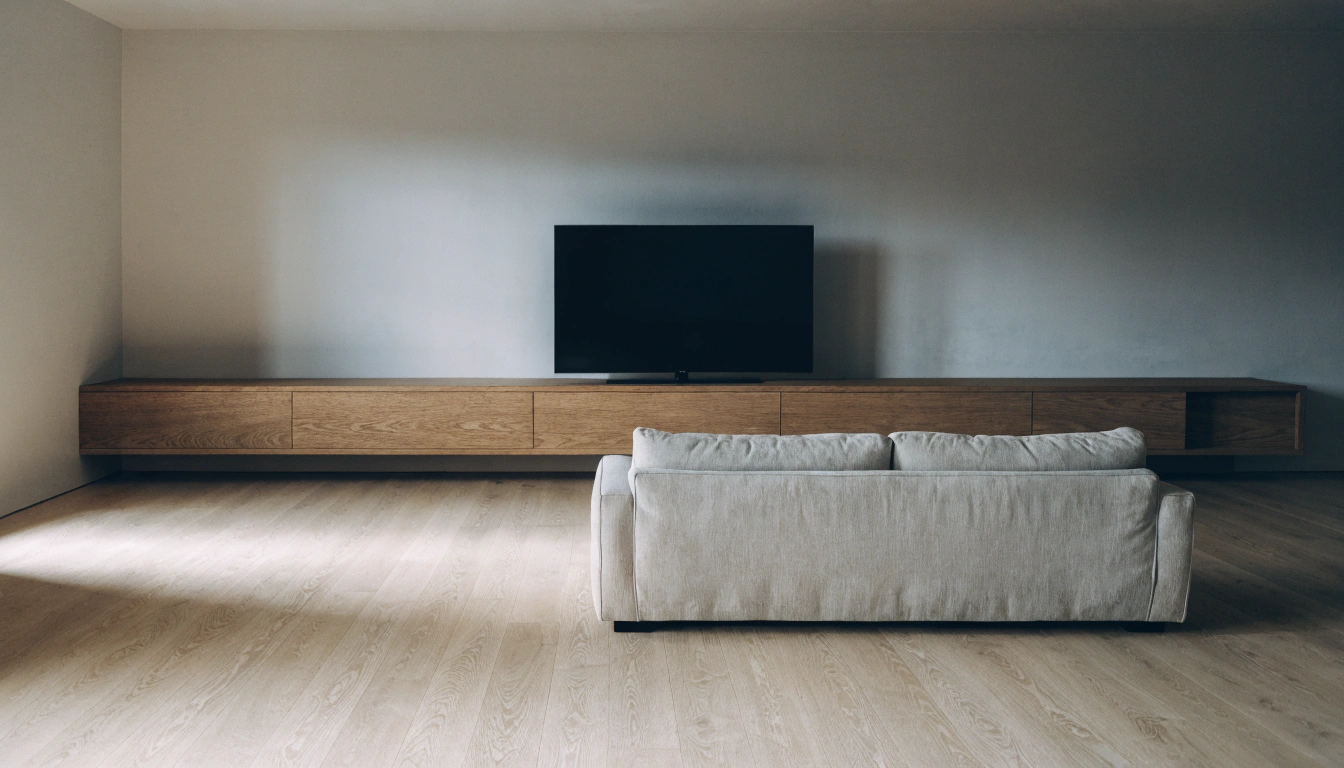
Start with the sofa. Cream, taupe, warm oat linen — an anchor that recedes rather than leads. Jute or natural wool rug underneath. Warm wood coffee table with real grain. Olive or rust cushions. One piece of wall art in muted browns or terracotta. For storage and display pieces in warm natural finishes that don't fight an earth tone palette, the Sicotas furniture collection covers sideboards and cabinets that sit in this palette without needing to be styled around. Keep the walls warm, white,e or very pale beige. The palette assembles itself once the anchor pieces are right.
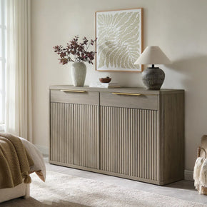
Bedroom — The Dresser

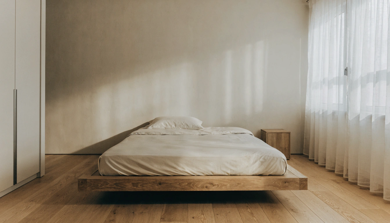
The dresser anchors a bedroom's palette more than almost any other piece because it's the one you see first when you walk in and the one whose finish spans from floor level to mid-wall. In a neutral earth tone bedroom, the furniture finish is the palette — everything else responds to it. The Terra 6-Drawer Dresser is the literal choice here. Terra means earth. The warm-wood tone lands exactly where this palette needs bedroom furniture to land: grounded, natural, warm without being heavy. No styling adjustment needed. It just belongs.
Bedroom — Second Dresser Option
If the Terra's proportions aren't right for the room — it's a horizontal piece, wider than tall — the Savanna 6-Drawer Dresser is the vertical alternative in the same warm-wood family. More drawer capacity, taller footprint, same natural finish. Both sit cleanly in an earth-tone bedroom without needing anything around them to change. Compare the dimensions against your wall space before deciding. The finish family is the same; the scale is what differs.
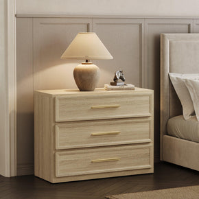
Bedroom — Nightstand

Nightstands do more for bedroom palette cohesion than people usually give them credit for. They're at eye level when you're lying down. They're the last thing you see at night and the first thing in the morning. A natural warm-wood nightstand in an earth tone bedroom doesn't just hold a lamp — it holds the palette together at the side of the bed. The Crescent Nightstand with 3 Drawers is clean-lined, warm-toned, and has enough drawer storage to keep the surface clear — which matters when visual calm on every surface is the whole point of the room.
Bedroom — Wardrobe

If the bedroom has a wardrobe as its dominant vertical piece, the finish matters more than in any other room because of the sheer wall area it occupies. A wardrobe in a cool white or cold-gray finish in an otherwise warm-toned bedroom is visually jarring in a way you notice every day without naming. The Savanna 71-Inch Wardrobe carries the same warm-wood natural finish language as the dresser and nightstand options above, which means the bedroom reads as a coherent palette rather than a group of furniture pieces that happened to be delivered to the same room.
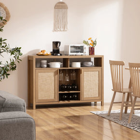
Dining Room

Natural wood table. That's 90 percent of the work done. The grain provides visual texture. The warm-brown tone echoes every other color in the palette. Warm neutral walls — beige, taupe, very pale greige. Linen or boucle chairs in cream, oat, or sand. Stoneware on the table. A low centerpiece in clay or dried plant material. The dining room converts to an earth tone palette faster than any other room because natural wood has always belonged in dining rooms, and everything else just needs to not fight it.
Entryway

The entrance sets the expectation for every room behind it. If the hallway is cold, white, and the rest of the house runs warm and earthy, people feel that disconnect the moment they walk in — even if they can't say why. One warm neutral paint color, a wooden bench or console, and a small plant near the door. That's the whole brief. Start the story here so the rest of the house continues it rather than contradicting it.
The Materials That Complete the Palette

Wood — The One Material You Can't Skip
Oak. Walnut. Ash. Pine. Reclaimed timber. Natural wood appears in every version of an earth-tone interior, at every price point, and in every style, because there's no substitute for what it does. The grain adds texture that no paint or wallpaper can replicate. The warm brown tones echo every other color in the palette without prompting. If an earth tone room feels like it's missing something, it's almost always a wooden surface. Add one, and the room resolves. It happens consistently enough to be treated as a rule. Browse the natural wood dresser and storage range if you're starting a bedroom — warm-wood furniture in the right proportions is the fastest route to a room that looks like it was designed rather than assembled.
Linen, Jute, and Rattan
Linen curtains in sand or cream. A jute rug under the main seating group. Rattan chairs and woven baskets. These are the materials that let an earth tone palette breathe. Without them, a room in cream, taupe, and walnut can still feel slightly synthetic — as if someone chose the right colors but didn't carry the natural reference all the way through. With linen, jute, and rattan in it, the room stops looking decorated and starts looking like it has its own internal logic.
Stone, Clay, and Ceramic Pieces
A terracotta pot. A rough-glazed ceramic lamp. A stoneware bowl. A piece of driftwood on a shelf. Small individually. Significant collectively. Each one adds a material note the eye recognizes from the natural world, and six or eight of these scattered through a room produce a cumulative effect — the space feels connected to something real rather than assembled from a current product catalog. Don't underestimate the accessories in an earth tone room. They do disproportionate work toward making the palette feel intentional rather than accidental.
How to Stop an Earth Tone Room from Going Flat

The all-beige room that looks like nothing. You've seen it. Probably lived in it. Here's what actually went wrong.
Three Depth Levels — Light, Medium, Dark
A single depth level is the fog problem. Not the colors themselves — the range. Everything at the same lightness and saturation reads as undifferentiated, regardless of how carefully the individual shades were chosen. Use three levels deliberately. Something genuinely light: cream walls, pale sand rug. Something medium: taupe sofa, natural wood furniture. Something actually dark: chocolate brown cushion, charcoal side table, deep olive. Three stops. The eye has somewhere to travel. One dark piece placed correctly sharpens the whole room.
Texture Before Another Color
When the room feels dull, the reflex is to add a new color. Usually, that's not what's missing. A smooth cream wall, smooth beige sofa, smooth sand rug — all correct individually, collectively boring because the surfaces are all the same. Add a chunky knit throw. A rough ceramic lamp. A woven jute basket. A wood grain that's genuinely visible. Physical contrast is what the room needed. The palette didn't have to change. It just needed something for the eye to move across.
One Deeper Accent
Charcoal. Deep olive. Chocolate brown. Warm black. Rust. Just one. Use it in one or two places — a side table, a lamp base, one cushion, a picture frame. That single point of real contrast makes everything lighter around it look intentional. Without it, a soft neutral room risks looking unfinished, like it's waiting. With one dark anchor placed correctly, the room reads as edited.
Warm Bulbs — Check the Box for 2700K
Cool-toned bulbs turn beige gray and walnut flat and terracotta into a color nobody chose. The number on the box is 2700K — warm amber light that pulls out the honey in beige, the depth in walnut, the richness in clay. Same paint, same furniture, same rug. Different bulb. The room looks like the magazine version of itself under 2700K and like a storage unit under 4000K. If you've repainted twice and it still looks wrong, check the bulbs before choosing another sample. The wall color is probably fine.
Warm Earth Tones vs Cool Earth Tones

Not all of them run warm. Knowing which direction each goes matters for how you arrange rooms.
Warm side: beige, camel, rust, terracotta, clay, ochre, walnut, cocoa, warm brown. Sun-baked and dry. Think desert, fired pottery, and afternoon light on hardwood. Best for bedrooms and living rooms where comfort and coziness are the brief.
Cool side: sage, moss, slate, stone gray, charcoal, blue-gray, muted forest green. Shade, rock, water. Best for bathrooms, offices, and open-plan kitchens where clarity matters more than warmth.
Most earth tone rooms that work well use both in the same space. Warm base — cream, walnut, beige — grounded by one or two cool notes. Sage cushions on a walnut sofa. Slate-gray side table in a cream room. Charcoal trim against warm-white walls. The warm-cool tension is what gives the palette visual energy. Too warm, and the room starts to feel pressurized after an hour. Too cool, and it never quite settles. Roughly 70 percent warm and 30 percent cool is where most successful rooms actually sit, even if nobody measured it deliberately.
FAQs
What are neutral and earth tones?
Two related color categories overlap. Neutral tones — white, beige, taupe, cream, warm gray, greige, ivory — are colors that work as backgrounds. They let the furniture, the light, and the textures in a room carry the visual story rather than competing with it. Earth tones are colors drawn directly from the natural world: clay, sand, soil, stone, bark, leaves, minerals. Terracotta, warm brown, rust, olive, sage, ochre. The overlap — warm sandy beige, muted walnut brown, dusty sage — is what gets called neutral earth tones. The warmest, most nature-connected corner of the neutral family.
What colors are neutral earth tones?
Cream, ivory, beige, sand, greige, taupe, warm white, camel, cocoa, chestnut, walnut brown, terracotta, rust, ochre, sienna, olive, sage, moss, stone gray, soft charcoal. The connecting thread is warm undertones drawn from the natural world rather than from synthetic color mixing. If a color looks like something you'd find outside — dry soil, sandstone, fired clay, tree bark, autumn leaf, river rock — it belongs in this palette.
What are the 5 nature colors?
One useful framework: green from plants and leaves, brown from soil and wood, sandy beige from rock and earth surfaces, gray-blue from sky, water, and stone, and terracotta or clay from fired earth and desert ground. Those five cover the majority of what the natural world looks like at eye level. The neutral earth tone palette is a refined, livable version of the same five — muted slightly, stripped of the saturated extremes, made workable in rooms with furniture and lamplight.
What are the top 3 neutral colors?
White, beige, and gray are used the most. For rooms that feel genuinely comfortable — not just well-photographed — beige, taupe, and cream outperform cool white and cool gray. Which specific neutral works in a given room depends on the direction it faces, the quality of light it gets, and the warmth of the furniture in it. A walnut-heavy room needs a warm neutral. One rule that rarely fails: if you're uncertain between a cool and a warm version of the same shade, go warm. You'll stop noticing the paint color and start noticing the room, which is exactly what good paint does.
How do I tell if a color is an earth tone or neutral?
Ask where you'd encounter it outside. Does it look like soil, sand, stone, bark, fired clay, dried grass, river rock, or a mineral deposit? Earth tone. Does it work as a quiet background that makes other things in the room easier to look at rather than competing with them? Neutral. The overlap is the neutral earth tone zone — warm sandy beige, muted olive, dusty walnut brown. Bright colors, cool synthetic-feeling grays, and anything with an obvious artificial base sit outside it regardless of the technical hue classification.
Is beige an earth tone?
Yes, when it's warm. Beige with a yellow or sandy undertone — the kind that looks like pale, dry earth or warm sandstone — sits clearly in earth-tone territory. It's also one of the most versatile palette bases in interior design. A cooler beige with a pink or gray undertone sits more in the neutral-only camp and behaves differently in a room: harder to warm up, sometimes reading slightly flat under lamp light. The undertone determines which category any beige actually belongs to. Warm undertone: earth tone. Cool undertone: neutral without the earthy quality.
Is neutral AC or DC?
That's an electrical question completely unrelated to color or home design. In AC electrical systems — which is what residential homes run on — the neutral wire is part of the circuit. If you ended up here from an electrical search, the color palette content won't help;d you should search for the electrical context specifically. For the decorating question: in interior design, "neutral" refers to a soft, non-dominant background color. The two uses of the word have nothing in common except the spelling.
Are earth tones warm or cool?
Both, depending on the specific color. Terracotta, rust, camel, ochre, walnut, and warm brown are on the warm side — they come from sun-baked, dry sources. Sage, moss, slate, stone gray, charcoal, and blue-gray run cooler — they come from shade, water, and rock. For most rooms, a warm-dominant palette with a cool balance works best: 70 percent warm tones, 30 percent cool tones. Too warm, and the room gets hotter over time. Too cool, and it never settles into comfort. The mix at that rough ratio is where most earth tone rooms that feel genuinely good to spend time in actually live.
Sources
- Vogue Arabia — The New Neutral: Earth Tones Define Spring's Palette Shift
- Pantone — Color of the Year 2025: Mocha Mousse
- HGTV Home by Sherwin-Williams — Earthy Charm Paint Color Collection
- Living Spaces — Earthy Neutrals for Your Home
- Sherwin-Williams — Neutral Paint Colors
- Real Simple — How to Decorate With Earth Tones at Home


Stay In The Know
Expert advice. Very good deals. The absolute best (and worst) things we've tested lately.
Looking for something else?
Positive and Negative Space Examples: How to Style a Balanced Home
LEARN MORE
Asymmetrical Balance in Interior Design: Style a Room That Feels Balanced, Not Matched
LEARN MORE
Line in Interior Design: How Lines Shape Space, Mood, and Balance
LEARN MORE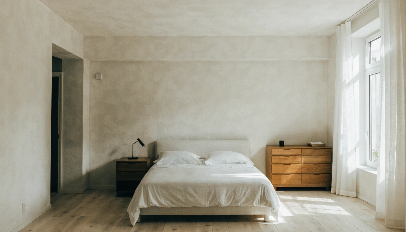
Bed Sizes Guide: Dimensions From Twin to King
LEARN MORERead more from Blogs
Looking for something else?
What Is a Platform Bed? A Simple Guide to Types, Benefits, and Buying
LEARN MORE
Upholstered vs Wood Bed: Which Bed Frame Is Right for You?
LEARN MORE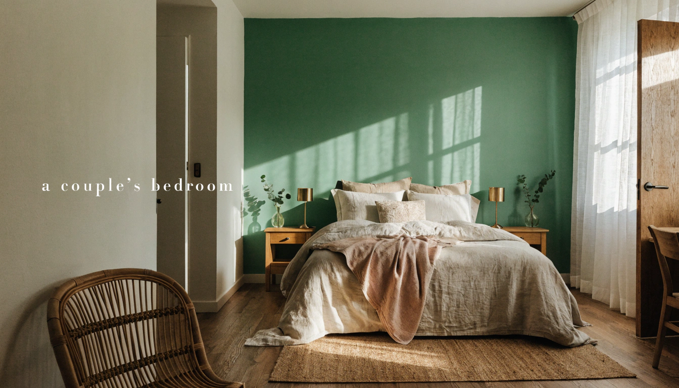
Best Bedroom Colors for Couples: 20 Romantic Color Ideas for a Calm Bedroom
LEARN MORERead more from Blogs
You may also like


Further reading
Best TV Stand Height: How to Choose the Right Size for Comfortable Viewing
Mid Century Modern Exterior Guide: 12 Design Ideas for American Homes