

Asymmetrical Balance in Interior Design: Style a Room That Feels Balanced, Not Matched
Asymmetrical balance in interior design is the reason a room full of mismatched pieces can still feel calm and pulled together. The two halves of the space never copy each other. They just carry a similar visual weight, so your eye settles instead of snagging on one heavy side. Plenty of designers build entire rooms around this idea, and the designer styling tips at Havenly show how effortless the finished look can be. Skip the design-school theory. Instead, you'll get a simple definition of what balance really means. You'll also learn about visual weight. That one idea quietly decides whether a room feels right or a little off. After that come nine fixes you can try tonight in the living room, the bedroom, or by the front door. And if you're stuck on something specific, the FAQ at the bottom answers the questions people ask most.
What Is Asymmetrical Balance in Interior Design?

Design jargon aside, asymmetrical balance is a pretty simple idea. You set up two sides of a room that look nothing alike, but somehow tug at your eye with about the same force. Picture a chunky sofa parked on the left. Over on the right, you'd answer it with maybe a pair of smaller chairs, a side table, and a framed print leaning on the wall. Not a single piece repeats, and yet the room holds steady. Living in that gap, between things not matching and the room still feeling settled, is the entire craft.
How It Differs From a Mirror Image

Symmetrical balance is basically copy-and-paste. Whatever sits on one side gets repeated on the other. Think of two identical lamps hugging a bed. Asymmetry tosses the mirror image out and leans on contrast to find its harmony. Both approaches feel balanced in the end. Where they part ways is mood: symmetry comes across as formal and composed, while asymmetry feels lived-in, looser, a bit more like a real home.
Why It Works in Real Homes

Almost no home is a perfect rectangle. Windows sit off to one side, doorways break up the walls, a hallway slices straight through the middle, and the fireplace nearly always lands somewhere inconvenient. All those quirks make textbook symmetry a struggle. Asymmetrical balance sidesteps the problem completely, because it bends around the room you genuinely have instead of fighting for a magazine-perfect layout you don't.
Why Visual Weight Matters Most

Of everything in this guide, visual weight is the one idea to hold onto. Put simply, it is how hard an object yanks your eye toward it. Once you can sense that pull, arranging a room stops being a guessing game and starts feeling obvious.
A handful of traits make a piece feel heavier than its actual size suggests:
- Scale and height, because the biggest, tallest thing usually wins the eye first
- Deep or saturated color, which always outpulls a soft neutral
- Busy pattern or coarse texture, both of which read as dense and weighty
- A striking shape, or simply a spot the eye is drawn to, anyway
It lands quicker with a few real-life matchups. Set a black bookcase next to a slim white chair, and the bookcase wins your attention hands down. Lay a patterned rug beside a plain one, and the pattern feels heavier underfoot. A tall floor lamp will always beat a little tea light in terms of pull. Not sure if a room is balanced? Try this. Stand where you'd normally walk in, and pay attention to whatever your eyes grab onto first. One side stealing all the attention usually means it's too loaded, and the fix is small: add a little to the quiet side, or pull something off the busy one. Honestly, most rooms come together after just that.
Symmetry vs Asymmetry: Which One Is Better?

Ask which one is better, and you are asking the wrong question. Symmetry and asymmetry are tools for two different moods. One delivers order and a quiet, formal stillness, the kind bedrooms and dining rooms tend to reward. The other delivers movement and a bit of personality. Most rooms that truly land borrow from each other, using symmetry to keep things grounded and asymmetry to give them a pulse. The table below stacks the two up against each other.
|
Feature |
Symmetrical Balance |
Asymmetrical Balance |
|
Feel |
Formal, calm, traditional |
Relaxed, modern, lively |
|
Method |
Mirror image across a center line |
Different objects, equal visual weight |
|
Best for |
Bedrooms, dining rooms, formal spaces |
Living rooms, entryways, small or odd rooms |
|
Effort |
Easier to pull off |
Needs a more careful eye |
|
Example |
Matching nightstands beside a bed |
One lamp balanced by a plant and art |

For testing the blend, nothing beats a bedroom. Matching nightstands on either side of the bed give you that calm, steady starting point. Once they're set, let the tops go their own way — paperbacks stacked and leaning on one, a little lamp and a dish for your rings on the other. That mismatch is what makes a bedroom feel actually lived in instead of staged for a photo. And if you're after pieces that pull their weight without crowding a tight room, themodern bedroom furniture range is a sensible place to start.
How to Create Asymmetrical Balance at Home: 9 Tips
Reading about balance and actually dragging a sofa across the floor are two different sports. That's the gap these nine tips fill. Most won't eat more than an afternoon, and you'll likely manage with things already sitting in the room. A bit of advice, though — don't run the whole list in one sitting. Change one thing and live with it for a day before you touch anything else. Once that first fix settles in, the next one always feels a lot easier.
1. Start With One Anchor Piece

A room needs one piece to carry the load, and that's your anchor: whatever takes up the most space. It usually picks itself — the sofa, the bed, the fireplace, a wide rug, or that one oversized canvas. Put it in place first, before anything else goes down. Then let the smaller pieces gather around it. Do it the other way around, and the room slowly drifts into a mess.
2. Balance Big Pieces With Groups of Smaller Ones

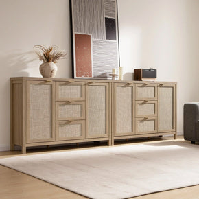
A heavy piece doesn't need a twin facing it across the room. A small huddle of items can match its weight just as well. Picture a tall Cas 6-Drawer Dresser standing on one wall. Across from it, set up a chair, a leafy plant, a table lamp, and a few framed prints. The shapes have nothing in common, yet together they weigh about the same. So your eye reads the wall as even.
3. Mix Shapes and Silhouettes

Placing opposite shapes side by side adds interest with almost no effort. A few pairings that reliably work:
- A rectangular sofa softened by a round coffee table
- A curvy accent chair beside a sharp, angular side table
- A tall bookcase looming over a low bench
The footprint stays balanced, but those clashing silhouettes keep your gaze wandering rather than locking onto a single tidy line.
4. Play With Height

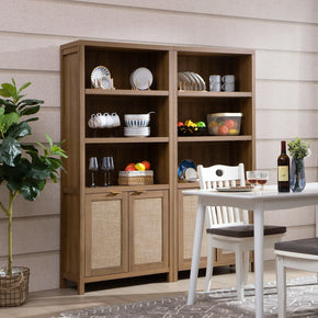
Of all the tricks, height might be the quickest path to asymmetry. Stand a tall floor lamp beside a low-slung sofa. Cluster stacked artwork next to a stretch of bare wall. Even a few tall branches in a vase can complement lower decor sitting across a shelf. A slim Willow tall bookshelf pulls this off beautifully, adding height and presence while taking up barely any floor space.
5. Build a Clear Focal Point

The eye always looks for a place to land first, so hand it one on purpose. A bold canvas, a fireplace, or a statement cabinet can take that role, and everything mismatched gets arranged around it. Without that single anchor, an unmatched layout reads as accidental; with it, the same pieces suddenly look deliberate.
6. Use Color and Texture to Add Weight

Color and texture tip the scales, too, and most people overlook it. Set a tiny object in some deep, inky shade next to a much bigger pale one, and that little dark thing somehow holds its own — rich color just lands heavier on the eye. Texture plays the same game. A rough-woven basket looks heavier than a smooth glass vase, even at the same size. So before you go spend money on something bigger, try balancing the room with the colors and textures you already have around you.
7. Lean Into Odd Numbers

Groups of odd things almost always look more natural than neat pairs. Three candles, five frames, seven small objects scattered along a shelf, each of which reads as easy and collected rather than arranged for a photo. There's a reason for it: odd numbers keep the eye from locking onto a tidy mirror image, which is the very thing asymmetry is trying to avoid.
8. Offset Your Placement

Line everything up dead-center, and the wall ends up looking like a furniture catalog. Knock things off-axis instead. Hang a framed print over toward the left third of the wall, then let a reading chair and a leggy plant carry the right side back to even. On a console, it's the same trick, a lamp at one end answered by a low pile of art books at the other. The whole thing leans into a soft zigzag, and that diagonal pull is the tell that someone styled the spot rather than measuring it out with tape.
9. Leave Negative Space

The gaps around your furniture matter just as much as the furniture. An empty wall, some bare floor, an open stretch of shelf — they all give your eye somewhere to rest between the busier spots. Fill every surface and the balance you worked so hard for vanishes under the clutter. Here's a trick that's saved a lot of our shelves: when a vignette feels off, take one thing away before you add anything new. Nine times out of ten the problem was the crowding, not a missing piece.
Asymmetrical Balance Examples by Room
Definitions only go so far. Seeing the principle land in an actual room is what makes it stick. The three setups below all run on visual weight, just dressed up with different furniture for each space.
Living Room

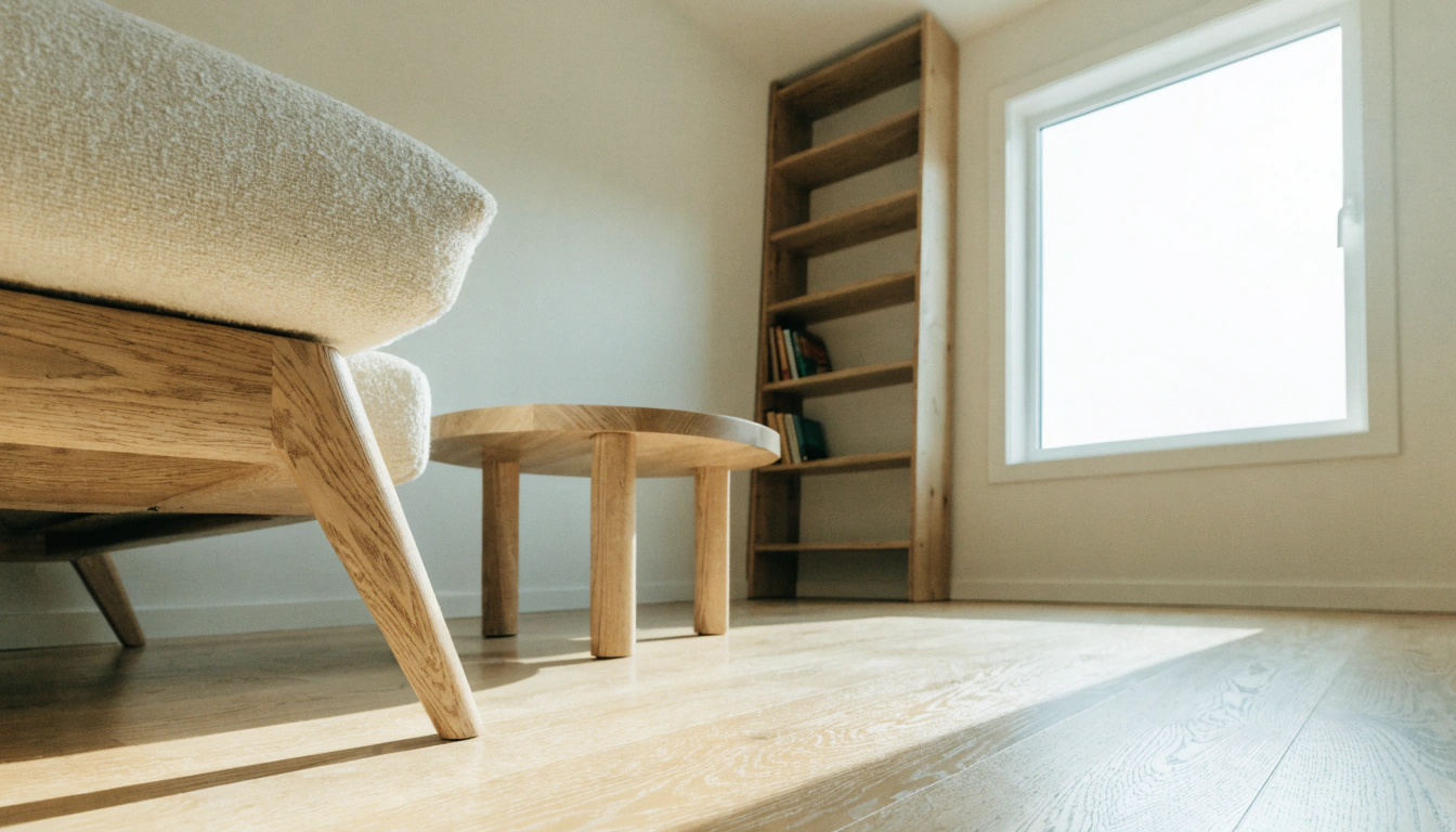
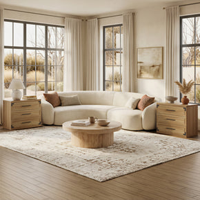
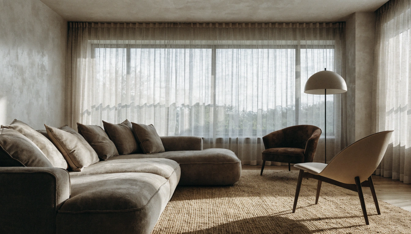
Shove a deep sectional into one corner, and it quickly becomes the heaviest thing in the room. The far side needs to hold its own, so build a small cluster there. Two accent chairs, a skinny floor lamp, and a rug with some texture to pull them together. Just keep a clear walkway between both sides so nobody has to turn sideways past the coffee table to get across. It all comes down to scale here. And theliving room furniture collection lets you hold the big and small pieces up next to each other before you commit to anything.
Bedroom

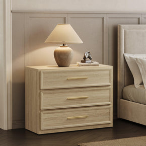
Leave the bed centered, since that one element of a bedroom genuinely benefits from symmetry. The stuff around it, though? That's where you mess with the rhythm a little. Tall lamp on one side, a small framed print on the other, and each nightstand left to hold its own random handful of things. Left side, aCrescent Nightstand with a paperback and a candle on it. Right side, nothing but one plant trailing down.
Entryway

Never tried asymmetry? Start in the entryway, where the surface is small, and a misstep costs nothing. Push a console flat against the wall as your base. Stand a tall lamp at one end, then tuck a low basket, a stool, or a little pile of books underneath the other. ASavanna Console Table works nicely for this, staying put while you keep fiddling, and the whole setup takes you maybe five minutes to switch around the day you get sick of it.
What Is the 3-5-7 Rule in Decorating?
People call it the 3-5-7 rule, and it boils down to one thing — odd numbers just work better when you're styling. Three candles, five frames, seven little bits on a shelf: somehow that always looks easy and collected. Go even, two or four, and the eye reads it as staged. The whole charm is in that slight off-balance, the thing that keeps a corner from looking like a store display.
A few quick ways to put the rule to work:
- Three objects are styled across a coffee table
- Five frames clustered into a gallery wall
- Seven mismatched pieces running along a long shelf
An odd count nudges the eye to hop from one piece to the next, never settling on a tidy pair, and the grouping still looks deliberate.
What Are the Four Types of Balance in Interior Design?
Talk to most designers, and they will rattle off three kinds of balance, then quietly leave out the fourth. It's worth knowing all four, since each one shifts how a room hits you the moment you step inside.
- Symmetrical balance: objects mirrored on both sides of a central line.
- Asymmetrical balance: different objects that create equal visual weight without matching.
- Radial balance: objects arranged around a central point, like a round table or a circular staircase.
- Crystallographic balance: a repeated pattern spread evenly across a surface, common in wallpaper, tile, and layered maximalist rooms.
Common Mistakes to Avoid
Even a sharp eye stumbles with asymmetry now and then. Four mistakes crop up far more than the rest:
- Chasing a random overbalanced. Repeat one color, wood tone, or shape so the mix still feels like it belongs together.
- Mismatched scale. A pencil-thin vase will never hold its own against a six-foot cabinet, no matter where you put it.
- Loading up one side. Too much weight in a single corner leaves the room feeling tipped and tense.
- Designing past the room's job. A layout can look stunning and still fail if it blocks a doorway or buries the only good seat.
Quick Checklist for Asymmetrical Balance
Give a room one last pass against these questions before you call it finished:
- Is one clear anchor piece carrying the room?
- From the doorway, does one side drag your eye more than the other?
- Are size, color, texture, and height all pulling their weight?
- Is there enough space for things to breathe?
- Do a couple of repeated colors or materials tie it together?
- Does the layout still work for how you actually live?
Final Takeaway
Matching was never really the goal. Balance was. Asymmetry is what gives a room its personality while still keeping it grounded, and visual weight is the lever you pull to make the whole thing work. Color, size, texture, height, a bit of ty space — those are the dials you nudge up and down. Don't go trying to redo the entire house in one afternoon, though. Pick a single spot, a console, one shelf, the coffee table, get that looking right, and let your eye reset. Do it a few times,mes and reading visual weight stops being a chore. It just turns into something you feel.
FAQs
What is asymmetrical balance in interior design?
Asymmetrical balance in interior design is when you pair objects that don't match but carry the same visual weight. One half of the room never copies the other, yet it still ends up feeling even somehow. The result is a relaxed, gathered look — the kind that reads as planned, not just thrown together in a hurry.
What is an example of asymmetrical balance?
Picture a big sofa holding down one side of a living room. Facing it sit two chairs, a side table, and a piece of art. Not one of them matches the sofa, yet their combined visual weight squares the room up. That is asymmetrical balance doing its thing.
What is the 3-5-7 rule in decorating?
The 3-5-7 rule says to gather decor in odd numbers, three, five, or seven pieces. Odd counts simply sit easier with the eye than tidy pairs do. That slight wobble adds movement and stops a shelf or tabletop from looking propped up for a catalog shoot.
What are the two types of asymmetrical balance?
Designers usually break it into two camps: weight-based and placement-based. The weight-based kind balances objects that tug the eye equally, like a dark chair set against a paler sofa. The placement-based kind leans on off-center positioning to push movement across the room.
Which is better, symmetry or asymmetry?
It comes down entirely to the feeling you are chasing. Symmetry reads calm and formal; asymmetry reads lively and personal. The strongest rooms tend to mix the two, grounding the layout with symmetry and lighting it up with asymmetry.
How do you explain asymmetrical balance simply?
A space can feel even when its two halves look nothing alike. Picture an old set of scales: a fistful of small things on one tray can hold up one heavy thing on the other. That equal-but-mismatched feeling is asymmetrical balance, boiled right down.
Sources
- Havenly, Asymmetrical Balance: The Designer's Styling Trick (2024)
- The Composed Interior, The Principles of Design – Balance (2017)
- Expand Furniture, A Guide to Symmetry and Asymmetry in Interior Design (2025)
- Alma de Luce, Symmetry and Balance in Interior Design: The Secret to Perfect Harmony (2024)
- IMI Design Studio, The Quiet Power of Symmetry and Asymmetry in Interior Architecture (2025)
- Abbeyfeale Interiors, Mastering Design: The Art of Symmetry and Asymmetrical Balance (2024)


Stay In The Know
Expert advice. Very good deals. The absolute best (and worst) things we've tested lately.
Looking for something else?
What Goes With Black Furniture? Stylish Color and Decor Ideas
LEARN MORE
Feng Shui Mirror Placement: Room-by-Room Rules for Better Energy
LEARN MORE
21 Contemporary Interior Design Ideas to Transform Your Home in 2026
LEARN MORE
Sectional Sofas for Open Concept Living Rooms: Layout Rules That Work
LEARN MORERead more from Blogs
Looking for something else?
Positive and Negative Space Examples: How to Style a Balanced Home
LEARN MORE
Asymmetrical Balance in Interior Design: Style a Room That Feels Balanced, Not Matched
LEARN MORE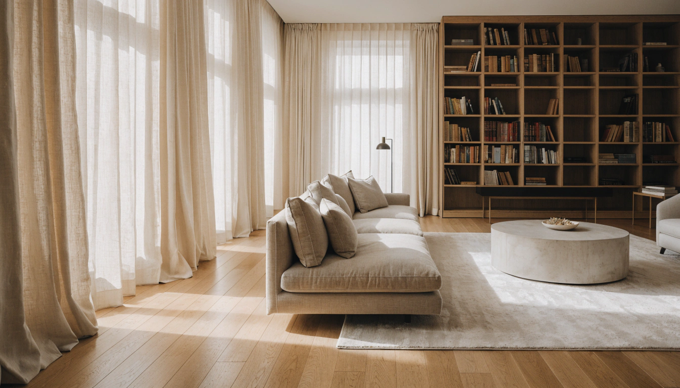
Line in Interior Design: How Lines Shape Space, Mood, and Balance
LEARN MORERead more from Blogs
You may also like


Further reading
Oversized Sectional Sofas: A Modern Home Buying Guide
Best Round Dining Table for 8 People: Sizes, Picks & Layout Tips