

36 Modern Living Room Ideas for a Stylish, Functional Home

Modern doesn't mean cold. That's probably the most stubborn misconception about this style — pictures of concrete floors, white walls, and furniture that looks like a geometry problem. That's not modern living. That's just uncomfortable with good lighting.
A room that actually works looks clean without feeling sterile. Comfortable without crossing into shabby. It handles the reality of how people live — remotes, chargers, books, all that stuff that colonizes every flat surface — and still leaves enough open space to breathe.
Here are 36 ideas for getting there. Use what fits your room. Skip what doesn't. And if you're still figuring out the right storage or display pieces to anchor the space, Sicotas Furniture has modern sideboards, display cabinets, and storage units that work in living rooms without dominating them.
Before You Buy Anything
Most living room regrets trace back to skipping one of these four things.
- Measure the room and draw a rough floor plan. Furniture that doesn't fit is furniture you're moving twice.
- Decide the focal point first — fireplace, TV wall, window, statement art. Everything else orients toward it.
- Buy the rug before the sofa if you can. Matching furniture to a rug is more significant than matching a rug to furniture.
- Build in more hidden storage than you think you'll need. You'll need it.
LAYOUT & SPATIAL PLANNING
1. Decide on the Focal Point. Then Stop Debating It.

A fireplace. A TV wall. A big window with something worth looking at outside. One large piece of art. Whatever it is — pick it before a single piece of furniture goes anywhere.
Rooms without one feel unresolved. Not minimal, not intentional — just unfocused. Everything else in the room orients toward it, which means it needs to exist before anything else does.
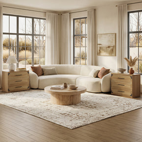
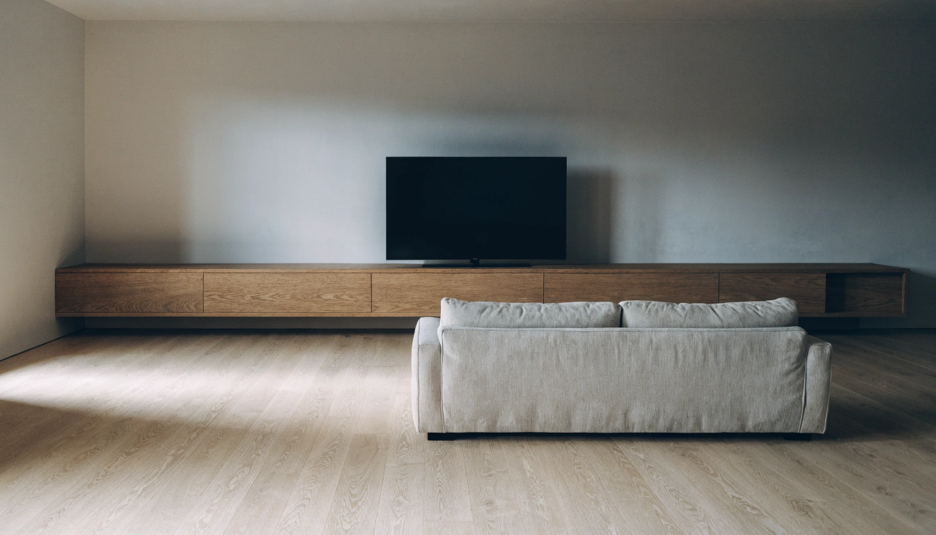
2. Pull the Sofa Away From the Wall

Every instinct says push furniture to the edges. Every designer says don't. Pulling the sofa 12–18 inches off the wall creates a floating arrangement that reads as intentional, opens up the center, and makes the whole room feel more deliberate. It sounds wrong. It isn't. Apartment Therapy's furniture arrangement guide explains why wall-hugging layouts consistently make rooms feel smaller — even when they technically leave more floor space.
3. Protect the Walking Paths

Thirty to thirty-six inches for main walkways. At least eighteen between the sofa and the coffee table.
Tight rooms feel anxious, not cozy. The eye needs space to move. Pathways aren't wasted — they're the structure that makes the furniture look chosen rather than crammed.
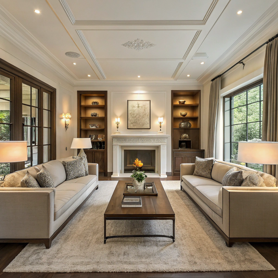
4. Try Symmetry When the Room Feels Chaotic

Two matching sofas facing each other. Paired lamps on either side of a console. Shelves are balanced on both sides of a fireplace. Symmetry creates order that reads instantly as calm and composed.
You don't need it everywhere. But anchoring one major element symmetrically tends to settle the whole room, even when the rest is loose.
5. Go Bigger on the Rug Than You Think

The front legs of all main seating belong on the rug. In most rooms, that means buying something noticeably larger than what feels right in the store.
An undersized rug is probably the most common living room mistake — and also one of the most visible. Furniture floating off the edge looks stranded. If you’re unsure: go bigger. Then reconsider going bigger again.
COLOR & PALETTE
6. Start With Warm Neutrals, Not Cool Gray

Gray works. But in rooms without a lot of natural light, gray tends to read as cold and a bit clinical — exactly what a modern living room shouldn't feel.
Cream, warm white, greige, taupe, soft linen, sand. These are the neutrals that catch warm light and stay livable through a long winter. They make rooms feel like somewhere you'd actually want to be.
7. Add Black in Small, Deliberate Doses

Picture frames. Lamp bases. Table legs. One dark chair. Cabinet hardware.
Black grounds a warm neutral in the room and stops it from drifting into beige boredom. It doesn't take much. Five or six small black elements distributed around the room are usually enough to hold the whole palette together.
8. One Earthy Accent. Not Two.

Olive green. Rust. Clay. Deep sage. Terracotta. Muted blue. One earthy accent color, introduced through cushions, a throw, a plant pot, or a piece of art, is what separates a "safe neutral room" from a room that actually looks considered.
Two competing accents fighting for dominance is a different problem entirely. One. That's the rule.
9. Try Color Drenching

Same color on the walls, deep, and on the ceiling: deep olive, dusty blue, warm terracotta. Color drenching creates a cocoon effect that photographs strikingly and feels surprisingly good to live in — warmer, more enveloping than most two-color combinations ever manage.
It's more forgiving than it looks, too. The uniformity simplifies rather than complicates, especially in awkward rooms where ceiling heights vary.
10. One Strong Accent Wall

If the room feels busy everywhere, commit the boldness to just one wall. Behind the sofa, behind the TV, or facing the entrance. Keep the other three walls quiet. The accent wall earns its impact precisely because everything around it stays neutral.
FURNITURE
11. Low-Profile Sofa. Almost Always.

A sofa with a low, clean back and trim arms makes a ceiling feel taller and a room feel less packed. A high, boxy sofa can work — but it needs the square footage to pull it off, and most rooms don’t have it.
When in doubt, between two sofas, take the one closer to the floor.
12. Add One Curved Chair

Sharp lines and right angles read as modern. Curves soften them without undermining that. One rounded chair — a barrel, a curved swivel, a contemporary egg form — introduces just enough contrast to keep things from feeling rigid.
It’s also usually the personality piece: the thing you actually love in a room that might otherwise be playing it a little too safe.
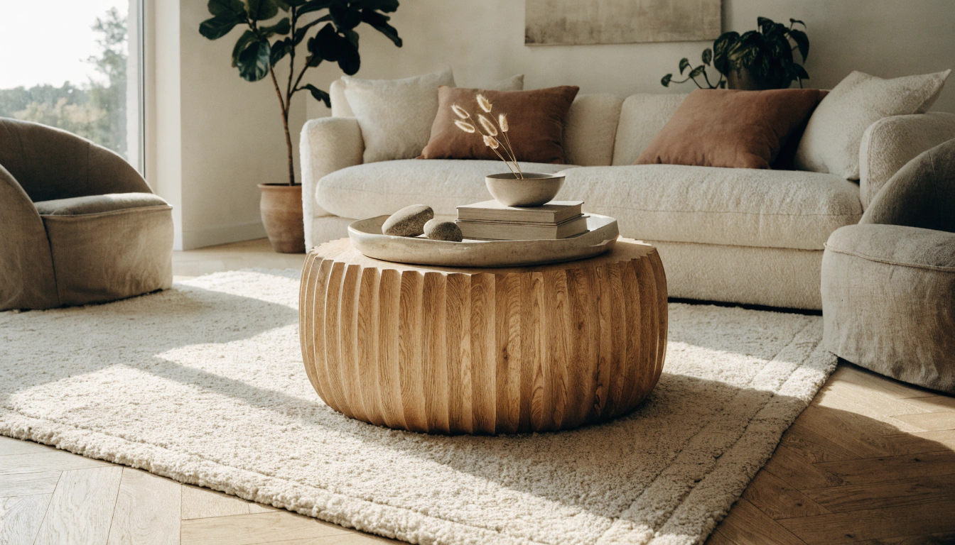
13. Coffee Table With Actual Presence

Not an afterthought. The coffee table sits at the visual center of the seating arrangement, and a flat, forgettable choice makes everything around it feel flat.
A stone top. Live-edge wood. Marble. A sculptural base. Something with real material presence. One good coffee table does more for the overall look than almost any other single purchase.
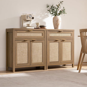
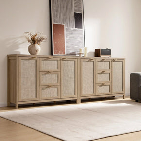
14. Use a Sideboard for Clutter

Every living room—remotest things. Rand emotes, chargers, and small items without a home. A sideboard handles all of it behind closed doors. For modern living rooms, the Helio Collection offers sideboard options in rclean, contemporary finishes — drawers for small items, cabinet doors for bulkier items. What sits on top becomes a display surface. Everything messy goes behind the doors. Simple division. Visible payoff.
15. Mix Old and New Pieces

A modern sofa beside a vintage chair. A sleek coffee table next to a secondhand cabinet. Every living room worth spending time in has at least one piece that breaks the formula.
All new furniture looks expensive and impersonal. All old furniture looks dated. The mix is what makes a room feel inhabited rather than installed.
16. Nesting Tables Over Cluttered End Tables

Two or three tables that tuck together when not needed and pull out when guests arrive. No visual weight when stacked. Maximum flexibility when in use.
In a modern room, pieces that disappear when not needed are almost always worth consideration. Nesting tables are one of the best examples of that.
TEXTURE & MATERIALS
17. Hard Surfaces Against Soft Ones

Stone coffee table. Bouclé sofa. Concrete lamp. Chunky knit throw. The back-and-forth between hard surfaces and soft ones is where a modern living room develops its character.
All hard materials: clinical. All soft: shapeless. The contrast between the two is what makes the room feel rich, rather than either one alone.
18. Natural Materials Are Non-Negotiable

Wood, stone, rattan, cane, jute, linen, leather. Natural materials age well, photograph well, and make rooms feel grounded in a way synthetic alternatives simply don't.
Small additions count just as much as large ones. A wooden bowl. A rattan pendant. A jute rug. They don't need to dominate the room — they just need to be present.
19. The Rug Does Three Jobs at Once

Defines the seating zone. Adds warmth. Absorbs sound. In a hard-floored room, it's often the most impactful single piece — and yet it's frequently undersized, underweighted, or chosen last.
Texture matters as much as size and color. A flatweave reads differently from a shag. A jute is different from a Moroccan pile. Choose the texture that fits the room's temperature.
20. Odd Numbers on Cushions

Three, five, or seven. Never four, never six. The odd number creates a slightly asymmetrical grouping that looks natural rather than arranged.
Vary the sizes, shapes, and textures. Keep the colors to a maximum of two, plus neutrals. A square, a rectangle, and a round in the area tone family are usually enough.
21. At Least One Linen or Bouclé Textile

Bouclé has been everywhere in modern interiors for a while — and with good reason. The loopy weave is visually interesting, comfortable, and works across almost every palette. Linen reads similarly: organic, relaxed, warm without being precious.
Either material on a chair, a cushion, or a throw changes the register of a room. It's one of the cheapest upgrades available for the visual impact it provides.
LIGHTING
22. Three Layers. Always Three.

Ambient overhead. Task lighting beside seating or at a desk. Accent lighting — decorative or atmospheric — that switches the room's mood.
Most rooms have one layer, maybe two. The rooms that feel genuinely finished have all three. Adding the missing layer is usually the single most effective intervention in a room that's "almost there."
23. A Floor Lamp Beside the Sofa

A single floor lamp next to the sofa transforms the seating area. Suddenly it’s a destination — a reading corner, somewhere to settle in the evening.
Overhead lighting alone flattens everything. The floor lamp is what makes the room feel like it’s actually used rather than just turned on.
24. Statement Pendant or Chandelier

A sculptural ceiling fixture in a living room acts as art you can turn on. It fills the ceiling zone — which would otherwise be blank — and gives the room a centerpiece even when the furniture is understated.
Err on the larger side. Pendants that look right in a showroom almost always look small once installed. Living room ceilings absorb much more scale than you expect.
25. Strip Out What's Blocking the Natural Light

Sheer curtains instead of blackout. Mirrors positioned to bounce window light. Furniture that doesn't cut across the window line. Light-colored surfaces near windows.
Natural light is free and unmatched. Clear whatever’s blocking it before spending anything on artificial alternatives.
WALL DECOR & ART
26. One Oversized Piece of Art

One large piece does more for a modern living room than a wall covered in small frames. It becomes the room's statement — the thing the eye finds first without having to work.
Scale is the variable most people get wrong. Art that's too small for the wall reads as uncertain. Art that fills the wall reads as confident if you're unsure: bigger.
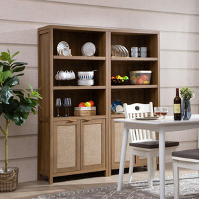
27. A Glass Display Cabinet Adds Structure to a Corner

Display cabinets with glass doors keep items visible yet protected — they add architectural detail without requiring built-ins. For a modern option with built-in lighting, the Helio Glass Sideboard with Doors works well in living rooms for exactly this: curated objects behind glass, lit from within, acting as a display feature rather than just storage. After dark, the internal lighting makes even a modest collection of ceramics look as if it were deliberately staged.
28. Gallery Wall — But Keep It Clean

Uniform frames, same finish, consistent spacing. For a modern living room, a clean grid reads as intentional. Mixed frames in varying sizes can work too — but only with an organizing principle. Randomness just reads as randomness.
Height matters: the center of the arrangement should sit roughly at eye level, not wherever the studs happened to fall.
29. Shelves: Edit Until It Hurts

Books, one or two ceramics, a small plant, deliberate space. That's a modern shelf. The same shelf with twice as many objects isn't more styled — it's just full.
Take two things off before you add one more. Leave more space than feels comfortable. It’ll look right before it feels right, so give it a week before reaching for something to put back.
STORAGE & ORGANIZATION
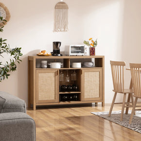
30. A Media Console That Actually Hides Cables

Visible cables will undo even the most carefully designed living room. A good media console with enclosed lower storage solves it entirely — TV on top, everything else (boxes, cables, remotes, chargers) behind closed doors.
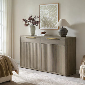
31. A Sideboard for What Lands on Every Surface

Keys, mail, chargers, and small objects that materialize on every flat surface—a sideboard with doors gives everything somewhere to go. The Helio 2-Door Sideboard splits storage between two sections, making it easier to keep different categories separate without labeling. The exterior stays clean. The mess stays behind the doors. That's the whole deal.
32. Add a Display Cabinet for Things Worth Showing

Not everything belongs hidden. Books, ceramics, objects with interesting form, plants — these are worth displaying. The Helio Glass Door Display Cabinet with Lights features internal lighting, which turns a modest collection of objects into an intentional feature after dark. It's the kind of piece that becomes a room detail rather than background furniture.
33. The 70% Surface Rule

Leave roughly 30% of each surface clear — coffee table, console top, sideboard, windowsill. Empty reads as undecorated.Full reads as cluttered. The seventy percent is where the room looks deliberate.
This is also a way to improve a room that feels busy instantly: take three things off a surface and leave the gap.
SMALL MODERN LIVING ROOMS
34. Furniture With Exposed Legs

Legs reveal the floor rather than sitting on it. The eye reads more floor, the room feels more open. A sofa on legs. A coffee table on a frame. Chairs that sit off the ground.
Each piece with legs contributes lightness that solid-base furniture can't. In a small room, that compound effect is significant.
35. Two or Three Colors. Not More.

More colors in a small room add visual noise, making the room feel smaller and busier than it already is—stick to one neutral base plus one or two accents. Restraint here isn't sacrifice — it's the actual strategy.
Personality comes from texture, form, and material quality. Not from stacking competing colors on top of each other.
36. Go Vertical With Storage

When floor space runs out, the only direction left is up—tall shelving, wall-mounted storage, and floor-to-ceiling built-ins if the budget allows.
Vertical storage also draws the eye upward, making ceilings appear higher. Two problems, one solution.
The Styling Rules Worth Actually Using
The 3-5-7 rule
Group objects in odd numbers: three, five, seven. On a coffee table, a shelf, a console, a mantelpiece. Odd groupings look natural. Even ones look placed. Use this when a vignette isn’t working, and you can’t figure out why — it’s almost always the number.
The 2/3 rule
The coffee table is about two-thirds the length of the sofa. Rug large enough for the front legs of all main seating to sit on it. These proportions have been tested in enough rooms to work consistently, which is why they became rules.
The 70/30 rule
Seventy percent of the room follows the main direction. Thirty percent introduces contrast or character that breaks it. Without the thirty, the rooms look assembled. With it, they look like choices were made.
The 3-4-5 rule for shelves
Vary object heights in every grouping: small, medium, tall. The height variation creates rhythm. Without it, even beautiful objects on a shelf read flat.
Mistakes Worth Avoiding
The furniture is too large for the room
The overscaled sofa in a small room makes both look worse — the sofa looks ungainly and the room looks smaller. Measure first, always. When it’s a choice between a piece that fills the room and one that gives it some air, take the smaller one.
One ceiling light and nothing else
One overhead fixture makes a room feel like a shop floor, regardless of how everything else is done. Add a floor lamp. Add a table lamp. Get some light into the lower half of the room.
Everything matching
Matched sets look like a showroom floor. Pieces that coordinate without being identical look like someone with actual taste lives there. The difference is subtle, but it’s always visible.
Comfortable forgotten
A modern living room still needs seating you actually want to sit in for three hours, a surface at the right height for a glass, and lighting warm enough to relax under. Modern isn’t a license for furniture that’s beautiful and uncomfortable.
Decor as a finishing move, not a last resort
The temptation is always to add more: another cushion, another object, one more piece of art. Most of the time, the room looks better with less. The edit is the real work. Do it more than you think you need to.
FAQs
How do I make my living room look modern?
Six changes move most rooms: a simple warm-neutral palette with one accent, a low-profile sofa, layered lighting (not just one overhead), a large rug that anchors the seating zone, one oversized piece of art on the main wall, and edited decor — fewer objects, not more. Start with those.
What's trending in living rooms right now?
Curvy furniture — rounded sofas, barrel chairs, oval coffee tables — is the dominant shape direction. Mixed materials in the same room (stand, ne, wood, bouclé, metal together). Warm neutrals are replacing cool gray as the default base. Lounge-worthy, low, genuinely comfortable layouts replacing stiff formal arrangements. Statement lighting asa focal point rather than an afterthought.
What is the 3-5-7 rule?
Group decorative objects in odd numbers: three: coffee, or seven: coffee tables, shelves, consoles, mantels. Odd groupings look natural. Even groupings look deliberately placed. The slight asymmetry of an odd number is what makes the difference.
What is the 2/3 rule for living rooms?
Two things: the coffee table should be roughly two-thirds the length of the sofa, and the rug should extend far enough that the front legs of all main seating rest on it. Both rules exist because they've been tested in thousands of rooms, and they consistently work.
How do you make a living room look expensive?
Fewer but better pieces. Layered textures — wool, leather, linen, stone in the same room. Large-scale art. Three layers of lighting. Hidden storage so surfaces stay clear. One or two metallic accents in a warm finish. The perception of luxury is almost always about restraint and quality rather than spending more.
What is the 3-4-5 rule?
Vary the heights of objects in any grouping: something short, something medium, something tall. The variation creates a visual rhythm that keeps surfaces from reading flat, even when the individual objects are good.
How do you make a room look classy?
Limited palette. Quality textiles over quantity. Balanced furniture arrangement. Clean surfaces. One strong focal point to which everything else defers. A room looks classy when every element does, es its job quietly and nothing fights for attention it hasn't earned.
What is the 70/30 rule?
Seventy percent of the room follows the main style or color direction. The other thirty percent introduces contrast, character, and something that's deliberately formulaic. Without that thirty percent, rooms feel assembled. With it, they feel like someone made actual choices.
Final Thoughts
The best modern living room isn’t the one that photographs best.
It’s the one that actually works — for how you use the space, for the size of the room, for the reality of how much stuff real life generates. A room that still looks like somewhere worth being on a Tuesday evening, not just on the day everything was freshly arranged.
Pick the one or two things most visibly wrong with your current setup. Fix those first. Everything else tends to fall into place.
References & Resources
Sources consulted in the preparation of this guide:
- Martha Stewart — Modern Living Room Ideas — https://www.marthastewart.com/modern-living-room-ideas-8598095
- Farrow & Ball — Living Room Inspiration and Color Schemes — https://www.farrow-ball.com/room-inspiration/living-room-ideas
- Apartment Therapy — Furniture Arrangement Rules — https://www.apartmenttherapy.com/furniture-arrangement-rules-36896403
- Parachute Home — How to Clean Wood Furniture — https://parachutehome.com/blogs/posts/cleaning-wood-furniture
- Taskrabbit — Living Room Ideas and Styling Tips — https://www.taskrabbit.com/blog/living-room-ideas/
- Homes & Gardens — The 3-5-7 Decorating Rule Explained — https://www.homesandgardens.com/solved/the-3-5-7-decorating-rule-explained
- Granite Gold — Wood Furniture Care: Dos & Don'ts — https://granitegold.com/blogs/blog/how-to-care-for-wood-furniture-dos-donts-cleaning-guide
- Shuttercraft — 30 Modern Living Room Design Ideas — https://www.shuttercraft.co.uk/blog/guide/30-modern-living-room-design-ideas/


Stay In The Know
Expert advice. Very good deals. The absolute best (and worst) things we've tested lately.
Looking for something else?
Positive and Negative Space Examples: How to Style a Balanced Home
LEARN MORE
Asymmetrical Balance in Interior Design: Style a Room That Feels Balanced, Not Matched
LEARN MORE
Line in Interior Design: How Lines Shape Space, Mood, and Balance
LEARN MORE
Bed Sizes Guide: Dimensions From Twin to King
LEARN MORERead more from Blogs
Looking for something else?
What Is a Platform Bed? A Simple Guide to Types, Benefits, and Buying
LEARN MORE
Upholstered vs Wood Bed: Which Bed Frame Is Right for You?
LEARN MORE
Best Bedroom Colors for Couples: 20 Romantic Color Ideas for a Calm Bedroom
LEARN MORERead more from Blogs
You may also like


Further reading
Best TV Stand Height: How to Choose the Right Size for Comfortable Viewing
Mid Century Modern Exterior Guide: 12 Design Ideas for American Homes