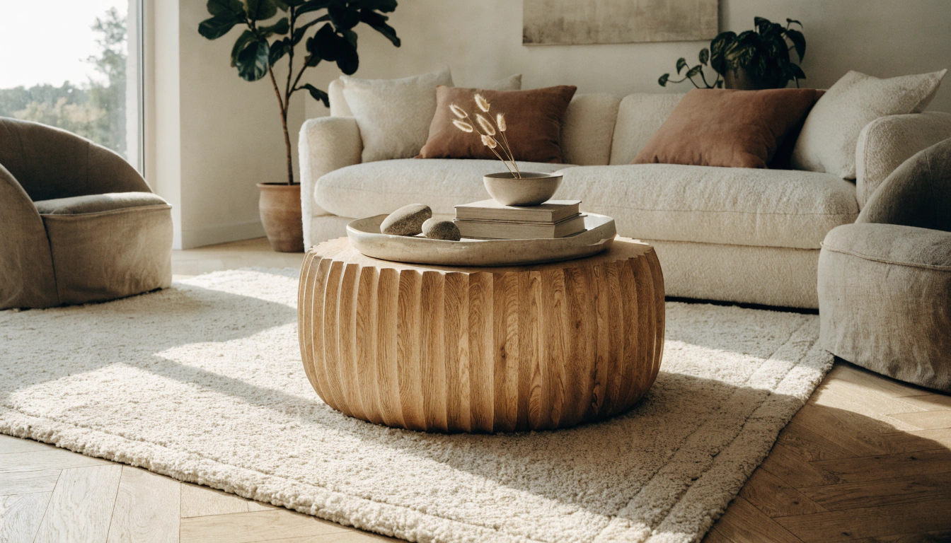


41 Living Room Decorating Ideas That Feel Polished but Easy to Maintain
No room in the house gets more traffic and less attention than the living room. It absorbs the end of every workday, hosts every gathering, doubles as a reading spot and a TV room, and sometimes a homework space. Most people live with it the way it is for years — not because it's working, but because they don't know where to start. These 41 living room decorating ideas are drawn from what actually makes a difference in real rooms. Some are free. Some cost something. None requires a contractor.
Color and Paint Ideas
1. The All-Gray Living Room Had Its Moment — It's Over

Gray had a good decade. Around 2010, it felt fresh. Now it reads as a default that nobody is quite committed to. Cool grays and cool whites also have a specific problem at night: once the natural light is gone and you're down to lamps, they go slightly clinical. Pharmacy-adjacent. A warm white or a cream or a greige — any of those — holds warmth through the evening without asking anything else of the room. If you're repainting and you're on the fence between cool and warm, go warm. You'll stop thinking about the paint within a week, which is what good paint does.
2. Two Cushions in the Same Color Isn't an Accent — This Is

An actual accent color has weight. It shows up somewhere that matters — in the curtains, in an armchair, in the rug — not just sprinkled across two decorative cushions that everyone moves when they sit down. Pick one: dusty terracotta, aged navy, deep olive, warm rust. Put it somewhere real. Then let it echo in a couple of smaller places around the room. The rooms that feel intentional almost always have one color the eye keeps finding. Not three. One.
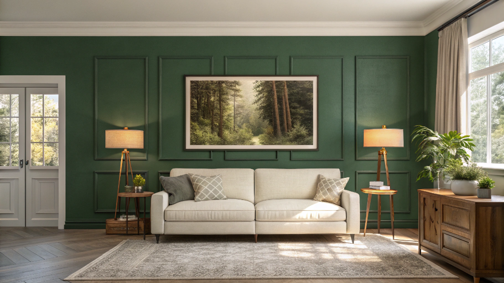
3. One Dark Wall Won't Ruin the Room — Bad Lighting Will

Here's what actually happens with a dark accent wall: people paint it, leave the lighting exactly as it was, and then decide dark walls are a mistake. They're not. The mistake was one overhead bulb. A deep green or navy wall behind the sofa with two lamps running beside it — warm bulbs, 2700K — looks expensive and deliberate—same wall, single ceiling fixture: gloomy. The wall color isn't the variable. The lighting always was. Sort the lighting first, then decide if you still hate the dark wall.
4. Paint the Trim Dark and Leave the Walls Alone

This is the one most people walk past. Matte black, deep navy, forest green — just on the baseboards, the door casings, and the window frames. Walls stay light. The result: the room picks up architecture it didn't physically have before. It reads as custom. It isn't — it's a few cans of trim paint and a Saturday afternoon. Works in traditional rooms, works in modern ones, works in rentals where you can't touch the walls. If you've never tried contrasting trim, try it a try. It's hard to go back.
5. Three Shades of One Color Beat Three Different Colors

Running three competing colors in a living room is harder than it sounds. Running three tones of the same color — a pale version on the walls, a mid tone on a cushion, the deep version somewhere in the rug — is almost impossible to get wrong. The movement between shades keeps it from looking flat. The shared color family keeps it from looking busy. Small rooms especially benefit from this. One committed color in multiple shades reads calmer and more spacious than three colors trying to balance each other.
6. Nobody Ever Regrets Painting the Ceiling

Almost everyone leaves it white. Most people never look up. But a ceiling in a tone one shade deeper than the walls — even slightly — makes the room feel more resolved, like someone thought about all of it rather than just eye level and below. A ceiling painted a contrasting color is bolder and, done right, genuinely striking. It photographs well. More usefully, it changes how you feel when you walk in. It's the surface with the most surface area in any room, and it's consistently wasted on white.
7. One Wallpapered Wall Is a Decision; Four Is a Commitment

Four wallpapered walls: expensive, permanent, something you'll be explaining to whoever buys the house eventually. One wall: a design decision you can revisit. The wall behind the sofa is usually the best candidate. A textured linen, a soft geometric, a botanical print that earns a second look. It gives the room a focal point — somewhere the eye goes when you walk in — that paint alone rarely achieves, and without the cost or the commitment of doing the whole room.
Furniture and Layout Ideas
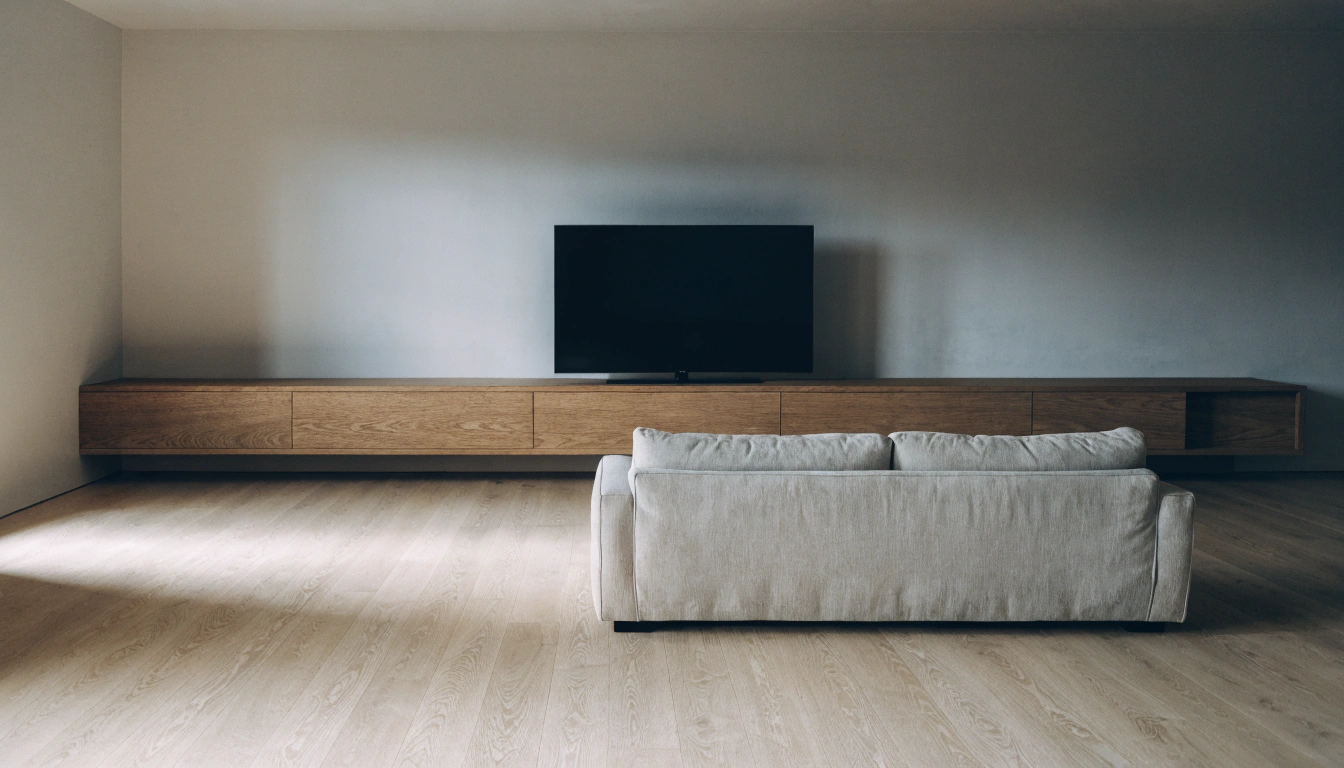
8. Move the Sofa Off the Wall Right Now

Walk into a room where every piece of furniture is against a wall, and you'll feel it before you can name it. The room is arranged to stay out of its own way. The center is empty and awkward. Nobody chose it to be empty — it just happened by default because moving furniture away from walls feels counterintuitive until you've seen it work. Pull the sofa forward. Twelve inches. Eighteen if the room allows. You create a zone — a reason the furniture is where it is — and a strip of space behind the sofa that can hold a console table, a lamp, a row of books. The room makes sense now. And it will feel larger, not smaller, even though the floor between the sofa and the wall is now occupied.
9. Chairs Pointing at the TV Can't Host a Conversation

Four chairs and a sofa, all facing the screen, work fine as a cinema arrangement. For an actual gathering — for any evening involving people talking to each other — it doesn't. Rotating two chairs to face the sofa at even a slight angle doesn't break the TV viewing. People can still watch. But the room stops being organized exclusively around a rectangle on the wall and starts being organized around the humans sitting in it. Worth doing even if you think you only use the room for TV. The option to host a real conversation without rearranging the furniture before guests arrive is worth something.
10. Matching Furniture Suites: The Showroom Problem

When everything comes from the same catalog page — same sofa, same loveseat, same armchair, same leg finish, same delivery day — the room looks furnished rather than lived in. That's the showroom problem. Mix it up instead. Buy a sofa you love and find chairs that go with it rather than match it. Pick up a side table from somewhere different. The variety signals that the room developed over time, which is the look that makes photographs look like someone actually lives there, rather than someone staging it for a sale.
11. The Coffee Table Should Be Two-Thirds the Sofa Length

Too small and things that need to go on it end up on the floor beside the sofa. Too big and it blocks the whole seating area. The rough proportion: two-thirds the length of the sofa, height within two inches of the cushion surface. Can't find it in the right dimensions? Two smaller tables pushed together do the same job with more flexibility. You can separate them when the room needs different configuration for a gathering. One rigid table can't do that.
12. Open-Plan Rooms Need a Soft Edge

A kitchen-dining-living room that runs together without any visual break reads as one very large room rather than three connected spaces. You don't need a wall. A console table behind the sofa, facing the dining area, acts as a boundary — quiet and permeable, not a partition. It says: the living zone ends here. It's subtle enough that guests won't notice it's doing structural work. But remove it and the room loses definition in a way that's hard to explain but easy to feel.
13. An Oversized Sectional in a Small Room — Try It

Sounds wrong. Almost always works. One large sectional leaves more clear floor area than a sofa plus two separate chairs, because the footprint is a single continuous shape rather than several competing ones with gaps between them. The room commits to its purpose. It looks chosen rather than compromised. The condition: measure properly — include the clearance needed to walk around it in every direction — because a sectional that technically fits but leaves no passage doesn't work. If it fits with the walking room, it almost always looks better than the cautious undersized option.
14. Every Chair Needs a Surface Within Arm's Reach

This one's invisible until it isn't. A room where one or two seats have nowhere nearby to put a drink means guests hold glasses for the entire visit, or set them on the floor, or balance them on a knee. It's mildly uncomfortable in a way nobody mentions. Fix it with whatever's available — a stool, a small side table from a different era, a stack of large books with a tray on top. The material doesn't matter. The surface at arm's reach from every seat is what makes the room actually comfortable to use for a full evening.
Lighting Ideas
15. A Single Ceiling Fixture Is Where Lighting Plans Go to Die

One overhead light illuminates the room the way a bare bulb illuminates a garage. Everything is the same brightness. No shadows. No depth. No warmth. It gets the job done in the way that a folding chair gets the seating job done — technically, joylessly. Layered lighting means a floor lamp in one corner, a table lamp at each end of the sofa, something near the bookcase if there is one—the overhead drops to a supplementary role. After dark, the same room with the same furniture feels like somewhere worth staying, because the lighting is doing real work rather than just illuminating the problem.
16. 2700K. That's the Number. Check the Box.

Cool bulbs — 4000K and above — push the living room toward office territory after dark. Blue-toned, flat, slightly clinical. The kind of light that makes you want to deal with your inbox rather than sit and relax. 2700K is warm amber. Skin looks better. Furniture reads as warmer. The room feels like somewhere to stay. It's the same fixtures, a different bulb, and the difference is immediate and obvious. Check every socket before buying — mismatched color temperatures in the same room read worse than they sound.
17. One Lamp Worth Looking At Beats Three That Aren't

A sculptural floor lamp in a corner, a ceramic table lamp in an interesting shape, a brass piece that took some finding — a single lamp that earns visual attention works as both light source and decor. It does two jobs. A generic shade on a generic base does one job and contributes nothing to the room beyond lumens. The investment in one lamp you'll genuinely like looking at consistently pays off more than three forgettable ones placed around the room to cover the room's brightness.
18. Install a Dimmer Switch — It's a Hardware Store Job

Same room. Same furniture. Same lamps. A dimmer on the main overhead circuit and you now have three different settings depending on what the evening calls for. Full brightness for active mornings and reading. Sixty percent for a gathering. Forty percent when it tips into late-night territory. This is a $15 switch and an hour with an electrician if you're not comfortable doing it yourself. The return on the room's usability is genuinely out of proportion to the investment. Most rooms that feel like they don't have an "evening mode" just don't have a dimmer.
19. Put a Floor Lamp Behind the Sofa and Aim It at the Wall

Indirect lighting — a lamp behind the sofa with the shade directed at the wall rather than into the room — creates a glow rather than a beam. Hotels use this constantly because it makes spaces feel warmer and more expensive without doing anything else to the room. A plug-in floor lamp handles it fine. No installation, no electrician, just a lamp positioned slightly behind the sofa arm and a cord tucked along the baseboard. Try it once in a room that's currently relying on overhead light. The before-and-after is obvious in about ten seconds.
Rugs, Cushions, and Textiles Ideas
20. The Rug Is Wrong. Go Bigger.

Almost every living room that feels vaguely off without a clear reason has a rug that's too small. Sofas and chairs floating on bare floor around a small island rug — that's the problem. The rug's job is to anchor the whole seating group: front legs of every piece on it at minimum, all four legs ideally. When you're in the store and you're between a size that feels right and a size that feels almost too big: buy the bigger one. You will never regret a rug that was too large. You will continue to notice a rug that was too small every single time you walk into the room.
21. Two Rugs on Top of Each Other — Not a Mistake, a Move

A large natural-fiber rug underneath, a smaller more decorative one on top. The bottom rug fixes the size problem. The top rug provides the color, texture, or print you actually wanted without needing it at a scale that might be overwhelming. This gets used constantly in professionally decorated rooms — not because the designer couldn't find a single rug that worked, but because layering gives you two things the single-rug approach can't: proper scale and the material you love. In that order.
22. Four Identical Cushions in a Row: Stop.

It looks like a hotel lobby. Perfect symmetry on a sofa reads as staged — like nobody sat down and moved them around when they got comfortable. Three sizes instead: two large 22-inch at the back, two medium 18-inch in front, one lumbar across. Two patterns and one solid, or mixed textures in a single color family. The goal: looks like someone sat down, rearranged them slightly, and left. Not like someone placed each one with a ruler. Asymmetry on a sofa signals that the room is actually lived in.
23. A Throw Is a Texture Addition, Not a Spare Blanket

One throw, deliberately draped — not folded, not crumpled — over one arm of the sofa. The material choice matters more than the color: chunky knit on a smooth sofa, lightweight wool on a velvet cushion arrangement, cotton waffle weave against boucle. The texture is what the throw contributes. Two throws means the sofa has become a soft-furnishing storage unit. One, chosen for what it brings to the surface, is enough.
24. Curtains: Floor Length, Rod at the Ceiling, Not Above the Window

Curtains that stop a few inches above the floor look unfinished. Rods hung just above the window frame rather than near the ceiling waste the height the room has. Both of these are free to fix — rehang the rod higher, let the fabric graze the floor. The room gets taller. The windows look larger. It's the same curtains, a different decision about where the hardware goes. The visual difference is significant enough that it's consistently the first thing designers mention when they're asked why a room looks underdone. Check the rods first before buying anything new.
Wall Decor and Art Ideas
25. One Large Piece Holds a Wall. Ten Small Ones Fight Over It.

A wall covered in small, mismatched frames is busy in a way that's hard to resolve — the eye moves from one to the next, looking for a point, and doesn't find one. A single large piece stops that. It holds the wall with confidence. It doesn't need to cost much: a large print properly framed, a canvas bought online at a decent scale, a photograph at real size. What makes it work is the commitment to scale and to a frame that does the piece justice. Size and good framing do more work than price on most walls.
26. Gallery Walls Work When They Share One Rule

Without a unifying principle — same frame tone, same mat width, roughly similar color temperature across all prints, or at least a loose subject — a gallery wall is just things near each other on a wall. Pick one thread and hold it across all the pieces. Then, lay everything on the floor before touching the wall. Arrange it down there. Move pieces until the composition feels balanced. Only then put holes in the wall. That floor session saves the better part of an afternoon re-patching plaster and questioning every decision.
27. You're Hanging the Art Too High

The standard guidance — eye level when standing — is for people walking past art in a hallway or a gallery. In a living room, you're sitting down. Art hung at standing eye level floats above the furniture, disconnected from it, as if it arrived before the sofa did and nobody bothered to adjust it afterward. Drop it: at the center of the piece, roughly 57 to 60 inches from the floor, or 6 to 8 inches above the top of whatever's below it. The furniture and the wall become one composition rather than two things happening in the same room that haven't met.
28. Floating Shelves: Storage That Also Does Decorating Work

Three well-placed floating shelves hold more room personality than most art purchases at twice the cost. Books, a small plant, a candle, something from somewhere worth remembering. The rule that actually matters: leave space between things. A shelf packed edge-to-edge reads as clutter, regardless of how nice each item is individually. The same objects with breathing room look like a deliberate display. That's the whole trick — not what you put on the shelf, but how much space you leave between the things you put there.
29. Texture on an Accent Wall. Not Just Paint.

Limewash plaster, wood paneling, grasscloth wallcovering, board and batten — any of these add a depth that paint at any price can't replicate. They work in neutrals where paint would look flat. They age better than a trend color. A limewashed plaster wall in warm cream behind the sofa adds warmth and architecture that the rest of the room doesn't have to explain or work around — it's quiet, it's structural, it's the kind of thing that looks like it was always there. Not every accent wall needs to be bold. Some of the best ones barely announce themselves.
Storage and Organization Ideas
30. A Sideboard Is the Room's Best-Kept Secret

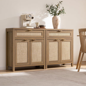
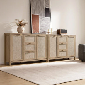
Board games behind closed doors. Remote controls in a drawer. Cables out of sight. Seasonal cushion covers that don't have to live on the sofa. The top of the sideboard becomes the considered surface — a lamp, a plant, two objects that were chosen — while the cabinet absorbs the daily reality of a room that gets used. The Savanna Sideboard with 3 Drawers and 2 Doors is built for exactly this: three drawers for smaller daily items, two cabinet doors for everything else. Most living rooms that look calm aren't actually tidy — they just have a sideboard that does the work quietly.
31. Glass-Door Storage: Visible but Not Scattered

Open shelving puts everything on display — including the things you'd rather not. Solid doors hide everything. A glass-door piece sits between: things visible and organized rather than scattered. Books, ceramics, a few objects worth looking at. Behind a glass panel they read as a collection. On an open shelf they sometimes read as stuff that hasn't been sorted yet. The Helio Glass Sideboard with Doors handles display and containment at the same time — the glass keeps the piece from feeling heavy or closed off, and the structure keeps whatever's inside from looking like it's waiting to be dealt with.
32. If the Bookcase Doesn't Reach the Ceiling, It's Leaving Space on the Table

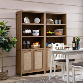
A bookcase that stops at five feet leaves a dead wall above it that collects visual noise the same way an undersized rug leaves bare floor around it. Ceiling-height bookcases use the full wall, make the room feel taller, and provide real storage that shorter units can't match. The Savanna Arched Bookcase combines open upper shelving for books and display with closed lower storage for things you want contained rather than shown — a more practical configuration than all-open, which forces everything to look good, or all-closed, which gives back nothing visually.
33. Ditch the TV Stand. Use a Low Buffet Instead.

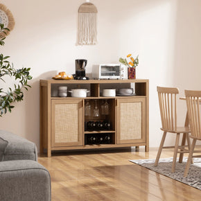
A purpose-built TV stand organizes the room around technology. A low buffet or sideboard does the same structural job while reading as furniture — the TV happens to sit on top of it rather than being the obvious reason the piece exists. The room feels less arranged around a screen. The Stria Buffet Cabinet with Large Drawer Storage is a good fit: clean drawer fronts, slim profile, reads as a genuine furniture rather than media infrastructure. That shift — from tech storage to furniture — changes how the room feels to walk in, even when the TV is off.
34. Closed Storage Is a Daily Habit, Not a One-Time Purchase

Every cable has a drawer. Every remote has a tray. Every spare throw has a basket. The rooms that stay calm aren't rooms with less stuff — they're rooms where things get returned to their homes at the end of the day. Five minutes. That's the maintenance window. Two-hour weekend tidying sessions are a symptom of a room where things don't have permanent homes, not a cleaning strategy. Give things homes they'll actually be returned to, and the room mostly takes care of itself.
35. Browse the Full Range Before Committing to Individual Pieces

Buying storage pieces one at a time from different ranges produces a room that looks assembled over many years from many different design conversations. Seeing a full collection first — where the sideboard, bookcase, and console table clearly share a design language — makes it possible to choose pieces that will read as intentional together. The full Sicotas living room furniture range covers sideboards, bookcases, and storage in coordinated styles. And the Zura collection specifically — bookcase and storage pieces in different heights and configurations, all in the same design conversation — is worth browsing before committing to anything individually.
Plants, Nature, and Personal Style Ideas
36. One Big Plant. Not Four Small Ones.

A single large plant fills a corner of furniture that a row of small pots on a windowsill can't reach, adds organic shape, and makes the room feel genuinely alive in a way that a row of small pots on a windowsill doesn't. Fiddle-leaf fig, monstera, olive tree, snake plant — pick one, find the right corner with some light, put it in a pot worth looking at. Four small plants scattered around looks like a plant collection. One large plant in the right spot looks like the room was designed around it. The difference in how the room reads is not subtle.
37. Natural Materials Age. Synthetics Just Wear.

Rattan, jute, seagrass, linen, raw wood, and terracotta. These develop character over time — a jute rug gets richer, a rattan piece mellows, and terracotta improves with a chip or two. Synthetics at the same price just get worn and look it. Natural materials also have an easy compatibility with each other that manufactured versions of those same textures don't quite manage. Put enough different natural materials in a room, and they feel like they belong there. That's not design theory — it's just what keeps rooms looking good for longer than a trend cycle.
38. The Room Should Belong to the People in It

Books read, not displayed. An object picked up somewhere that means something. A piece of art bought because it stopped you, not because it matched the sofa. A photograph taken by someone who lives there rather than downloaded from a stock library. The rooms that feel worth spending time in have things in them that a stylist who'd never met the residents couldn't have sourced. A perfectly coordinated, impersonal room impresses for about two minutes. A room that tells you something about its occupants stays interesting — to the people who live in it, which is the only audience that matters.
Small Living Room Ideas
Small living rooms get decorated defensively more often than not — pale everything, small furniture, nothing too bold, nothing too committed. The result is almost always a room that's successfully neutral and unsuccessfully comfortable. House Beautiful's small living room guide makes the same point repeatedly: the compact rooms that actually work are the ones where someone made real decisions, not cautious ones.
39. Commit to the Size Instead of Fighting It

A compact living room decorated with conviction looks like a jewel box. Deep color on one wall, the right scale of furniture, one piece worth looking at — the tightness of the space makes every decision more visible, which means good decisions land harder than they would in a larger room. The same space decorated defensively — pale paint, tiny furniture, nothing that commits to anything — just looks like a bigger room that didn't work out. The size isn't the problem. The approach to the size is.
40. A Large Mirror Opposite a Window. Not a Decorating Myth.

It genuinely works. A large mirror positioned to face a natural light source reflects that light into the room — the effect is more space and a second window. The emphasis is on large: one substantial mirror does this, three small ones scattered around the room don't produce the same result. In a small room with one window and limited natural light, a well-placed large mirror is the highest-return single object you can add. Cheaper than a skylight. More effective than three table lamps.
41. Give the Floor Back to the Room

Every object sitting directly on the floor of a small living room compresses it — boxes, baskets, bags, anything that claims floor area rather than wall area or shelf area. Furniture with visible legs helps because the floor reads as continuous beneath them. Moving storage onto walls, into tall bookcases, into drawers — that's not organization for its own sake. That's giving the floor back. And floor space in a small living room is the space. A clear floor makes a room feel larger, even when the dimensions haven't changed. A cluttered floor makes a generous room feel cramped. This one's free. It just requires deciding where things live when they're not in use.
FAQs
How do I make my living room look nice?
Layout before anything else. Not decor — layout. Sofa off the wall. Rug at the right size. Seating facing each other rather than facing the TV. Get those three right, and even average furniture starts to look considered. Then lamps: two at minimum, warm bulbs, in addition to the overhead. Then, floor-length curtains hung at ceiling height. Wall art—accessories at the end. Most people start with accessories and circle back to layout, wondering why nothing ever gets resolved. Doing it in order means the room builds its own logic.
What is the 3-5-7 rule in decorating?
Odd numbers look balanced, where even numbers look like rows. Three objects on a coffee table form a composition. Four look like they're waiting for a fifth. Five on a mantel becomes a proper display. Seven is about the limit before it reads as a collection in need of editing. Use it anywhere you're grouping objects: shelves, coffee tables, side tables, mantels. Not a law — but it works consistently enough that it earned a name. Rooms that use it consciously look more deliberate than rooms that don't, and it costs nothing to apply.
How do you make a room look classy?
Controlled palette: two main tones and one accent that earns its place. Surfaces that are mostly clear rather than covered. One strong piece per room rather than many moderate ones. Storage that closes — things put away rather than displayed by default because there was nowhere else for them. Symmetry where it matters: flanking lamps, balanced objects on either side of a focal point. Classy rooms almost always have fewer visible objects than you'd expect. The restraint is the statement, not the individual pieces.
What 5 things make a living room look dated?
A matching three-piece furniture suite was bought all at once from the same page. A rug sized for a smaller room than the one it's in. Nothing but overhead lighting — no lamps, no layers. A color scheme with no warm tones. And over-arranged surfaces: every shelf, every coffee table styled in perfect symmetry, nothing suggesting that a real person sat down and left something there. Dated rooms are decorated for photographs. Real rooms are decorated for the people sitting in them.
How do you make a living room look expensive?
Curtains at ceiling height, touching the floor. Rug in a natural material at the right size — not one size down from right. Warm layered lighting from multiple sources. One large piece of art in place of several small ones. A real color committed somewhere — not two cautious cushions, but a chair or a curtain or a rug where it actually holds weight. Closed storage keeps functional clutter out of sight. And one decent plant in a pot worth looking at. That last one contributes more to how expensive a room reads than most people expect.
How do you decorate a living room for beginners?
Work in this order, and you'll be fine: sofa position first, pulled off the wall. Rug under the seating group, correctly sized. One floor lamp plus one table lamp with warm bulbs. Curtains that touch the floor, rod at the ceiling. The coffee table is proportional to the sofa. Wall art. Accessories and plants last. Almost every beginner does this backward — starting with small objects and working toward the sofa placement. Backward means the room never quite resolves because the foundation wasn't set before the surface was decorated. Do it in order.
What is the 2-3 rule for living rooms?
Two main colors, three distinct textures. Two colors keep the palette legible — three competing tones at the same visual weight create noise. Three materials — something smooth like wood or metal, something soft like linen or velvet, something organic like rattan or jute — give the room depth and interest without overcomplicating any single decision. The logic: constrain one dimension so another can breathe. Controlling the color and texture variety makes it readable rather than chaotic. It's a simple framework that works better than it sounds.
What actually makes a living room feel cozy?
Warm light from multiple sources — not just one overhead, and not cool bulbs. Texture differences in the soft furnishings, so the sofa has some variety rather than all one material. A rug large enough to actually ground the seating group. Curtains over the windows in the evening, because bare glass after dark just reflects the room's own darkness into it. And something personal: a book mid-read, a plant that needed water last week, an object that means something to the person who put it there. Cozy isn't a style you can purchase. It's evidence of a room being lived in by specific people. The styling helps. The living is what does it.
Sources
- Southern Living,Living Room Decorating Ideas That Bring Warmth and Style
- House Beautiful,62 Small Living Room Decorating Ideas Designers Swear By
- House & Garden,107 Stylish Living Room Ideas to Copy Now
- Farrow & Ball,Living Room Color Inspiration and Ideas
- Apartment Therapy,Small Living Room Ideas That Work in Any Space
- Real Simple,Living Room Organization and Decor Tips


Looking for something else?
Positive and Negative Space Examples: How to Style a Balanced Home
LEARN MORE
Asymmetrical Balance in Interior Design: Style a Room That Feels Balanced, Not Matched
LEARN MORE
Line in Interior Design: How Lines Shape Space, Mood, and Balance
LEARN MORE
Bed Sizes Guide: Dimensions From Twin to King
LEARN MORELooking for something else?
What Is a Platform Bed? A Simple Guide to Types, Benefits, and Buying
LEARN MORE
Upholstered vs Wood Bed: Which Bed Frame Is Right for You?
LEARN MORE
Best Bedroom Colors for Couples: 20 Romantic Color Ideas for a Calm Bedroom
LEARN MORE


Further reading
Best TV Stand Height: How to Choose the Right Size for Comfortable Viewing
Mid Century Modern Exterior Guide: 12 Design Ideas for American Homes