


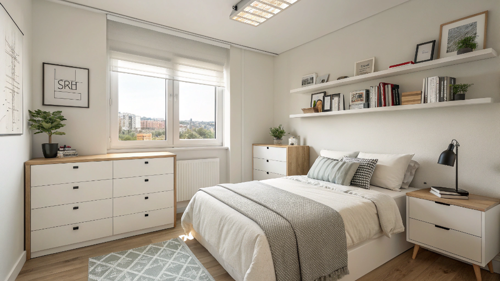
What Color Goes With Brown Bedroom: 16 Ideas That Actually Work.docx

Brown bedrooms get dismissed way too quickly.People hear 'brown bedroom' and picture something from their grandparents' house — heavy curtains, dark everything, a general sense of the 1970s. But that's not what we're talking about. Modern brown bedrooms — walnut furniture, warm wood tones, well-chosen pieces — are having a real moment right now, and for good reason. The issue isn't the brown. Nine times out of ten, it's the colors around it.
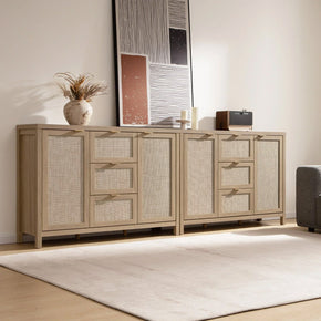
Pick the wrong companion and even gorgeous furniture looks flat. Pick the right one,e and the whole room shifts. Here are 16 combinations that actually work, with some notes on why. If you need furniture to go with any of these, Sicotas Furniture carries bedroom pieces in natural wood tones that slot into every combination on this list — worth browsing before you finalize anything.
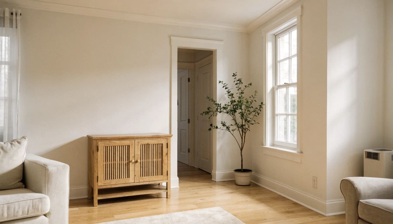
1. Ivory — Just Start Here

Paralyzed in the paint aisle? Pick ivory. Seriously. Brown-and-ivory is the combination with almost no failure mode.
The reason it works better than plain white is the undertone. Cool white can read as clinical next to warm wood — that slight blue in many white paints clashes with the yellow in walnut or caramel tones. Ivory doesn't do that. It's warm, slightly yellow, and it echoes the brown instead of contradicting it. Dark dresser against ivory walls doesn't look like furniture placed in front of a blank wall. It looks like a decision.
Works in small rooms, large rooms, dark wood, and light wood. Ivory just adjusts. It's probably the most underrated bedroom color going.
Design Tip: Walls are only part of it. Ivory bedding plus ivory or cream curtains plus a light rug — that three-part combination is what people are actually responding to when they call a bedroom 'effortless.' The wall color alone won't get you there.
2. Cream — One Step Warmer, Just as Easy

Cream is ivory with the yellow turned up a notch. More golden, less cool. And that extra warmth makes it particularly good alongside caramel-, walnut-, and honey-toned furniture — they're from the same family, so the room feels cohesive rather than coordinated.
You know those Airbnb bedrooms that look like they belong in a slow travel magazine? Or hotel rooms you genuinely didn't want to leave? Cream and brown are doing a lot of that heavy lifting. The palette looks lived-in rather than designed. Which — counterintuitively — is much harder to achieve than it looks.
Also worth knowing: cream handles accent colors really well. Navy cushion, sage throw, terracotta candle on the dresser — the cream base absorbs them without breaking. That's a genuinely useful quality.
Design Tip: Go heavy on texture when the color palette is this quiet. Linen duvet, woven rug, chunky knit throw. Same warm tones, totally different surfaces. That contrast in texture does what color contrast would do in a bolder room.
3. Sage Green — Look at Any Tree

Bark is brown. Leaves are green. That combination has been working outdoors for a few hundred million years. Sage green and brown together in a bedroom is really just bringing that indoors — and it works for the same reason.
Sage specifically, though — not forest green, not lime, not that particular 1990s hunter green that still haunts certain bathrooms. Sage is muted and dusty, almost more grey-green than actual green. It doesn't demand attention. It creates a kind of quietness in a bedroom that's genuinely hard to replicate with other colors.

Taller, more substantial pieces of furniture look particularly at home in a sage green room. The Savanna 7-Drawer Tall Dresser against a sage wall has that quality of furniture that belongs somewhere — like it's been in that room for years, not like someone put it there last Tuesday.
Design Tip: One sage wall behind the headboard is usually more effective than four. Keep the other three in cream or off-white. The contrast from one wall does the work — you don't need to go all in.
4. Olive Green — Sage's Less Polite Sibling

If sage green is the polite, easy-going option, olive is the one with more going on. Darker, richer, less background, and more foreground. Some rooms need that.
Olive and dark walnut or espresso furniture do something interesting together — they make each other look better. The brown gets warmer, the olive gets more interesting. The bedroom ends up feeling as if it were designed by someone with a point of view rather than by someone who just matched things carefully. Think: the kind of room that makes guests ask what color that wall is.
Try it in curtains before committing to walls. Olive curtains against cream walls and brown furniture deliver maybe 80% of the effect with zero permanent decisions.
Design Tip: One olive curtain panel. That's a $30 test of whether you love the combination in your actual room before you touch a paintbrush.
5. Navy Blue — There's Color Theory Behind This, and It's Worth Knowing

Brown is essentially dark, muted orange. The complementary color of orange — its direct opposite on the color wheel — is blue. So brown and navy isn't just a combination people happen to like. It's what complementary colors do: they make each other look more vivid.
In a bedroom, this translates into a quality where the room feels deliberate, as if it were thought about. Navy walls with walnut furniture don't look like two dark things in the same room. They look like a decision. The furniture becomes the focal point because the wall behind it is doing exactly the right thing.
Watch the balance, though. Navy plus very dark brown furniture with nothing lighter anywhere gets cave-like. Cream bedding is non-negotiable. A pale rug helps. The eye needs somewhere to land.
Design Tip: Navy accent wall behind the headboard. Walnut nightstands. Cream bedding. Brass lamp. Write that down and come back to it — it works every time and photographs extremely well, which matters more than people admit.
6. Dusty Blue — Same Family as Navy, Half the Commitment

Not every bedroom needs to make a statement. Some rooms just need to be easy to be in. That's dusty blue's whole job.
It's a washed-out, almost faded blue — like a blue that's been left in the sun a bit, which sounds like a criticism but isn't. That bleached quality makes it one of the most livable wall colors. You stop consciously noticing it after a week, but the room still feels calmer than before. For a bedroom, that's actually the ideal outcome.

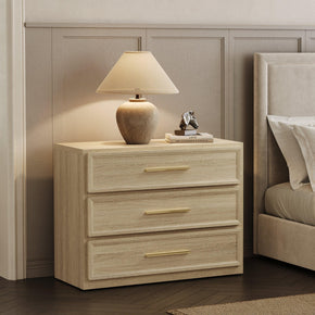
Lighter tan and natural wood furniture do particularly well here. A Crescent Nightstand in natural wood tones against dusty blue is the kind of combination that makes the room look styled without you being able to explain why. The colors are doing quite ajob.
Design Tip: Dusty blue walls, cream bedding, beige rug. Three decisions. Seriously, that's it — resist adding more.
7. Muted Teal — When Cream Feels Too Safe

There's a whole category of people who look at their brown bedroom, know it needs something, but can't quite commit to a bold wall color. Muted teal is for that situation.
Bright teal or aqua would stand out against brown furniture. But muted teal — the dusty, grey-tinged kind — adds personality without aggression. It's sophisticated in a way that bright teal simply isn't. Next to dark espresso furniture, it creates a cool note that makes the whole room feel considered rather than just warm.
And you genuinely don't need to paint anything to try it. Two teal cushions on a brown bed will shift the feeling of the room more than you'd expect. Start there.
Design Tip: Two throw pillows. That's a proper test of whether teal works with your specific furniture before you spend money on curtains or paint.
8. Terracotta — The Combination That Feels Like Somewhere You've Been

You know the rooms on travel accounts — warm, sun-drenched, walls the color of clay, wooden furniture, the whole thing looking like a farmhouse in Provence or a riad in Morocco? A lot of that is terracotta and brown doing the work.
Both colors are essentially earth. Brown is soil, terracotta is fired clay — they're from the same place, which is why they never compete. Put terracotta next to mahogany or reddish-brown wood and something interesting happens: the red undertones in the wood, which usually get lost against neutral backgrounds, suddenly show up. The furniture looks deeper, richer, and more interesting than it did before.
This palette also ages gracefully, which isn't something you can say about every trend color. Terracotta and brown together look just as intentional in ten years as they do now—maybe more.
Design Tip: Terracotta pot on the dresser, a burnt-orange cushion, maybe a warm-toned throw. You don't need to repaint anything to test whether this feels right. See if the room shifts before committing to walls.
9. Gold Accents — Small Change, Outsized Effect

Gold isn't a wall color. But it belongs on this list because what it does to a brown bedroom is disproportionate to the effort.
Dark wood furniture absorbs light — that's just physics. A bedroom that's absorbing too much light feels heavier than it is. Gold reflects off its brass lamp, gold-framed mirror, and various drawer pulls — small metallic touches that bounce light around the room and make the furniture look richer rather than darker. It's one of those changes where you do it, step back, and immediately think: why didn't I do this six months ago?

Especially good with espresso and dark chocolate tones. A Savanna Nightstand in a deep wood finish, next to a brass lamp, looks genuinely considered — not overdone, not trying too hard. It was noticeably better than it was next to a chrome one.
Design Tip: Change the drawer pulls to brass first. Costs almost nothing. Makes a bigger visual difference than it has any right to.
10. Beige — Stay With Me on This One

I know. Beige. But hear me out: a tonal beige-and-brown bedroom done well is one of the most quietly elegant combinations on this list. The people who dismiss it are imagining it done badly.
Done badly: flat, smooth, identical texture everywhere. Same tone in everything, nothing to look at. Done well: a linen duvet, a bouclé throw, a woven rug, actual wood grain, maybe a rattan element. Same warm family throughout, but every surface is different. The eye moves around the room, exploring texture rather than color contrast. It works — genuinely.
The gradient approach is part of why good tonal rooms feel grounded. Darkest at the floor, medium at furniture and bed height, lightest at the walls. It's subtle, but it's why some 'beige rooms' feel anchored, and others feel like they're floating.
Design Tip: Three textures minimum: smooth wood, soft linen or cotton, and something woven or chunky on the floor. Keep the color range narrow and let the surfaces do the work.
11. Soft Blush — More Useful Than It Has Any Right to Be

This one raises eyebrows. Pink and brown? But dusty rose and soft blush aren't the pink you're picturing. They're muted, warm, slightly clay-toned — more warm-neutral than actually pink. And those undertones sit alongside brown furniture without any argument.
What blush adds to the hat cream can't be a kind of emotional warmth. A bedroom with blush bedding and dark brown furniture feels soft in a way that's genuinely hard to replicate. Less formal, more personal. If your brown bedroom currently feels a bit austere — like you bought the furniture and then ran out of ideas — blush is worth trying before you rearrange anything.
Design Tip: Blush pillowcases only, to start. It's a $15 test of whether the combination works in your specific room. Give it two weeks before you decide.
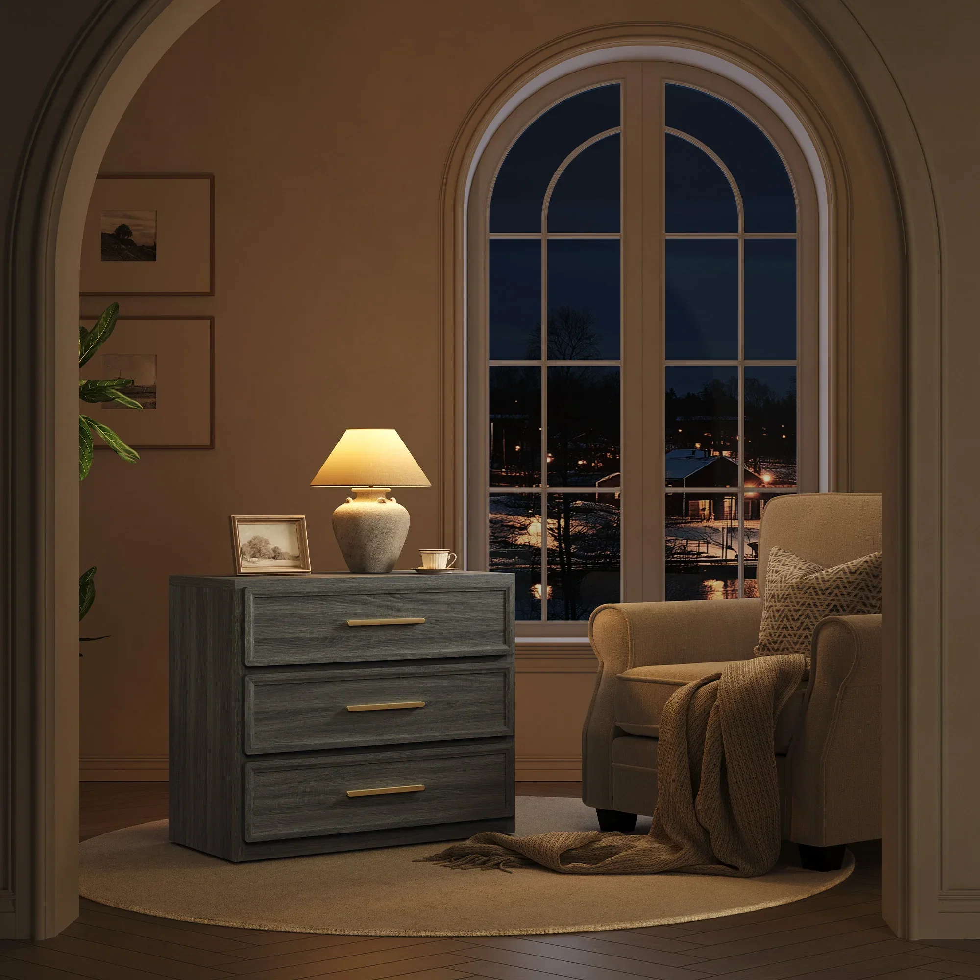
12. Charcoal Grey — Only if You Pick the Right Grey

People get this wrong constantly. Cool grey — the kind with a blue or purple undertone — argues with warm brown furniture. The undertones clash, and the room feels vaguely off, without anyone able to say why. That's not a brown problem or a grey problem. It's an undertone mismatch.
Charcoal specifically — deep, warm-neutral grey — is different. It has enough depth to sit alongside brown without washing out, and enough warmth to stop things feeling cold. And it does something kind of interesting to the brown: the contrast makes the warm wood tones look warmer by comparison. The furniture reads as richer than it did before.
Good for contemporary or industrial-leaning bedrooms. It modernizes brown without stripping away the warmth, which is honestly a pretty specific and useful thing to do.
Design Tip: Test in a large rug before putting it on the walls. You'll get a genuine read on how it sits with your furniture without any permanent decisions. Keep bedding light regardless — cream or off-white, no exceptions.
13. Off-White + Brown + Black Accents — Three Colors, Done

This is the combination that's all over design accounts right now, and it earns it. Off-white for brightness. Brown for warmth. Black for definition. Without the black, the first two blur together — cozy but shapeless. The blackness of the room's edges.
Doesn't take much black. Metal legs on the bed or dresser—a black-framed mirror. Matte black drawer pulls. These small hits of contrast act like punctuation — they tell the eye where one thing ends, and another begins. Remove them and the room loses its sharpness. Add them, and everything looks more deliberate.
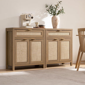
Clean-lined furniture is what this palette needs — not ornate, not heavily detailed. The modern bedroom dressers at Sicotas have the kind of straightforward proportions that work in exactly this kind of scheme without competing with it.
Design Tip: Black-framed mirror above the dresser. That's the fastest single move for this look. It adds definition, bounces light, and costs less than most people expect.
14. Burgundy — Not for Everyone. Completely for Some People.

Okay, so some bedrooms are meant to feel restful. And some bedrooms are meant to feel like somewhere. Burgundy with dark brown furniture is firmly in the second category — it's the palette of libraries, well-funded boutique hotels, rooms belonging to people who own things they actually like.
Deep wine-red and chocolate brown share a warm undertone — both lean red underneath — so they don't fight. They layer. Each makes the other look richer. The bedroom ends up with a depth and heaviness that's somehow not oppressive. That's a hard thing to pull off, and this combination does it.
Fair warning: half-measures backfire here. One burgundy cushion against a brown bed just looks accidental. To get the effect,t you need to go further — curtains, a deep velvet throw, maybe a plum rug. The palette rewards commitment. Hedging it produces something that looks like neither thing.
Design Tip: Burgundy velvet throw over the foot of the bed. Costs almost nothing, tells you immediately whether the combination works with your furniture. If it does, go further.
15. Emerald Green — People Stop at the Doorway for This One

Not 'nice.' Not 'pleasant.' Emerald green with dark brown furniture is the combination that makes people stop at the bedroom doorway and actually look.
Espresso wood and emerald velvet bedding is one of those combinations that reads as expensive across every price point. Both colors have real depth and saturation — they amplify each other rather than canceling out. The brown looks darker, the green looks richer, and the whole room has an immersive, almost botanical quality. It's the kind of bedroom that gets saved to Pinterest boards. Which shouldn't be a goal in itself, but it says something about the visual impact.

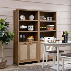
Strong wood grain earns its place here. Something like the Savanna 6-Drawer Dresser surrounded by emerald accents — the grain detail in the wood stands out against dark, saturated green in a way it simply doesn't against cream or ivory.
Design Tip: Emerald velvet bedding is the entry point. Reversible, high impact, tells you everything. Ivory walls, brass lighting around it — that's the full setup.
16. Soft Lavender — Weird on Paper. Wonderful in Practice.

This gets the most skeptical reactions. And then, consistently, the most enthusiastic converts.
Cool purple next to warm brown furniture shouldn't make sense on paper. The logic isn't immediately there. But try it in an actual room and something unexpected happens: instead of clashing, they pull each other into focus. Dusty lavender — the grey-purple kind, not bright violet — brings a dreamy, almost introspective quality to a bedroom that nothing else on this list quite replicates.
Against walnut or espresso furniture, it looks genuinely distinctive. Not trendy. Not trying to be interesting. Just actually interesting. If you've stared at your brown bedroom for months thinking 'it's fine,e but it doesn't say anything' — this is the move.
Design Tip: Dusty lavender bedding only, to start. Keep everything else in cream and warm wood. One element is all this needs — adding more just dilutes it.
Why Brown Actually Works in a Bedroom
Short answer: It's the color of the ground. Color psychology links brown to stability, safety, and protection — the same associations we have with soil and trees. That's not abstract. It's why brown-heavy rooms feel physically grounding in a way that grey or cool white rooms often don't. A bedroom is supposed to feel like somewhere you can rest. Brown helps with that.
The companion color is doing its own job, though. Brown without contrast can tip from 'grounded' to 'heavy' pretty fast. Cream opens it up. The Navy makes it intentional. Sage makes it feel alive. The companion shifts the character of the brown without fighting it — that's what a good pairing does.
One thing worth knowing: the specific shade matters more than most guides acknowledge. Light tan is flexible and pairs with almost anything. Dark espresso needs real contrast, or it dominates the room. Reddish-brown woods want warm companions. Taupe with grey undertones actually works better with cooler neutrals. Get the shade right first, and the rest will follow.
Also: Texture Matters as Much as Color
Color gets a bedroom to 'nice.' Texture gets it to 'wow.' You can make perfect color choices and still have a room that looks unfinished if every surface is flat and smooth. A linen duvet, a woven rug, a chunky throw in the same tonal family as everything else — that's what makes a room look like someone actually thought about it.
Brown furniture benefits more from texture than most. Natural wood grain is itself a texture — it catches light differently at different angles, has depth that painted furniture doesn't. It's a big part of why well-made wooden pieces tend to look more expensive than their price tag. The surface is doing visual work.
Three textures are the working minimum. The wood itself. Something soft and woven on the floor. Something you'd want to touch on the bed — linen, bouclé, heavy knit. Same color family throughout if you want. The texture variation creates the interest that color contrast would create in a bolder room.
Design Tip: Start with the rug if you're unsure. A natural-fiber rug in a warm tone anchors the whole room and makes everything above it look more considered. That one change does a lot.
Quick Color Reference by Brown Shade
Know your shade. Then use this.
|
Brown Shade |
Best Wall Colors |
Best Accent Colors |
Best For |
|
Light brown / Tan |
Soft white, dusty blue |
Sage green, blush |
Casual, relaxed bedroom |
|
Caramel / Honey |
Cream, ivory |
Olive green, dusty rose |
Warm, organic bedroom |
|
Walnut |
Ivory, off-white |
Navy, olive, black |
Modern, sophisticated |
|
Chocolate brown |
Cream, warm white |
Teal, burgundy, navy |
Rich, cozy bedroom |
|
Espresso |
Warm white, beige |
Gold, emerald, lavender |
Luxury, formal bedroom |
|
Reddish brown |
Cream, ivory |
Terracotta, dusty blue |
Earthy, Mediterranean |
|
Taupe / Greige |
Soft grey, off-white |
Dusty rose, black |
Contemporary minimal |
FAQs
What colors go with brown in a bedroom?
Honestly, more than most people realize. The reliable ones are cream, ivory, sage green, dusty blue, navy, muted teal, and terracotta — but most colors can work with brown as long as the undertones align. Warm brown furniture needs warm companions. If your wood has grey or cool undertones, cooler neutrals will sit better than cream. That distinction matters more than the specific color choice.
What wall color works best with brown bedroom furniture?
Warm white, cream, or ivory handles 90% of cases without any drama. They're warm enough to complement the furniture and light enough to stop the room feeling heavy. Dusty blue and sage green are the best options when you want actual color. What to avoid: cool blue-grey walls with warm brown wood. The undertones genuinely contradict each other, and the room ends up feeling off in a way that's hard to diagnose.
My brown bedroom feels too dark. How do I fix it?
Walls first — cream or ivory will do more than anything else. Light bedding. Pale rug to bounce light upward. Large mirror positioned to catch window light. And check the curtains — heavy, dark curtains in an already dark room compound the problem significantly. Swap them for something lighter if you can. Those changes, in that order, will open a dark brown bedroom up more than any other intervention.
What makes brown furniture look more expensive?
Brass and gold accents more than anything — drawer pulls, lamp bases, mirror frames. Metallics reflect light in a way that makes the surrounding wood look richer. After that, quality textures: velvet, linen, visible wood grain, all read as expensive in a way that smooth painted surfaces don't. And real contrast — cream or ivory against dark brown — lets the furniture be the focal point rather than disappearing into a matching background.
Does grey work with brown in a bedroom?
Yes, but the grey matters a lot. Charcoal — warm-neutral and deep — works well with most brown wood tones. Cool grey with a blue undertone is harder because the undertones argue. If you're unsure which you've got, add cream to the mix. It bridges the gap between grey and brown and stops the room from reading as cold.
What curtains work in a brown bedroom?
Cream, off-white, and ivory are the most versatile — they add lightness without clashing with anything. Sage green and dusty blue work well if you want color. Deep navy or muted teal with dark furniture looks genuinely beautiful when the rest of the room is kept lighter. Avoid very dark curtains unless the room has strong natural light. They'll make an already-warm space feel smaller.
What accent color works best with chocolate brown?
Teal, dusty blue, ivory, brass, and burgundy are the strongest options. Teal adds cool contrast without competing. Ivory creates that classic, timeless quality. Brass lifts the dark wood and adds light. Burgundy creates drama and depth. Which one you go with depends on the mood — calm, classic, luxurious, or dramatic. Pick based on feeling, not just on what looks good in a photo.
Can I mix multiple colors with brown in a bedroom?
Yes — and three colors often read better than two. The reliable structure: one neutral as the dominant (cream or warm white), the brown furniture as the secondary, and one accent color for maybe 10% of the room. That 60-30-10 split is a useful frame. It stops the room from feeling random without making it look like a monochrome exercise.
So, what color do you go with?
Start with the shade of brown you actually have. Not the color you want to add — the furniture you already own. Is it light tan or dark espresso? Does it lean warm and reddish, or cooler and more taupe? Undertone determines the palette more than personal preference does. Get that right first, and the choice becomes obvious.
Then pick based on mood, not just appearance. Cream and ivory if you want easy and settled. Navy or emerald if you want deliberate and immersive. Sage or terracotta for a natural, lived-in look. Lavender, when you want the room actually to say something specific. The chart above does the matching — use it.
And if you're also looking at furniture while you're here, the natural wood tones across modern bedroom dressers at Sicotas work with every combination on this list. Worth a look before you decide on anything.
Sources
- House Beautiful: 13 Beautiful Colors That Go With Brown, According to Designers — Designer-approved color pairings with brown covering wood tones, wall colors, and textile combinations across bedrooms and living rooms.
- Jaipur Rugs: 10 Best Colors That Complement Brown: 2026 Home Decor Trends — 2026 interior trend guide covering ten brown pairings from sage green to gold, with expert design tips and room examples.
- Palette Hunt: Colors That Go With Brown — Complete Brown Color Combination Guide — A color theory guide covering brown on the color wheel, complementary pairings for dark and light brown shades, and home decor palette examples.
- Living Spaces: 11 Colors That Go With Brown — Furniture retailer guide to 11 color pairings for brown furniture, including wall color, rug, and bedding recommendations.
- Elle Decor: What Colors Match With Brown? — Editorial color guide covering brown combinations across the bedroom, living room, and kitchen.
- Reddit — r/DesignMyRoom: What Colors Work With Browns? (Community Discussion) — 40+ homeowner responses on pairing colors with brown furniture — community consensus confirms sage green, terracotta, and teal.
- Coolors: Popular Brown Color Palettes — Designer palette library confirming cream, navy, olive, and teal as the most-used companion colors across thousands of brown-based schemes.
- Stella's Wardrobe: What Colors Go With Brown Clothes: Ideas That Work — Cross-reference for warm brown pairings with cream, sage, navy, and terracotta — useful for how brown's complementary palette translates between fashion and interiors.


Looking for something else?
Small Bedroom Organization: Smart Ideas for a Clutter-Free Room
LEARN MORE
Shoe Storage Ideas for a Cleaner, More Organized Home
LEARN MORE
Shoe Cabinet vs Shoe Rack: Which Shoe Storage Option Is Better?
LEARN MORE
10 Entryway Organization Ideas That Actually Work
LEARN MORELooking for something else?

Rattan Shoe Cabinet: A Practical Guide to Style, Storage, and the Right Fit
LEARN MORE
Arched Bookcase Ideas 2026: How to Build, Buy, and Style 15 Stunning Picks
LEARN MORE
TV Stand Height Guide: Find the Perfect Height for Your TV
LEARN MORE


Further reading
Mold on Furniture: Causes, Cleaning and Removal, Health Risks, and Prevention
Best Time to Buy Furniture: 2026 Month-by-Month Sale Guide