


33 Earth Tone Color Palettes to Cozy Up Your Home

Nobody ever repaints a room in terracotta and regrets it. Nobody looks back at the walnut dresser and wishes they'd gone white. Earth tones stick around because they're right, not because they're fashionable — though right now they happen to be both. These 33 palettes are the ones worth stealing.
What Are Earth Tone Colors?
Here's the short version: earth tones are colors that look like they came from somewhere. Soil. Riverstone. Old bark. greige). Best palettes borrow from all three.
The thing people miss is that texture makes or breaks these colors. Flat sage-green walls against a flat sage-green sofa, and you've got a room that looks like someone gave up halfway through. But bring in rough linen, a worn leather chair, unfinished wood, a jute rug — suddenly the same colors look like they grew there. Wikipedia and interior designers back this up with centuries of history: earth pigments were always paired with real physical materials, never used alone.
- Warm earth tones: terracotta, rust, camel, clay, ochre, and mustard
- Cool earth tones: sage, olive, slate blue, stone gray, and muted navy
- Neutral earth tones: cream, ivory, beige, taupe, greige, and warm white
33 Earth Tone Color Palettes for Every Room
1. Camel, Brown & Ivory

You can't really go wrong with camel and ivory. It's the palette equivalent of a white shirt — works every time, looks better than it has any right to. Anchor it with a genuinely deep brown through a leather chair or walnut table and stop there. Don't add to it. The restraint is the point.
2. Sage, Clay & Cream

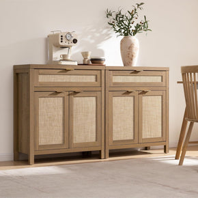
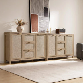
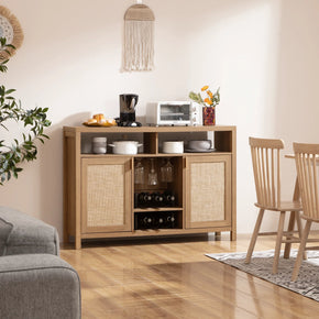
Cool sage against warm clay is one of those color pairings that makes sense the second you see it together, even though it shouldn't. One reads as mossy and cold, the other as baked and warm. Cream separates them, and the room just settles. Best in a dining room where the warmth does something useful — a proper wood sideboard earns its place here. The Savanna Sideboard with Drawers and Doors disappears into this palette like it were always there.
3. Terracotta, Walnut & Warm White

Terracotta gets people to sit down. That reddish-orange baked tone does something physical to a room — makes it feel inhabited even when it's empty. Walnut is the obvious wood to run with it: dark, grainy, warm in a way that paint never gets to. Keep the walls in a soft, warm white so the room breathes. That's genuinely all this one needs.
4. Olive & Fawn

Two colors are thinking their own business. Olive doesn't demand attention, and fawn doesn't either — they're both mid-tones that just support each other quietly, which is a quality that's harder to find in a palette than you'd think. Ivory or cream underneath, olive in curtains or one chair, fawn in leather or a natural rug. It looks better after a year in the room than it does on day one.
5. Navy, Cognac & Beige

The version of navy that works here looks like deep water or a cloudy November sky — not a logo, not a corporate wall. That navy next to cognac leather and soft beige is warm and layered in a way that takes a minute to understand but is impossible to un-see once you do. Add ivory and a touch of gray. For wood furniture in tones that won't argue with this palette, the Sicotas furniture range has pieces that work.
6. Charcoal, Chocolate & Taupe

Dark rooms get a bad reputation they don't entirely deserve. Charcoal and chocolate done right — with taupe to stop the slide into actual darkness, and pale linen and warm lighting as counterweights — create depth that brighter rooms just don't have. Get the balance wrong, and yes, it's just a dark room. Get it right,t and it's the one people always want to stay in.
7. Ochre, Cream & Moss Green

Ochre's been around since cave paintings. Literally, those painters used it forty thousand years ago because it was on the ground, it was warm, and it worked. Alongside cream and moss green, it still works, for the same reasons: the warmth it carries and the way it sits without demanding anything. One armchair. A ceramic bowl. Two cushions. That's the right dose.
8. Rust & Mustard Yellow

Both come from the same natural source — oxidized things, dried things, the colors at the bottom of a spice rack. That shared origin is why they don't fight each other. But a lot of white and ivory around them is non-negotiable; the room feels like the inside of a Moroccan market, and not in a good way. Accents only. Never the dominant.
9. Forest Brown, Black & Olive

This is the palette for people who aren't afraid of a room. Forest brown, near-black, muted olive — atmospheric and layered and genuinely dramatic without being theatrical. It needs pale anchors badly: ivory linen, a light wood surface somewhere, a pale rug underfoot. Without them, it's a cave. With them, it's usually the most interesting room in the house.
10. Dusty Blush & Warm Taupe

Dusty blush is the color of an old rose or a late-summer peony three days past its best. Not pink. Not terracotta. Somewhere in between and better for it. With warm taupe and creamy white,e it becomes something refined that doesn't announce itself. Velvet, marble, pale gold.
11. Soft Coral, French Blue & Warm Tan

Keep both colors at the dusty, almost-faded end of their range, and the beach house cliché just doesn't happen. What you get instead is something quieter — settled, a bit serious, and genuinely livable. Natural wood and cream hold the whole thing down. A room with decent natural light makes this palette shine. A dark room turns the coral mud,y and everything unravels from there.
12. Latte Brown & Spiced Red

Coffee, when brewed on its own, can get boring fast. Spiced red — actual brick, actual cinnamon, the inside-of-a-pomegranate kind of red — is what saves them. It makes the coffee tones feel rich rather than safe. Creamy off-white walls are essential so the red doesn't run the room. Brass hardware somewhere. That's the finishing move.
13. Deep Navy & Terracotta

They're complementary colors, which is the technical explanation. The real one: these two hold each other in check because cool and warm at the same intensity cancel out the bad tendencies in both. Ivory and natural wood do the rest of the balancing. A solid storage piece in a warm finish anchors the living room version — the Helio Decorative Sideboard Cabinet works in this palette without drawing any attention to itself, which is exactly right.
14. Evergreen, Winter White & Oxblood

Deep evergreen, winter white, oxblood burgundy. The green and burgundy are on opposite sides of the temperature scale, and that tension between them is what makes the palette feel deliberate rather than accidental. Warm wood and brass stop the green from going cold. Without them, it tips into lobby territory. With them, it looks like someone actually thought about the room before furnishing it.
15. Shades of Sage

Sage on sage on sage — pale walls, deeper eucalyptus in upholstery, khaki green woven into a throw or rug. The tonal variation creates movement without a single competing color entering the picture. That's the trick. Cognac leather or warm wood brings enough heat that the room doesn't go clinical. Sage has stayed relevant for fifteen solid years because it acts like a neutral while still being an actual color.
16. Cognac, Ivory & Terracotta

Cognac leather, ivory walls, and terracotta in a rug or a pot. Black accents on the lamp base and the side table legs. That's the full list, and it shouldn't need anything added. Mid-century modern without the fussiness. The moment you start accessorizing past what this palette asks for, you've already gone too far.
17. Navy, Charcoal & Pine Green

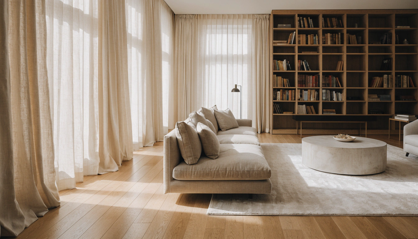
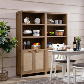
There's a specific quality to rooms that look like they were designed rather than assembled. This palette has it. Navy, deep charcoal, pine green — moody, intentional, and genuinely settled. Best in a home library or a study where dark and quiet are the point, not a problem. Warm wood floors, cream walls, and a proper tall bookcase stop the three dark tones from eating the room. The Willow 75-inch Tall Bookshelf fits this setup structurally — the height gives the palette a spine.
18. Brown, Pumpkin & Leaf Green

The dark brown needs to be really dark — close to walnut, not mid-brown — or pumpkin orange and leaf green stop being accents and start being arguments. Get the dominant tone genuinely deep, and the other two just slot in. It's a bolder palette than most people reach for,r but it photographs brilliantly and ages well, which is a combination that's rarer than it should be.
19. Emerald, British Tan & Wheat

Old bottle glass, no Christmas tree. That's the emerald this palette needs. Pair it with British tan leather and a wheat background, and the room leans towards autumn without being seasonal. But it only works if you commit — bold wallpaper, leather seating, brass everywhere. Go halfway, and it looks abandoned. Go all the way,y and it's a room worth showing people.
20. Golden Hour — Wheat, Honey & Green

The muted versions of lemon and marigold — not the bright ones, the ones that look like they've been left in afternoon light for a few hours — work surprisingly well alongside a warm-undertoned green. Ivory and tan anchor it so the yellows don't float. Only works in rooms with real natural light. In a dark, north-facing room, this palette turns flat and cold, and nothing saves it.
21. Shades of Greige

Greige sounds like a compromise, and it isn't. Layers of soft greige, stone gray, sandy tan — the depth is subtle,e and that subtlety is the whole point. It's the palette that feels expensive in person and impossible to photograph in a way that explains why. Texture is what makes it: rough linen, chunky knit, rough-cut wood, a ceramic lamp, brass on furniture edges. Without texture, re it's just beige. With it, people ask what you did to the room.
22. Soft Neutrals & Dusty Mauve

Dusty mauve is that specific color that lives where pink, purple, and gray meet when none of them is trying. Warm, subtle, and not at all sweet. Ivory, beige, warm taupe around it. Velvet, marble, pale gold in the details. The whole palette feels personal and considered, and that quality is genuinely hard to manufacture — either the room has it, or it doesn't.
23. Gray, Sage Green & Walnut

Stone, moss, bark. Light gray walls, sage green in the soft furnishings, walnut for the furniture. It reads consistently across different lighting conditions, from morning to evening, which is a practical quality that most palettes don't bother to earn. Real houseplants are nearly mandatory — the living version of the sage green against the painted version creates a layering that no styled prop can match.
24. Pop of Coral with Tan & Olive

Coral earns its place by staying muted and staying scarce. Tan and olive set the room's mood; coral just makes people stop and look without knowing why. One armchair. A rug with coral threads. A cluster of cushions.
25. Black, Ivory & Ochre

Monochrome rooms go cold over time, and ochre is the correction. A few cushions, one vase, maybe a piece of art with warm yellows in it — that's all this takes. The ochre reads as deliberate because the surrounding contrast is so sharp. And because it's such a small addition, you can swap it out in an afternoon when you want something different.
26. Shades of Warm Brown

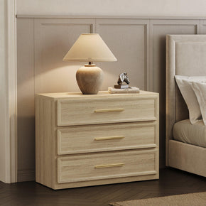
The trap here is picking browns that are too close in tone and ending up with a muddy single-note room. Real spread is the fix: pale caramel, actual walnut, deep chocolate, something near espresso at the darkest end. Natural wood furniture handles this automatically because grain variation creates tonal spread without any effort from you. The Terra 6-Drawer Horizontal Dresser brings exactly that kind of warm, naturally varied tone into a bedroom without making it a feature.
27. Navy, Off-White & Burnt Orange

Navy and burnt orange sit opposite each other on the color wheel, which is why they create contrast without conflict, rather than clashing. Off-white holds them apart. The ratio matters: burnt orange as accent only — one chair, a cushion, a ceramic piece. Push it to half the room, and the whole balance the palette is built on collapses.
28. Coastal Blues & Natural Sand

Light blue and sand appear together in coastal landscapes everywhere on earth. The eye recognizes the combination as correct before the brain has worked out why. Keep the blue light unsaturated. Keep the sand warm. And use real natural materials — jute, rattan, linen, raw cotton — because those textures are what turn this from a color scheme into an actual feeling in the room.
29. Olive, Bronze & Warm Cream

Bronze over gold. Gold reads as glamorous; bronze reads as something that's been around long enough to earn its place, which is a very different energy and the one an earth tone palette actually wants. Against cool olive and warm cream, that quality grounds the whole arrangement. One black-and-white photography somewhere in the room provides the contrast that prevents the palette from becoming a single long warm note.
30. Lemon, Marigold & Warm Neutrals

The muted versions of these yellows — late-summer fields, dried straw, honey in afternoon light — work within an earth-tone palette when ivory and tan hold them down, and real greenery provides contrast. But only in rooms with decent natural light. A dark room kills the warmth these yellows depend on,n and the palette turns flat and strange.
31. Cedar, Stone Gray & Ivory

Cedar brown has a depth that tan and standard mid-brown don't reach — darker, warmer, the color of old heartwood rather than stained pine. Stone gray provides a cool counterpoint, but it doesn't go rustic. Ivory separates them and lets both breathe. Simple, clean-lined furniture works best here because ornate pieces compete with the palette instead of supporting it.
32. Dusty Rose, Mushroom & Warm White

Dusty rose at the earthy end — an old shell, a peony going soft — is genuinely different from the pink that puts people off. Alongside mushroom taupe and warm white, it becomes refined and personal in a way that generic neutral palettes never quite reach. For furniture that sits inside a soft room like this without pulling focus, modern home furniture at Sicotas has warm-finished, clean-lined pieces that do exactly that job without announcing themselves.
33. Cinnamon, Muted Teal & Cream

People always say this one surprises them when they see it working in a real room. Cinnamon — warm, spiced, actually closer to terracotta than to orange — sets the mood. Muted teal provides contrast without taking over. Cream holds them apart. One accent wall, a lamp base, and a throw for the teal. Cinnamon and cream run everything else. Get that ratio right, and the palette feels effortless rather than experimental.
How to Use Earth Tones Well
Pick one group to lead — warm, cool, or neutral. Pull accents from the other two. Beige sofa, olive curtains, walnut table, cream rug: that works every single time because it mirrors what nature actually does. Add texture before you add more color. If the room still feels off after that, it's probably natural light that's missing, not another cushion. Fix the light source first.
For furniture in warm wood tones that won't fight with any of the palettes above, the Sicotas furniture range has a solid selection across different styles and storage needs. Clean silhouettes in natural finishes sit quietly in an earth-toned room, letting the palette do the talking.
FAQs
Is navy blue an earth tone?
Yes — but only the muted version. Deep-water navy, overcast-sky navy, the kind that reads as dark and slightly gray. Surrounded by warm beige, cognac, or cream, it settles into the palette without issue. Bright saturated navy is a different category and doesn't belong here.
What are the 5 natural colors?
Brown (soil and bark), green (plants), blue (sky and water), gray (stone and cloud), and beige (sand, dry grass). These five run through almost every palette in this article in some form. Change the proportions between them and you get most of the combinations above.
What are earth tone colors in clothes?
Camel, beige, brown, rust, olive, khaki, cream, mustard, terracotta, taupe, and muted navy. They layer with each other and with denim, black, and white without requiring any real planning. Cream top, olive trousers. Camel coat, dark denim. It just works, and you stop thinking about it.
Do earth tones go with everything?
Nearly. They work alongside most neutrals, denim, black, white, and other muted shades. The one situation where they fail is next to very saturated or neon colors — the brightness gap is too large, and the earth tones just look dull by comparison. Keep the surrounding palette consistent,t and they do the rest.
Are earth tones warm or cool?
Both. Terracotta, rust, camel, ochre, and clay are warm. Sage, olive, slate blue, stone gray, and muted navy are cool. Rooms that work best usually mix the two — warm base with cool accents, or the other way around. That balance is what makes the palette feel natural rather than one-note.
What are the top 3 neutral colors?
For earth tone rooms: warm beige, soft greige, ivory. All three work as wall colors, large furniture tones, and rug backgrounds. They're forgiving as light shifts through the day, and they sit comfortably next to every other earth tone without demanding anything.
Is beige an earth tone?
Yes. Sand, dry grass, undyed linen, pale stone — beige looks like natural things, which is the whole criterion. It works as a wall color, a furniture tone, and a floor base. It also shifts slightly with changing light rather than reading as a single flat color all day, which is one of its underrated aspects.
What is the best 3-color combination?
Sage green, warm beige, terracotta. Cool, neutral, warm — one of each. Balanced and genuinely inviting without effort. These three show up constantly in rooms that work because the logic behind them is the same one nature uses, and that logic is hard to argue with.
The Bottom Line
These colors come from somewhere real. Soil, stone, bark, the sky at a certain hour. That's why rooms built around them feel settled in a way that other palettes don't — people can't always name what's different, but they notice it. Pick a palette. One dominant tone, one cool accent, one warm one, neutral walls. Texture before color. Empty surfaces on purpose. That's it.
Sources
- Wikipedia: Earth Tone — History, Definition & Color Display — Historical definition of earth tones, pigment composition, and applications in art, fashion, interior design, and graphic design.
- Amy Wax / Color911: Earth-Tone Colors: Nature's Inspiration within Your Home — Interior design perspective on earth tone colors, the role of texture, biophilic design, and natural hue introduction into home spaces.
- Havenly: 35 Designer-Curated Earth Tone Color Palettes — Designer-curated earth tone palette examples with layering, texture, and material advice from lead interior designers.
- Sherwin-Williams: Color Through the Decades: 1970s — Historical context on earth tone color trends in American interior design across the decades.
- Your Color Guru: Warmth of Earth Tones: A Comprehensive Color Guide — Psychological impact of earth tone colors on mood and perception, with wardrobe and personal styling applications.
- Wayfair: What Are Earth Tones? A Decor Guide — Practical categorization of cool, warm, and neutral earth tones with room-by-room decorating guidance.


Stay In The Know
Expert advice. Very good deals. The absolute best (and worst) things we've tested lately.
Looking for something else?
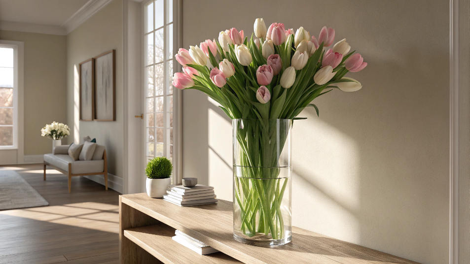
Best Vase for Tulips: A Florist's Honest Guide to Shape, Height, and Styling
LEARN MORE
41 Small Outdoor Living Spaces Ideas to Transform Even the Tiniest Patio
LEARN MORE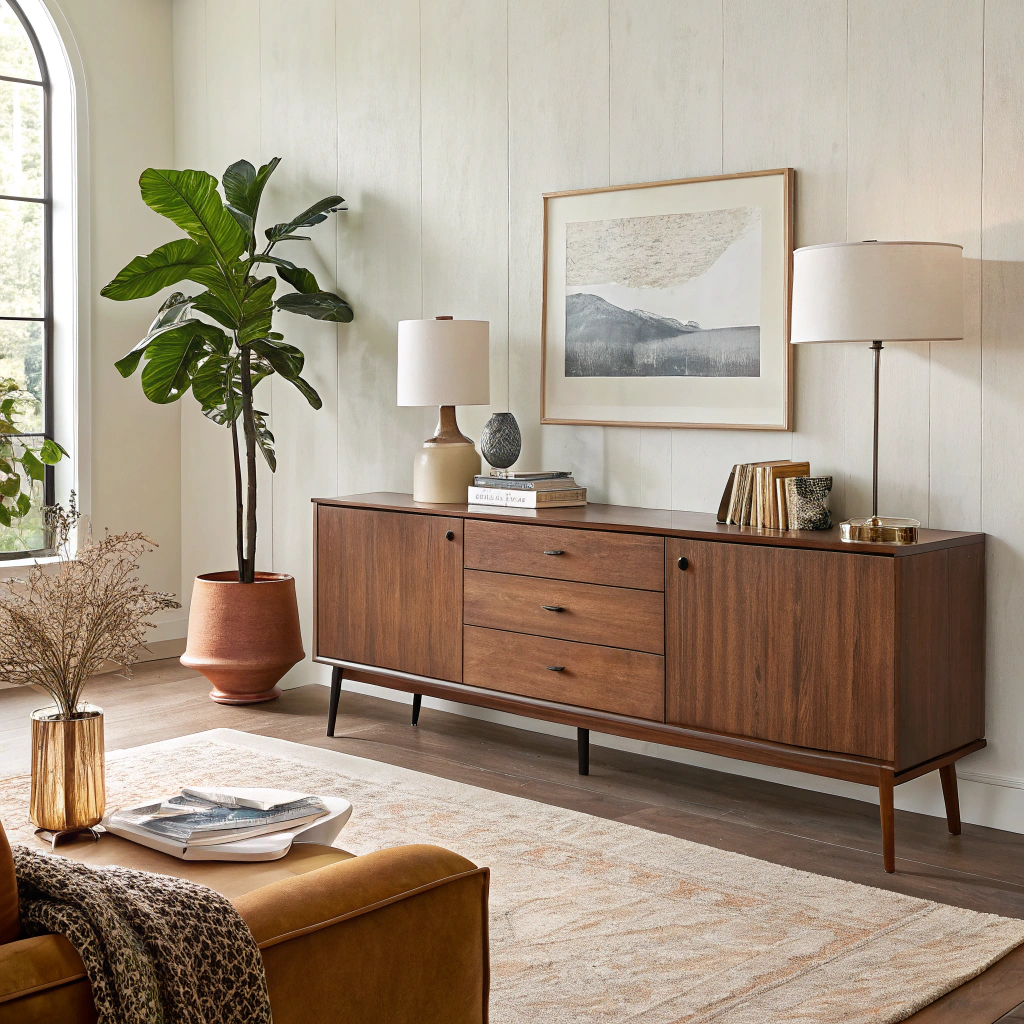
Modern Sideboard for Living Room: Complete Buying & Styling Guide
LEARN MORE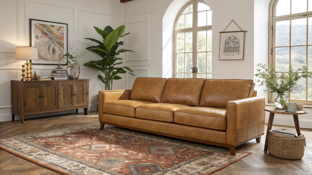
17 Camel Leather Sofa Decorating Ideas to Transform Your Living Room
LEARN MORERead more from Blogs
Looking for something else?

36 Wall Art Ideas That Make Any Room Feel Finished
LEARN MORE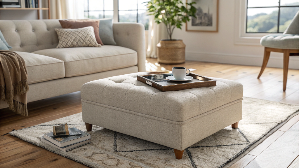
What is an Ottoman? 8 Reasons Why You Need One
LEARN MORE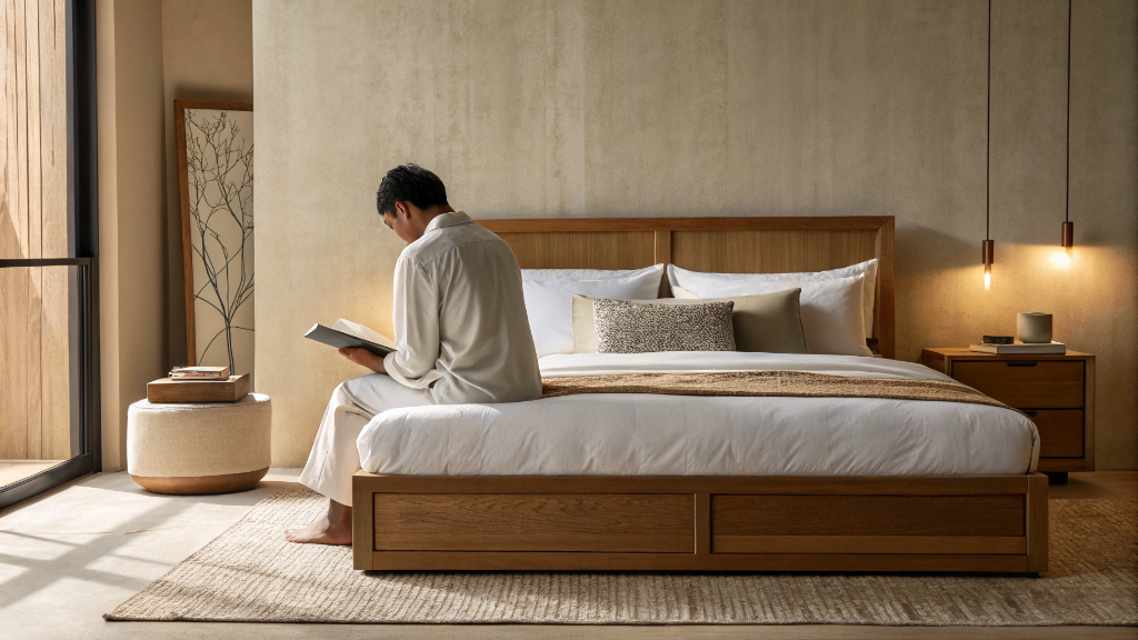
How to Sit in Bed With Good Posture: 10 Simple Tips
LEARN MORERead more from Blogs
You may also like


Further reading
What Is a Platform Bed? A Simple Guide to Types, Benefits, and Buying
Bed Sizes Guide: Dimensions From Twin to King