




How to Choose a Wall Color in the Living Room: Paint Ideas and Wall Color Tips
Paint should be the last decision, not the first, and that one switch makes choosing a wall color in the living room far easier. The room has already voted. The sofa, the rug, the floor, and the light all cast ballots before the first chip comes home. That is really what picking a living room paint color comes down to: a practical guide to choosing paint colors around the furniture and light you already have, so your living room color palette works in the real space rather than on a swatch.
This guide walks through the entire decision process, from furniture to undertones to sample testing. Palette libraries like theliving room color inspiration at Benjamin Moore supply endless names. The steps below decide which one survives in your actual room.
How to Pick a Living Room Wall Color: Start With the Room, Not the Paint Chip

Thousands of paint options exist. Your flooring exists once. The hardest things to change get to set the rules, and everything else falls in line behind them.
List the fixed players before anything else: floor, fireplace, trim, and the biggest furniture. Something as simple as asofa-and-couch lineup that defines your living room color palette trims the field early, since upholstery tones knock out whole shelves of paint before a single sample is bought.
No advisor beats the rug. Its pattern already includes a working palette, and the wall color, in its quietest tone, succeeds more often than not. The advice came woven in.
Let the Sofa Lead the Palette

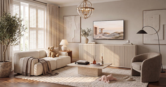
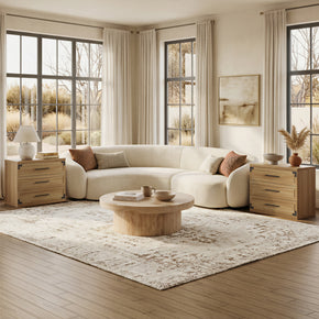
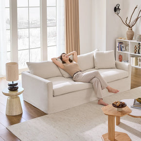
Walls answer to the sofa, because the sofa is usually the biggest block of color in the room. Neutral upholstery hands the mood job to the walls. A bold sofa asks the walls to calm down.
If you're wondering what color goes with a dark sofa, flexibility is the answer, and it looks like adark grey three-seater sofa for testing living room wall colors. Grey welcomes warm whites, sage, muted blue, and even terracotta behind it, and designers lean on it as the quiet anchor for exactly that reason.
Pillows give the test run. Set two or three candidate colors against the sofa through inexpensive pillow covers for a week. The wall version of the winner rarely disappoints.
Decide the Mood Before the Color

One word decides it: calm, cozy, bright, or dramatic. Ask how the room should feel at 8 p.m. That single word throws out more paint chips than any design rule ever written.
For 2026, trend reports like the 2026 paint forecast at Bob Vila see living rooms leaning into soft, chalky off-whites and warm neutrals, with high-contrast accents keeping them grounded. Trends inform the shortlist. The mood word makes the cut.
Time of day matters to the choice. A room used mostly at night can go deeper and moodier than a daytime room, because lamplight flatters dark walls.
Mood also assigns the finish later. Calm rooms favor matte depth, brighter rooms take a whisper of sheen, and the choice belongs to the same one-word brief.
Pick a Color Family and Stay Inside It

Warm whites and creams flatter wood and art. Greige bridges warm floors and cool fabrics. Sage and muted blue behave like neutrals with personality—terracotta and clay warm a sun-starved room.
Commit to dark, or skip it. Consultant guides like Color Concierge balance deeper walls with lighter ceilings and matching undertones, and that balance is what separates a cave from drama.
There is a name for whole-room commitment. Color drenching runs one shade across walls, trim, and ceiling, and a plain box becomes a deliberate, cocoon-like space.
Grey deserves one warning. Cool grey walls read cold beside warm oak floors, while greige splits the difference. The last decade taught that lesson at scale.
Read the Undertones Before You Commit

A second color hides inside every neutral. Beige carries yellow, pink, or green underneath. Grey carries blue, purple, or brown. Your floor clashes with the hidden lean, never with the label.
Lighting drags those hidden tones into view, as the undertone guide at Sherwin-Williams demonstrates. Test every finalist against the floor, the trim, and the sofa. Any clash shows up within seconds.
Nothing exposes an undertone faster than trim. If a wall color turns crisp white trim yellow or dingy grey, that color failed, whatever the chip promised.
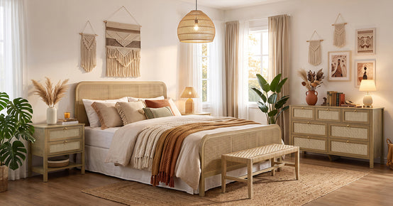
The same rule covers wood. Red oak floors, walnut furniture, and rattan textures each play a different role, and in most rooms, the floor gets the final word.
How Room Direction Affects Living Room Wall Color

The best wall color for a north-facing living room leans warm, since it runs cool from morning to night, and warm undertones help prevent it from going grey. South light flatters almost anything. The east and west rooms swap personalities as the day progresses.
The room-direction advice at Sherwin-Williams adds a useful shortcut in LRV. Colors with higher light reflectance values reflect more light, which matters most in north-facing rooms and rooms used after dark.
Window treatments join the equation. Sheers let warm light through, while heavy drapes cool a room by blocking light, and the same paint reads differently under each.
After sunset, bulb temperature takes over. Warm palettes stay warm near 2700K, and daylight bulbs around 4000K pull everything toward the cooler side.
Balance Dark Furniture Against Light Walls

Treat contrast as a tool. Dark furniture turns sculptural against a light wall, and that same dark weight stops an airy room from drifting off.
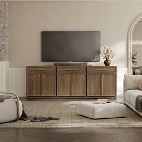
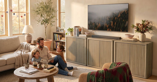
The media wall proves it daily. Ablack TV stand grounds a light living room wall color against warm white, anchors the screen, visually hides the electronics, and gives the palette its 10 percent of drama without a drop of dark paint.
Screens count as black rectangles. The TV itself is a permanent dark block on the wall, and planning the palette around it beats pretending it disappears.
Flip it, and it still works. Paint the far wall dark behind light furniture, and the wall steps visually backward, which is why designers never choose the near one.
Build the Palette with the 60-30-10 Rule (the 3-Color Rule in Interior Design)

Sixty percent of the room carries the main color, usually the walls. Thirty percent takes a secondary tone through large furniture and floors. Ten percent goes to accents.
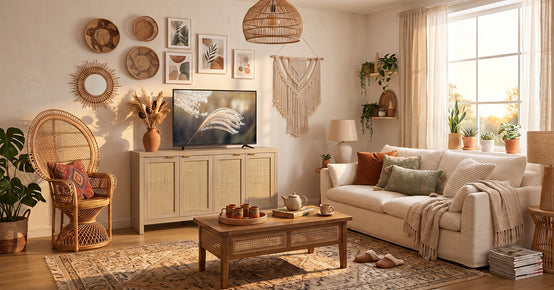
Wood counts as a color in that middle layer. Awarm wood coffee table that anchors the living room color scheme can be the entire 30 percent, and its texture works where flat paint can't.
Breaking the rule is allowed with repetition. A fourth color earns its place when it appears at least three times around the room. Once is a mistake. Three times is a theme.
Keep Trim, Ceiling, and Built-Ins in the Plan

Bright white trim sharpens contrast. Trim near the wall color calms the room and makes it feel larger. Ceilings follow the same logic: white for height, tinted for coziness.
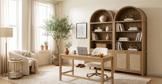
Storage walls join the conversation too. Ahigh bookcase that reads like architecture in your paint plan reads as architecture at its scale, so its finish should complement the trim tone rather than fight it.
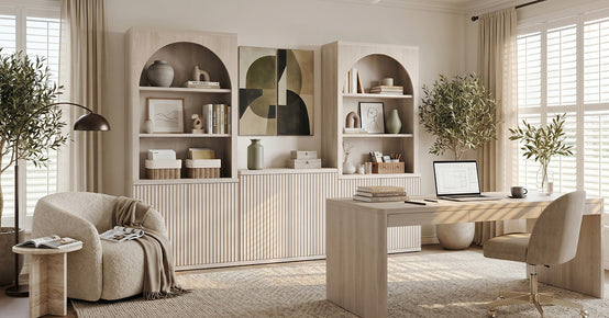
One trick calms busy rooms. Painting shelving a shade lighter than the walls preserves its detail while lowering the contrast, and the room instantly reads quieter.
Doors get a vote as well. Interior doors in the trim color vanish politely, while doors in a deep accent shade become architecture. Both are correct. Pick on purpose.
Carry the Color Through an Open Floor Plan

Open layouts punish abrupt color changes. One wall color across connected spaces creates flow, and shifts happen at doorways, beams, or corners where the eye expects a border.
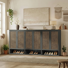
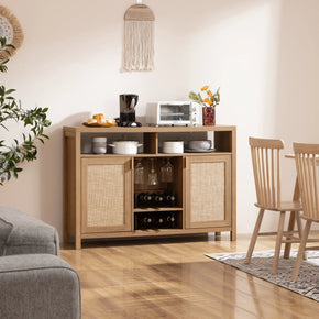
Repeating furniture finishes stitches the zones together. A TV stand range in white, walnut, and black makes that easy, since the media wall can echo whichever finish the dining and entry furniture already speaks.
Undertone is the passport between rooms. Different colors travel fine across an open plan when they share a warm or cool lean, and clash instantly when they do not.
Sight lines set the test. Stand at the front door and look across every visible wall. Whatever colors share that single view must get along.
Test Samples Like a Pro

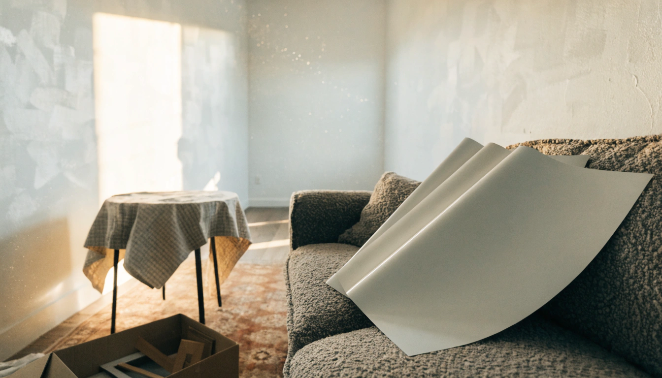
Learning how to test paint samples before painting comes down to one move: narrow it down to three or four finalists, then sample the big ones. Two-inch chips lie. Poster-size patches, large sample boards, or peel-and-stick swatches tell the truth on a real wall.
Sample services like Samplize make the multi-wall test painless. Move samples to every wall, watch them morning and night, and live with them for three days before buying a gallon.
Photograph nothing. Phone cameras auto-correct color and lie confidently, so judge every sample with your eyes in the actual room. The camera never buys the paint.
The register has an order too. One quart first. Roll a true coat on the biggest wall, then commit to gallons.
Common Living Room Paint Color Mistakes to Avoid
The classic error is painting before furnishing. Close behind come the tiny-chip gamble, the single-wall test, and borrowing a color from a photo shot in somebody else's light.
Artificial light gets forgotten the most quietly. Every color shifts after sunset, yellow under warm bulbs and blue under daylight ones, so check the finalists under your own lamps.
The sneaky entry is seen. Flat paint hides wall flaws yet scuffs easily; eggshell splits the difference, and glossier finishes highlight every small dent. Washable matte or eggshell suits most living rooms.
Last comes the rush. A store mixes paint in minutes while a repaint eats a weekend, so the three-day sample rule keeps earning its keep.
Final Takeaway
One sequence answers the question of how to choose a wall color for the living room every time. Fixed pieces first, then the mood, then a family, then undertones checked against furniture and light, then big samples on every wall. On day three, the right color still looks right.
FAQs
How do I pick a living room wall color?
Follow the order that prevents repaints:
- Start from the sofa, rug, and flooring tones.
- Pick the mood first, then one color family.
- Hold undertones up to the trim and the wood.
- Test big samples across several walls over a few days.
Which color is best for living room walls?
Warm white, greige, soft beige, sage green, and muted blue top the list, since most furniture and most lighting go with them. The single best pick is the undertone that best complements your floor and sofa.
What is the 3-color rule in interior design?
It splits a room into one main color, one secondary, and one accent, roughly 60-30-10. The walls take the 60 in most rooms, big furniture and floors take the 30, and pillows, art, and decor claim the 10.
What color goes with a dark sofa?
A dark sofa lifts against warm white, cream, greige, pale sage, or dusty blue. Keep the walls light, and the dark piece reads as the anchor rather than a shadow.
Which 4-color combination is best for a living room?
Four-part palettes that keep working:
- Warm white with natural wood, sage green, and black accents.
- Cream and beige grounded by navy and brass.
- Greige plus charcoal, white, and olive.
- Soft blue with sand, white trim, and walnut.
Sources
- Sherwin-Williams – How to Choose Paint Colors Based on Room Direction
- Benjamin Moore – 30 Living Room Paint Colors and Inspiration for an Inviting Space
- Sherwin-Williams – What's in a Color? Understanding Paint Undertones
- Bob Vila – 2026 Paint Color Trends by Room, According to Experts
- Color Concierge – 18 Best Paint Colors for a Small Living Room
- Samplize – Best Living Room Paint Color Ideas


Looking for something else?

Burl Wood Furniture: The Complete Buying Guide
LEARN MORE
What Is a Hope Chest? Meaning, History, and Modern Uses
LEARN MORE
What Is a Foyer? Meaning, Purpose and Design Guide
LEARN MORE
GREENGUARD Gold Certified Furniture: What It Really Means for Your Home
LEARN MORELooking for something else?

How to Clean a Mirror Without Streaks: Simple Step-by-Step Guide
LEARN MORE
21 Above-Bed Decor Ideas for a Stylish Bedroom Wall
LEARN MORE
Furniture Materials Guide: Picking the Right Material Room by Room
LEARN MORE


Further reading

18 Decorative Storage Box Ideas That Hide Clutter Well

How to Store Comforters Without Losing Space or Loft


