


How to Style a Bookshelf: 10 Designer Rules for a Curated (Not Crowded) Look
The worst bookshelf I ever lived with was a white IKEA Billy I filled in a single Saturday afternoon in spring 2022. I pulled stuff off the floor, off the windowsill, off every surface in the room, and stacked it all on the shelves. Old paperbacks. A clock that had stopped working during lockdown. Three half-burnt candles. A wooden bowl I bought at HomeGoods assuming it would read minimalist, but instead made me look like I collected bowls.
I stepped back. The shelf looked worse than the floor had.
If you landed here Googling how to style a bookshelf, chances are your shelves feel a little like that, too. The good news: styling a bookcase isn't really about buying new decor. It's about subtraction. The shelves that look curated in design magazines almost always have fewer things on them than yours do — arranged with breathing room, a loose logic, and a couple of personal pieces that actually mean something. That's basically it.
This guide walks through 10 designer-backed rules for styling a bookshelf in 2026, plus a step-by-step process, a room-by-room breakdown, and the mistakes most people make. If you're still shopping for the right unit to begin with, browse the full range at Sicotas Furniture — a good bookcase is half the battle.
The 10 Bookshelf Styling Rules at a Glance

Before the long version, here's the cheat sheet. Scan it, bookmark it, come back to it while you're actually standing in front of your shelves with a pile of stuff on the floor.
|
Rule |
What It Does |
|
1. Start with Let's empty the shelf |
Let's you rearrange instead of rearranging clutter |
|
2. Books come first |
Anchors the shelf; decor responds to them |
|
3. Mix vertical + horizontal stacks |
Adds rhythm and elevated surfaces for objects |
|
4. Use the rule of three |
Odd-numbered groupings feel naturally balanced |
|
5. Layer front-to-back for depth |
Turns a flat row into a styled vignette |
|
6. Mix textures and shapes |
Round vs. straight. Matte vs. glossy. Hard vs. soft. |
|
7. LeavSpacespace |
Empty space makes the good pieces read louder |
|
8. Keep a loose color thread |
Ties the whole unit together visually |
|
9. Add personal pieces |
Books, souvenirs, photos — things that mean something |
|
10. Edit at the end |
Remove 2–3 items af. ter it looks 'done' |
1. Start With an Empty Shelf (Yes, the Whole Thing)

I know. It feels dramatic. But every interior designer who writes about this will tell you the same thing: clear the whole bookcase before you put anything back.
Here's why. When you rearrange a full shelf, your brain works around what's already there. You shift things left. You add a candle. You push a photo to the back. The shelf ends up about 10% better—starting isn't much, and starting empty forces actual decisions instead of shuffling.
Take everything off. Pile it on the floor or a bed. Sort it into loose categories: books, framed art, baskets or boxes, sculptural objects, plants, and personal pieces. Now dust the shelves properly (they need it — trust me). And look at the empty—notice a second. Notice where natural light hits. Notice which shelves have better proportions than others. That's useful information you couldn't see before.
The most underrated part of this step is what doesn't go back on. The weird little souvenir from that work conference. The two half-dead candles. The book you haven't touched in six years. None of that needs a home on the shelf. Let it move on.
2. Put the Books Back First

The single biggest mistake in bookshelf styling is treating books like filler. Books aren't the background — they're the foundation. If the decor takes over and the books are just slotted into whatever space is left, the whole thing looks wrong in a way you can't quite name.
So books go back first. Then everything else responds to them.
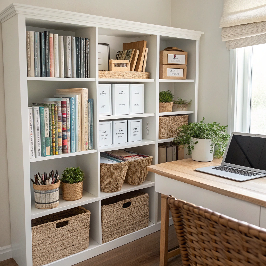
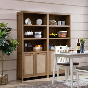
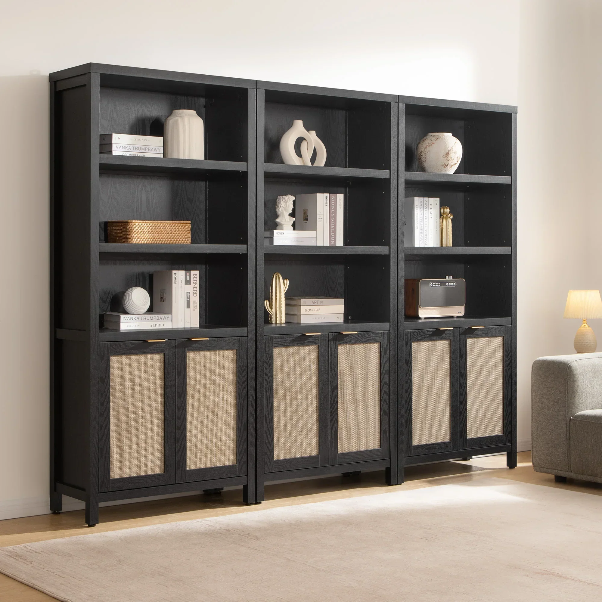
A good bookcase gives you room to work with. Something like the Willow 75-Inch Tall Bookshelf has enclosed us in a closet, which means the books can spread across multiple levels. This cabinet swallows the stuff you don't want on display. The shelves above are for books and curated objects. The doors below are for the remote chargers, the cords, the box of matches, the receipts — all of which would absolutely ruin a styled shelf.
A few tips for putting the books back:
- Don't go full library. Shelves that are 10,0% books look fine but flat. Aim for about 70–80% books with decor mixed in.
- Vary spine heights within each row. Tal, I have one bookonone read, and it reads like a pile. Mix it up instead.
- Group by subject or color, not alphabetically. Color grouping looks great on social media, but can make finding a specific book a nightmare — if that matters to you, stick to the subject.
- Flip a couple of books spine-in if you want a neserves section. It works with visual paufacing, and the pages face out in a soft cream.
3. Mix Vertical and Horizontal Stacks

All books standing up: library energy. All books on their sides: pile energy. Mixing the two: styled. That's the trick.
A vertical row gives the shelf structure and mass. A horizontal stack adds rhythm and — here's the bonus — creates a small elevated surface where you can land a decorative object. A stack of three books with a small bowl on top is probably the single most-used move in shelf styling. It's not original, it's not clever, but it works every time.
Some practical notes. Horizontal stacks should be blargestid-shaped: biggest at the bottom, smallest on top. Two or three books per stack is plenty — any more, and it starts to look like you're about to read them. And don't stack books on top of vertically standing ones. The visual noise gets ugly fast.
4. Follow the Rule of Three

Odd numbers feel balanced. Even numbers feel stiff. This is one of those design rules that sounds like pseudoscience until you try it and realize everyone is right.
One object alone can look lonely. Two objects look like a set waiting for its third. Three objects — especially at varied heights — create a natural triangle that your eye reads as complete. Five also works. Seven is pushing it. Two or four rarely feels right.
Try this: group a tall vase, a stack of books, and a small ceramic bowl together on one shelf. Now try the same arrangement with just the vase and bowl. The three-piece version looks styled. The two-piece version looks unfinished, even if the two objects are individually beautiful.
The rule isn't sacred — I've seen designers break it beautifully. But it's the safest starting point when you don't know where to begin.
5. Layer Front to Back for Depth

Flat shelves kill styled bookcases. If eveaobject sits in one straight line along the front edge, the shefrather thanads as a list, not a scene. The fix is depth.
Put larger pieces toward the back — a leaning frame, a tall vase, a tray standing upright. Then bring smaller objects forward in front of them. The eye reads the arrangement as three-dimensional rather than two-dimensional. Architectural Digest's designer bookshelf styling guide highlights leaning art as one of the most effective moves for this — a small framed print or even a postcard in a frame gives you a back layer that almost anything else can sit in front of.
A closed-back bookcase helps this a lot. The Cas Arched Bookcase with 2 Doors, at 82 inches tall, has a solid back panel that gives leaning art and trays something to rest against. Open-back units can work too, but you'll need to prop pieces more carefully.
Practical checklist for layering:
- Back layer: a framed print, a leaning canvas, or a tall vase
- Middle layer: a stack of books or a sculptural object
- Front layer: a small ceramic, a candle, or a trailing plant edge
6. Mix Textures, Shapes, and Finishes

Rounded ceramic against straight book spines. A matte clay bowl in front of a glossy glass frame. A plant trailing slightly over a shelf edge. These contrasts — texture against texture, shape against shape — are what make a shelf feel rich without feeling busy.
The goal is variety, not matching. A shelf where every object is the same material (all ceramic, all wood, all metal) reads as a curated collection in a store window. A shelf with three or four textures — something woven, something smooth, something with visible grain — reads as lived-in.
If you're starting from scratch, think in categories:
- Something natural: wood, rattan, clay, stone
- Something shiny: brass, glass, polished ceramic, mirror
- Something soft: a basket, a fabric-bound book, a trailing plant
- Something matte: a chalky candle, a raw linen journal, an unglazed vessel
One fish from each category spread across the unit, and the shelf already feels layered.
7. Leave Negative Space (It's the Secret)

This is the hardest rule to follow and the one that makes the biggest difference. The instinct when styling a bookshelf is to fill every gap. An empty section feels unfinished, so things get added until the shelf you wanted to look curated ends up looking like a pile.
Space on a bookshelf is not wasted real estate. It's part of the design. One good object in an otherwise empty section carries more visual weight than four objects competing for the same space. The space is what allows the object actually to be read.
A quick sanity check: stand across the room from your finished shelves and squint. If every section feels fully occupied, something needs to come off. Usually,y it's not a major piece — it's the filler. The small items that got added because there was a gap, not because they were doing any work. Those are the first to go.
Libraries use a rough three-quarters rule: fill about three-quarters of the shelf, leave the rest. It's a decent guideline. One strong piece beats three weak ones, every time.
8. Weave in a Loose Color Story

Cohesion isn't the same as matching. You do not need to paint every book cover or commit to an all-white shelf. What you need is a thread — some visual element that runs across the shelves and ties them together when you look at the whole unit from across the room.
That thread can be almost anything:
- Warm wood tones repeating across frames, books, and accent objects
- A few earthy ceramic colors — clay, terracotta, oatmeal —appear on different shelves
- Dark navy or forest-green book spines act as an anchor color throughout
- A loose neutral palette with one recurring accent (sage, rust, or muted blue works)
What doesn't work: every shelf in a completely different color story with no visual connection. That is, rather than as unplanned, not expressive. Even maximalist designer shelves — the ones that look chaotic and fun — almost always have one unifying element pulling them together. You just have to squint to see it.
9. Add Personal Pieces, Not Just Pretty Ones

The shelves that look most like showrooms usually have the least personality. Everything matches. Every piece is beautiful in a sort of generic way. Nothing suggests who actually lives there.
Personal pieces are what make a bookcase feel lived-in instead of installed. A paperback with a cracked spine because you've read it three times. A ceramic mug from a trip to Lisbon that you keep around for pens. A photo in a simple frame. A slightly lopsided bowl your niece made in pottery class. These are the things guests actually notice.
One or two personal pieces per section is plenty. You're not building a memory archive — you're adding evidence that a real person lives here. A generic West Elm vase is fine. A generic West Elm vase next to a trinket that means something to you is better.
10. Edit Ruthlessly at the End

Here's the step almost everyone skips. After the shelf looks done — everything placed, nothing obviously wrong — remove two or three things.
Not because the shelf is empty, but because deciding what to remove reveals the pieces that are just filling space. The Real Simple bookshelf process ends with this exact instruction for a reason. Subtraction is where the real improvement happens, not addition.
Candidates to remove first: small filler objects under 4 inches that you added to 'fill a gap.' Duplicates of anything. Pieces without a clear reason to be there. Anything you picked up for $5 at a discount store without a story. When in doubt, remove it and see if the shelf looks worse. Usually, it doesn't.
How to Style a Bookshelf by Room

The same bookcase should look different depending on where it lives. Not dramatically — the core rules above still apply — but the calibration shifts. What counts as a useful object changes. The balance between practical and decorative changes. The level of personality you dial in changes.
Living Room Bookshelves

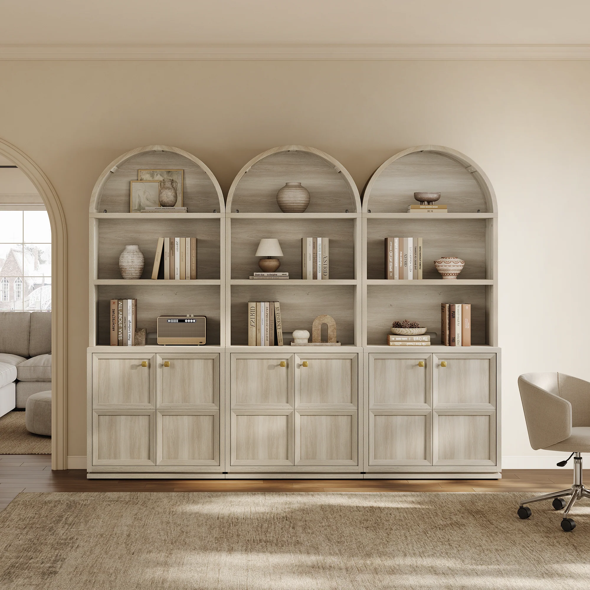
In the living room, a bookcase usually serves as a backdrop to the seating — the visual anchor behind the sofa or in a conversational corner. The objects and colors on the shelves should feel related to what's in front of them. A tall, statement-making piece like the Helio 3-Tier Arched Bookcase, at 81 inches, works especially well here because its arched silhouette plays against rectangular sofa shapes. Living room shelves tend to carry more decorative weight than practical items. Lean heavier on art, sculpture, and coffee-table books — and save the paperback novels for the bedroom.
Bedroom Bookshelves

Bedroom shelving skews toward the personal and the cozy. This is the room where sentimental objects live — the photos, the paperbacks you're actually reading, the perfume bottles. A closed-door unit like the Savanna Arched Bookcase with Doors (84.2 inches, rattan-accented) works beautifully because the lower cabinets absorb everything that belongs in a bedroom but doesn't photograph well — jewelry boxes, backup skincare, the stack of unread New Yorkers. The upper shelves stay soft and personal. Bedrooms are also where trailing plants shine: a pothos or a small trailing ivy at eye level makes the whole room feel calmer.
Home Office Bookshelves

In a home office, the bookshelf is usually working harder than in other rooms — it's functional storage first, decor second. Reference books, binders, a printer's worth of paper. But that doesn't mean abandoning the styling rules. Hide the ugly stuff in baskets or behind cabinet doors. Keep the top shelves styled with a few objects and some leaning art. The eye line above your desk should still feel considerate, rather than cluttered.
Bookshelf Styling Trends for 2026

The current direction in bookshelf styling has shifted noticeably over the past couple of years — away from the perfectly coordinated set-piece shelf and toward something warmer, more personal, and a little less fussy. A few patterns worth knowing about:
- "Curated clutter" — the phrase sounds contradictory,y but describes something real. Shelves with depth, personality, and visible life, but still edited—nothing thrown on; everything chosen.
- Warmer wood tones over white paint. The matte-white built-in look has faded. Oak, walnut, and rattan are back, and dark-stained bookcases are everywhere on design Instagram.
- Arched bookcase silhouettes — the graceful curved crown reads as modern and soft at the same time, which is why they've shown up in every roundup this year.
- Sculptural objects over symmetry. A lopsided ceramic. An asymmetric vase. Organic forms that contrast with the grid of books.
- Fewer plants, better ones. The "urban jungle" era is over. One trailing plant per bookcase reads more current than six crowded on every shelf.
Step-by-Step: Style Your Bookshelf in 30 Minutes

If the rules above are overwhelming, here's the short version. Six steps in the order that works. Set a timer — this really does take about half an hour for a standard bookcase.
- Step 1. Clear the entire bookcase. Every shelf, every object. Dust it properly while you're at it.
- Step 2. Sort what came off into categories: books, art, objects, storage pieces, plants, personal items. Put each category in its own pile.
- Step 3. Edit before anything goes back. Remove duplicates, obvious filler, and anything that was only there because it had nowhere else to live. Be honest.
- Step 4. Place the books first. Mix vertical rows with horizontal stacks. Leave some sections with breathing room — don't fill every inch.
- Step 5. Add one larger back-layer piece per piece shelf: a leaned-on piece, an art piece, a tall vase, a tray standing upright. This creates depth.
- Step 6. Bring smaller objects forward in front of the larger pieces. Add one touch of greenery somewhere. Step back, squint, and remove 2–3 things that aren't pulling their weight.
That's it. That last step — removing things after the shelf looks done — is the one almost everyone skips, and it's the one that makes the biggest difference.
Common Bookshelf Styling Mistakes to Avoid

Using too many small objects
A shelf covered in little trinkets reads as cluttered even if each piece is nice on its own. Scale matters more than quantity. One medium object almost always beats three small ones.
Filling every section
The biggest visual difference between a designer shelf and a DIY shelf is usually just negative space. Empty sections are a feature, not a flaw.
Ignoring, scale
Five objects, all roughly the same height, kill the rhythm. Vary heights deliberately — something tall, something medium, something short per shelf, every time.
Treating books as filler
Books are the foundation. Stacking them in as an afterthought while the objects take over almost always reads wrong. Books lead. Decor responds.
Over-coordinating
Matching everything perfectly reads as a showroom, not a home. A loose thread (one color, one material, one tone) is enough. Exact matching is too much.
Skipping the final edit
The last pass — removing what isn't earning its space — is where the shelf goes from decent to styled. Don't stop when it looks done. Stop when it looks edited.
FAQs
How do you make a bookshelf look expensive?
Fewer things, better spacing, and one or two real materials. A brass frame, a heavy ceramic vase, a piece of real wood — any of these beats ten plastic trinkets. Cohesion is the other half: a shelf where the pieces feel related reads as expensive even if each piece was cheap.
What is the rule of thirds for bookshelf styling?
It's a variation of the rule of three. Fill roughly two-thirds of the shelf with books, leave one-third for decor and breathing room. Or fill one-third with a strong focal vignette, leave two-thirds with simpler styling. Either way, you're dividing the shelf into uneven sections, which looks more dynamic than splitting it 50/50.
How do I style a bookshelf with too many books?
Keep them. A dense shelf full of books can look great — the trick is variation within the density. Break up long vertical rows with horizontal stacks. Leave occasional sections with a single object instead of books. Rotate some book covers outward. The shelf doesn't need fewer books; it needs more rhythm.
What do you put on empty bookshelves?
Start with books — even a modest 20-book collection spread across the shelves anchors the unit. Then add one larger piece per shelf (a vase, a framed print, a small sculpture), one textural piece (a woven basket, a ceramic bowl), and one personal item. Resist the urge to fill everything. Three well-placed pieces per shelf is usually enough.
How do I style a bookshelf without books?
It's doable but harder. Lean more on sculptural objects, art, stacked trays, and storage boxes. Group in odd numbers. Bring in greenery for softness. But honestly — even a dozen coffee-table books make a big difference. Used boocheaply, es sell them cheap, and they work as both decor and content.
How often should I restyle my bookshelf?
Seasonally if you enjoy it, yearly at minimum. A quick refresh — swapping out one or two objects, moving a few books around — keeps the shelf from going stale. Full tear-downs every 6–12 months reveal clutter you stopped noticing.
Should my bookshelf match my furniture?
Related, not matching. Same wood family, or one repeated finish, or a shared material between the shelves and other pieces in the room. Exact matching reads as a furniture set from a catalog. Related-but-distinct reads as collected over time.
Wrapping Up
Styling a bookshelf well comes down to three simple things: start from an empty slate, let the books lead, and remove things until the shelves can breathe. Everything else — the layering, the rule of three, the color thread, the personal pieces — builds on top of those three. None of it is complicated. Most of it is editing.
Most bookcases look better after something is removed, not added. That's the part that's hard to believe until you try it. And once you do, the shelf is usually done. If you're still looking for the right unit to begin with, the full bookcase collection at Sicotas has everything from slim 71-inch uprights to substantial 84-inch arched pieces with closed lower storage — a good shelf is the starting point, not the finish line.
Resources
1. Architectural Digest — How to Style a Bookcase Like a Designer. Layering, negative space, color, and personal objects.
2. The Spruce — How to Style Bookshelves. Books as foundation, horizontal stacks, personal pieces, and depth techniques.
3. House Beautiful — Bookshelf Decorating Ideas. Leaned art, layering, current trends, and curated clutter direction.
4. Real Simple — How to Organize and Style Your Bookshelves: editing, negative space, and the step-by-step rebuilding process.
5. Better Homes & Gardens — Bookshelf Styling and Ideas. Rule of three, scale contrast, and shelf formula techniques. Replaces HGTV (deprecated URL format).


Stay In The Know
Expert advice. Very good deals. The absolute best (and worst) things we've tested lately.
Looking for something else?
Different Kinds of Shelves: The Complete Guide to Shelf Styles, Uses & Best Models for Modern Homes
LEARN MORE
Rustic Home Design: A Complete Guide to Creating Cozy, Natural & Modern Spaces
LEARN MORE
Bar Carts for Home: The Complete Guide to Stylish Home Entertaining + Best Alternatives
LEARN MORE
Bar Carts for Living Room: The Complete Guide to Stylish Home Entertaining
LEARN MORERead more from Blogs
Looking for something else?
TV Console Decor Ideas: Stylish Ways to Elevate Your Living Room
LEARN MORE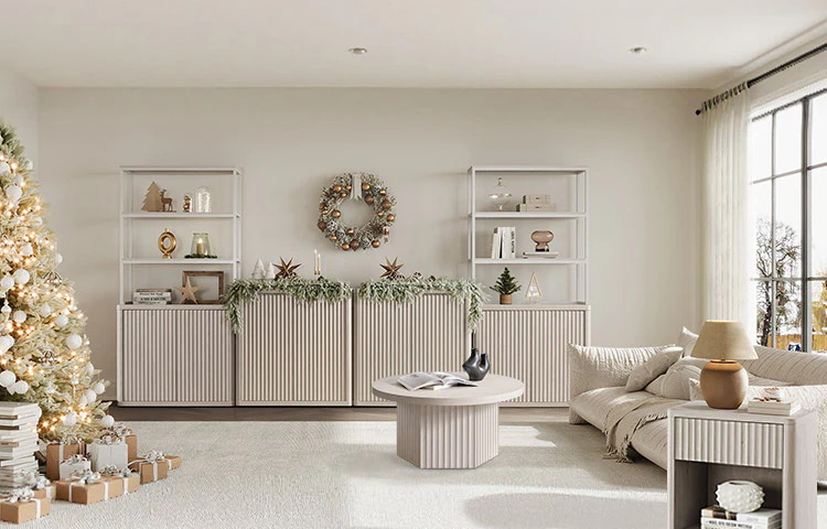
Types of Living Room Styles: A Complete Guide to the Most Popular Design Aesthetics
LEARN MORE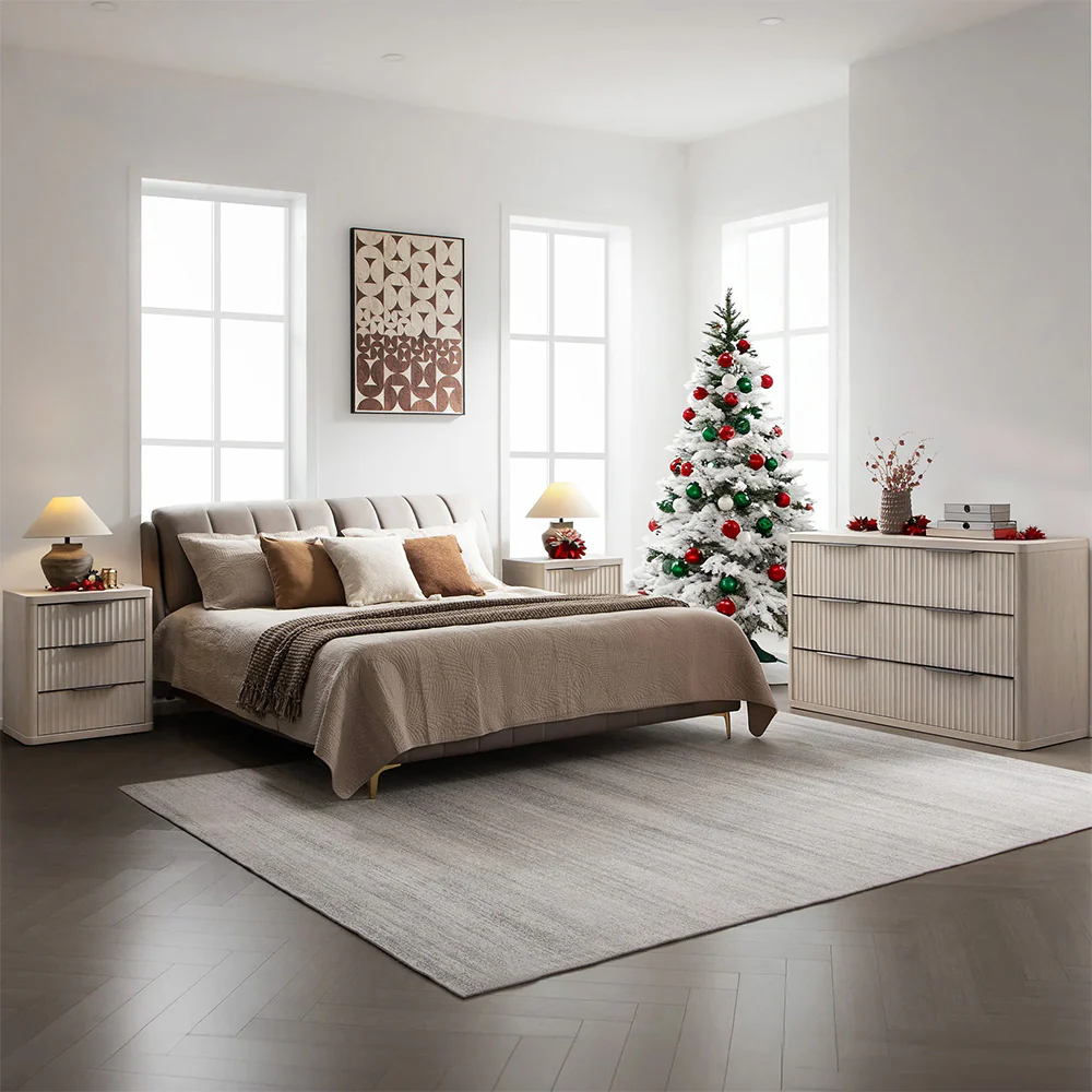
Bed Frame Bedroom Ideas: Modern, Stylish & Cozy Looks for Every Room
LEARN MORERead more from Blogs
You may also like


Further reading
Modern Playroom Ideas: 40 Ways to Design a Fun and Functional Space
What Color Goes With Brown Bedroom: 16 Ideas That Actually Work.docx