


What Color Goes With Purple? 29 Ideas That Actually Work

Here’s the thing nobody says about purple: it’s not a difficult color. It just gets treated like one.
Walk into any paint store and mention purple, and you’ll get cautious responses. People worry about it looking childish, or too dramatic, or like a Halloween decoration. And yes — purple can do all of those things. But so can red. So can yellow. The difference is that we give red and yellow the benefit of the doubt,t and we don’t give purple the same courtesy.
The rules are actually straightforward once you understand them. Warm purple — plum, aubergine, wine — needs warm companions. Cool purple — lavender, lilac — pairs well with winkle — needs cool or neutral companions. Yellow is the complementary color (maximum contrast), gold is the grown-up version of that, and gray is what you reach for when you want calm. Everything else is a variation on those principles.
Here are 29 of those variations.
1. Lavender + Soft Gray

Start here if you’re not sure where to start. Lavender and soft gray share cool undertones, which is why they get along so well — they’re not fighting for the same temperature in the room. The result is a bedroom that genuinely feels as if it were designed to help you relax.
Gray walls with lavender in the soft furnishings are the easiest version. Lavender walls with gray trim and furniture are the more committed version. Either way, the combination holds up. Add a white ceiling to stop the palette from feeling too enclosed.
2. Lilac + Crisp White

Simple. Works. Lilac with crisp white gives the color room to breathe without washing it out. Good for small bedrooms, bathrooms, and any space where you want both lightness and personality.
One thing: not all white is the same. Cool, blue-tinted white can make lilac feel sharp and uncomfortable. A slightly warm off-white does this combination more justice. Not cream — just white with the smallest amount of warmth in it. The adjustment is subtle, and the difference is real.
3. Lavender + Sage Green

This one surprises people every time. Lavender and sage green shouldn’t work as naturally as they do — a purple and a muted green, on paper that’s not obvious. But both colors are dusty and slightly grey-toned, which is exactly what they have in common and exactly why the room feels settled rather than busy when you put them together.
You don’t need sage green walls to get this effect. Three sage accessories in a lavender bedroom — throw pillows, a rug, and one plant — are enough to shift the whole mood. Try it before you paint anything.
4. Purple + Cream

Cream is the kinder version of white. Against richer purples — plum, aubergine, deep violet — it softens the contrast without diluting it. The room stays warm rather than clinical. This is the combination for people who love deep, dramatic purples but don’t want the bedroom to feel like a cave.
Warm wood furniture makes this combination click. Plum bedding alongside cream walls and a wide-drawer wood dresser like the Stria creates the kind of bedroom palette that reads expensive without costing that way.
5. Plum + Gold

The classic for a reason. Gold brings out the warmth in plum. Plum makes gold look intentional rather than flashy. Together, they read as genuinely luxurious.
Use brass hardware rather than polished gold for a contemporary look. A brass lamp, a gold-framed mirror, and warm metallic drawer pulls. Three considered touches. That’s enough.
6. Mauve + Dusty Rose

Two muted pink-purples in the same room. This sounds like it would be too much, and it would be if either color were bright. The muted versions — genuinely dusty and desaturated — sit together with a quietness that’s hard to replicate with other combinations. Warm, cozy, settled. Best in a bedroom where the goal is genuine rest.
7. Purple + Mustard Yellow

People see this and immediately think of Halloween. That’s the saturated version. Mustard yellow is a completely different thing — warm, slightly brown-toned, sophisticated. Against a medium or deep purple, it creates real visual energy without looking like a graphic design experiment gone wrong.
Use mustard in accent quantities only—a cushion, a throw, one artwork. The purple stays primary. The mustard gives it something to push against. Equal amounts of both are where it goes wrong.
8. Dark Purple + Emerald Green

Bold. No apologies. Both colors have depth and jewel-tone richness. When they sit together,r they amplify each other — the purple looks darker, the green looks more vivid. This is not a quiet combination.
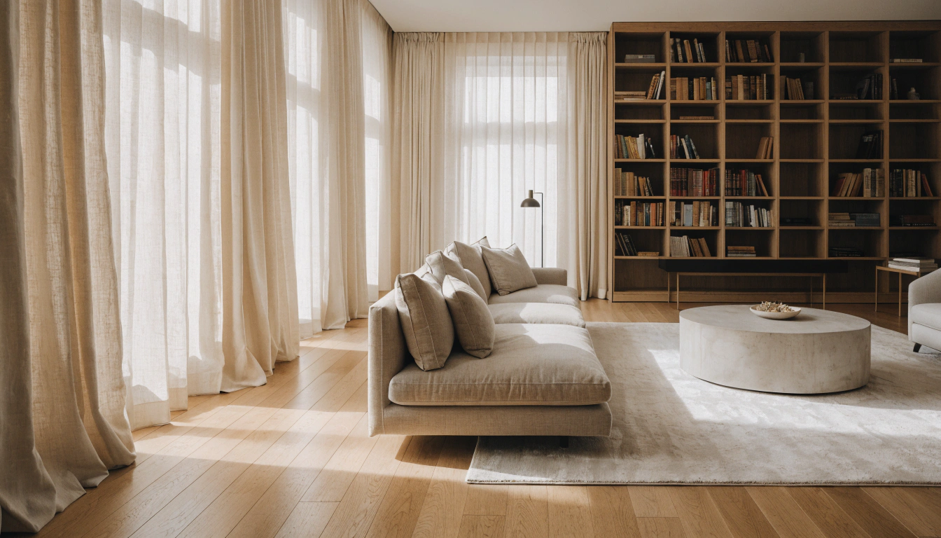
Best in dining rooms, home bars, and formal sitting rooms. In a bedroom, use emerald only on textiles and keep it off the walls. The combination rewards commitment and punishes hedging.
9. Lavender + Silver Accents

Gold warms purple. Silver cools it. For cooler purple shades — lavender, lilac, violet — silver accents create a modern, slightly ethereal quality. Chrome hardware, a silver-framed mirror, a silver table lamp. This is the contemporary version of the lavender bedroom, rather than the romantic one.
10. Purple + Black

Dramatic. Not approachable. But when deep purple and black are done right — matte black bed frame, black trim, dark plum walls — the result is a bedroom that feels genuinely confident. Eggplant and plum benefit most from this because the black gives them definition they don’t get against lighter backgrounds.
Every person who tries this combination learns the same lesson: you need cream bedding and warm lighting, or the room becomes oppressive. The darkness is what you want. The relief is what makes it livable. Don’t skip the cream bedding.
11. Lilac + Blush Pink

This combination has an unfair reputation for being too sweet. The bright versions earned that reputation. The muted versions — dusty rose and soft lilac — are almost neutrals. They share warmth, they share softness, and they don’t compete for attention in the room.
Test dusty rose pillowcases in a lilac bedroom before committing to anything else. The preview tells you everything you need to know about whether your specific shades of both colors are getting along.
12. Purple + White + Natural Wood

Three elements that balance each other without requiring any decorating skill. White keeps the room open. Wood adds warmth,h so the white doesn’t read as clinical. Purple comes in through bedding, a feature wall, or soft furnishings.
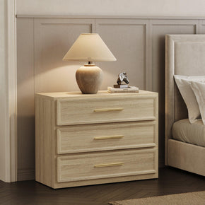
The wood is doing more work than it looks like. A low, wide storage dresser like the Terra 6-Drawer in warm natural wood, paired with lavender walls and white trim, creates a complete, cohesive bedroom palette. Three decisions, and the room looks considered.
13. Royal Purple + Ivory

More nuanced than purple and plain white. Ivory has a slight warmth that takes the edge off royal purple’s intensity. Where white can make a room feel sharp, ivory makes it feel refined. The combination reads as regal rather than stark.
14. Plum + Charcoal Gray

For people who want a bedroom that feels genuinely serious. Not romantic, not playful — just adult and quietly confident. Charcoal gray has enough depth to hold its own next to rich plum. The two together create a moody tension that somehow still feels restful.
Cream bedding is mandatory here. The contrast at eye level is what stops the room from becoming a bunker. Dark walls, dark furniture, light bedding. That’s the formula.
15. Purple + Navy Blue

Here’s the one most people get wrong. Purple and navy are neighbors on the color wheel, which means they need separation,n or the combination looks flat and heavy. Same-depth purple with same-depth navy — no contrast between them — just creates a dark, muddled room.
The version that works: lighter purple (lavender or lilac) as the dominant, navy as a strong accent, with cream or white bedding between them. The contrast between light and dark does the visual work here, not the color relationship.
16. Purple + Forest Green

Both colors seem to have some character. Forest green doesn’t apologize for its depth. Deep purple doesn’t either. Together they make each other look more interesting — the purple reads richer, the green reads more vivid. Richer purples (mulberry, aubergine) suit deep forest green—softerpurples pair well with eucalyptus or sage-adjacent greens. Either version rewardsfully committing to it.
17. Mauve + Warm Gray + Wood Tones

One of the most approachable modern bedroom combinations going right now. Mauve is so soft it barely reads as purple — it’s more of a warm neutral with purple tendencies. Warm gray and natural wood around it create a room that feels cohesive and restful with no single element demanding attention.
This palette specifically needs unfussy, clean-lined furniture. A clean six-drawer storage piece like the Cas sits quietly in an amauve-and-grayy bedroom without competing with it. That’s the contribution bedroom furniture should make in a palette this subtle.
18. Aubergine + Antique Gold

Antique gold has an aged, amber quality that polished bright gold doesn’t. Against aubergine,e it creates a combination that feels less ‘formal palace’ and more ‘rooms that have seen some things.’ Which is actually what most people want.
A distressed brass lamp, a vintage-style mirror frame, and warm metallic picture frames. Three or four pieces. More than that, and you’re decorating a stage set rather than a bedroom.
19. Violet + White + Black Accents

A contemporary three-color formula. White is the foundation. Violet is the statement. Black provides the definition:— metal bed frame legs, a black-framed mirror, matte drawer hardware. Remove the black and the violet,and the white feels soft but shapeless. Add it back,k, and the whole room gains edges and intention.
20. Lilac + Pale Olive

Pale olive sits between yellow-green and gray, which means it provides a quiet contrast to lilac without any harshness. Both share a muted, dusty quality. They work together the way certain colors in nature work — not because someone designed it that way, but because the underlying chemistry is right.
Better in rooms with decent natural light. In a dim room, both colors can go flat. Warm lamp light helps, but honestly,y this combination earns its keep most in rooms that get actual daylight.
21. Purple + Burnt Orange or Terracotta

Bright orange with saturated purple looks like a sports team uniform. Terracotta and burnt orange with a medium-deep purple is an entirely different story. The reddish warmth of terracotta finds warmth in the purple, and the two end up feeling related rather than contrasting.
Use it as a single accent only. One terracotta throw, a ceramic pot on the dresser, and a rug that pulls both tones together. The purple stays dominant. Terracotta just gives it a warm direction.
22. Deep Purple + Warm Brass + Cream

The sophisticated upgrade from ‘purple and gold.’ Brass is warmer, more amber, slightly aged-looking. Against deep purple, with cream as the main neutral, it creates a bedroom that reads as genuinely luxurious without any single piece being showy. Hardware, lamps, and one mirror frame. That’s the brass contribution. The rest is purple and crea,m doing what they do.
23. Grape Purple + Warm Chocolate Brown

On paper,r this should be a disaster: Brown and purple. The worst version of this is muddy and depressing. But a warm, saturated grape purple next to warm chocolate brown is — genuinely — one of the coziest combinations in this list. The red undertones in both colors share a warmth that makes them feel like they belong together rather than like two things that ended up in the same room by accident.
The one condition: the purple has to be warm and saturated. A cool, desaturated lavender next to warm brown actually is muddy. Warm grape purple next to warm brown is a deliberate choice that reads as such.
24. Wisteria + Mustard + Dusty Pink

Three warm tones in the same family. Wisteria is a pink-toned purple, which is why mustard and dusty rose sit beside it without any undertone conflict. None of the three fights the others. The room ends up feeling personal — the kind of combination that looks like it came from someone’s taste rather than a color formula.
25. Purple + Turquoise

No tidy color theory reason for this to work. Turquoise and purple aren’t complementary; they’re not analogous. But they share a vibrancy that creates energy together. Use muted versions of both — dusty teal and soft violet rather than electric aqua and bright purple — and the combination reads as confident rather than chaotic. This is one of those pairs that just works in practice despite the theory not fully explaining why.
26. Plum + Cobalt Blue

For rooms where subtlety isn’t the goal. Cobalt blue is intense and doesn’t pretend otherwise. Next to deep plum, the two jewel tones create a layered, immersive palette that’s frankly stunning when you commit to it. A cobalt area rug against plum walls. Cobalt dining chairs next to plum upholstery. These are statement decisions,s and they work best when treated as such.
27. Lavender + Natural Wood + Warm Linen

The most livable combination on this entire list. No drama, no edge cases, no version of this that goes wrong. Lavender with natural wood and linen textures creates a room that feels warm, restful, and like someone actually lives in it.
In a living room,m especially, one strong horizontal element anchors the whole palette. A slim console table like the three-drawer Savanna in warm natural wood, set against lavender walls with linen accessories, is the kind of setup that looks considered without requiring much effort. Sometimes simple combinations are simple for good reasons.
28. Eggplant + Black

This combination shows up in rooms that get written about in design publications. Deeply saturated eggplant walls, matte black furniture, purple velvet details. It’s genuinely beautiful when someone commits to it completely.
Here’s the honest part: it doesn’t do well at half measures. One eggplant accent pillow against a beige wall isn’t this combination — it’s just a pillow. To get the actual effect,t you need to commit to the whole direction. And then balance it. Cream bedding, warm lamps, and one light rug. The darkness is the point. The balance is what makes you want to stay in the room.
29. Pastel Purple + Soft Butter Yellow

The only genuinely cheerful combination on this list. Pastel purple and very soft warm yellow together shouldn’t feel as sophisticated as it does, but here we are. Both colors are light enough that neither dominates. The warmth of the yellow stops the purple from feeling cool or reserved. The result is spring-adjacent in a way that somehow doesn’t feel dated.
The version to avoid: bright violet with bright yellow. That’s too much. Muted lilac with warm primrose, dusty wisteria with pale butter yellow — those are the palettes worth trying.
Quick Pairing Chart by Purple Shade
Short on time or just want a quick answer.
|
Purple Shade |
Best Companion Colors |
Mood |
Best Room |
|
Lavender |
Soft gray, white, sage, silver |
Calm, restful |
Bedroom, bathroom |
|
Lilac |
White, blush, pale olive, light gray |
Soft, romantic |
Small rooms, soft decor |
|
Mauve |
Cream, dusty rose, warm gray, wood |
Warm, approachable |
Bedrooms, living rooms |
|
Wisteria |
Mustard, dusty rose, natural wood |
Feminine, warm |
Bedrooms, sitting rooms |
|
Plum |
Cream, gold, emerald, charcoal |
Rich, elegant |
Feature walls, living rooms |
|
Royal Purple |
Gold, ivory, black, emerald |
Regal, dramatic |
Bold formal interiors |
|
Aubergine |
Stone, antique gold, charcoal, cream |
Sophisticated, moody |
Dining rooms, bars |
|
Eggplant |
Black, brass, cream, deep green |
Dramatic, statement |
Statement bedrooms |
|
Grape Purple |
Warm brown, ivory, mustard |
Warm, grounded |
Family rooms |
What Doesn’t Work With Purple
Mixing warm and cool purple in the same room
Warm grape purple next to cool blue-lavender looks off in a way that’s hard to diagnose but immediately uncomfortable. If you’re using multiple purple tones, make them share an undertone direction. Or put a neutral between them.
Dark purple on all four walls of a dim, small room
This is the most common purple mistake. Deep plum or eggplant can look extraordinary on a single feature wall. On all four walls of a bedroom that doesn’t get daylight, it becomes oppressive. One wall is balanced with cream or white on the other three. That’s the formula.
Too many saturated colors are competing with the purple
Purple already asks for attention. Adding bright orange, neon yellow, and hot pink in the same room isn’t confidence — it’s noise. One accent color, used with restraint, is more effective than three competing with each other and with the purple.
Cool ashy brown with cool purple
Greyish, cool-toned brown next to lavender or lilac genuinely does look muddy. Warm, honey-toned, reddish brown works fine. The cool-ashy version is the problem. It’s not that brown and purple can’t coexist — it’s that the wrong brown and the wrong purple absolutely cannot.
FAQs
What color goes with purple in a bedroom?
Depends entirely on the shade. Lavender and lilac work beautifully with soft gray, white, and sage green — cool, calm, restful palettes. Plum and aubergine need warmer companions: cream, gold, antique brass, or forest green. The shade is the decision that matters most. Everything else flows from that.
What color complements purple very well?
Yellow is the textbook answer — it’s the complementary color, sitting directly opposite purple on the color wheel. In real rooms, mustard or gold works better than bright yellow because it’s warmer and less jarring. Gray complements lavender specifically with a quiet sophistication that nothing else matches. Emerald green makes dark purple look genuinely stunning if you want something with real impact.
How do you make the color purple?
Red and blue. More red → warmer purples (plum, wine, magenta-purple). More blue → cooler purples (lavender, periwinkle, violet). Add white to lighten (lilac, mauve, wisteria). Add black or very dark blue to deepen (eggplant, aubergine, dark plum).
Which 3-color combination works best with purple?
There’s no single answer,r but a few that consistently deliver: lavender, white, and soft gray for a calm bedroom — almost impossible to get wrong. Plum, cream, and gold for something richer and more formal. Royal purple, emerald green, and ivory for maximum jewel-tone impact. The right one depends on your specific shade and what mood you’re actually trying to create.
What color makes dull purple look more vibrant?
Contrast is the fastest fix. Put crisp white or cream nearby,y and the purple immediately reads as more vivid by comparison. Warm, second-fastest, fastest — cool fluorescence; kills purple, warm LED or incandescent brings out its richness. A small gold or mustard accent activates the complementary contrast and makes saturated purple look even more saturated. And honestly, if the purple looks dull on the wall, it might just be the wrong shade for the room’s light. Try a different paint before you redecorate around a problem.
What color should you avoid painting a bedroom?
Any color that creates anxiety rather than calm: very bright saturated reds, neon anything, high-contrast patterns in heavy doses. For purple specifically: dark eggplant or plum on all four walls of a small bedroom with poor light. Use it on one wall, balance with cream and light, and it’s one of the most beautiful choices you can make. Overdo it,t and the room feels like it’s closing in.
What two colors make purple?
Red and blue. Equal amounts → standard mid-purple. More red → warmer, plum-adjacent. More blue → cooler, lavender-adjacent. Lighten with white, deepen with black or dark blue.
What color not to use with purple?
Cool ashy brown (looks muddy with cool purple). Neon green or neon orange at full saturation (looks chaotic). Mismatched purple undertones in the same room without a neutral between them. And very dark purple with no light relief anywhere in the room — not because it can’t work, but because it requires more skill than most rooms allow for.
Where to Go From Here
Pick the shade first. That single decision eliminates most of the uncertainty. Warm purple → cream, gold, forest green, warm brown. Cool purple → gray, white, sage, silver, blush. Then pick the mood: romantic, calm, dramatic, or bold. The combination that delivers that mood from the list above is the right one.
And test before you commit. Purple shifts more than most colors under different lighting. A shade that looks beautiful in afternoon daylight can read cold or heavy under evening lamps. Always look at paint swatches in the actual room, at the actual time of day you use it. That five-minute test saves a lot of repainting.
If you’re also thinking about the furniture that will live in a purple room, the full Sicotas bedroom furniture lineup is worth browsing before you finalize the palette. The warm wood tones work across most of the combinations in this article without competing with them.
And if you want to see the full picture first, explore everything at Sicotas Furniture — bedroom, living room, and entryway pieces in styles that suit both bold and understated palettes.
Sources
- The Spruce: 20 Colors That Go Well With Purple — Interior design guide covering 20 designer-approved purple pairings, including yellow, green, turquoise, cream, and gold metallics.
- House Beautiful: 29 Gorgeous Colors That Go With Purple, According to Designers — Designer-curated gallery of 29 real rooms showing purple working across bedrooms, living rooms, and kitchens.
- Palette Hunt: Colors That Go With Purple — Your Complete Guide — A color theory guide covering complementary, analogous, and triadic purple combinations, plus home decor palettes.
- TourBox: What Colors Go Well With Purple: Perfect Pairings — Design overview of purple pairings, including black, gray, white, blue, red, green, orange, and yellow,w with mood context.
- I Love Wallpaper: What Color Goes With Purple? Expert Interior Design Guide — Expert undertone-based advice on pairing gray, cream, forest green, yellow, pink, and metallics with different purple shades.
- SimpolColor Purple Color Combinations for a Calm Bedroom — Room-specific purple combinations including lavender with white, plum with champagne beige, and purple with natural wood tones.
- Canva: Color Wheel: Color Theory and Calculator — Color theory reference for complementary, analogous, and triadic relationships and why yellow complements purple.
- Color Matters: Basic Color Theory — Foundational reference explaining complementary contrast and how red and blue combine to create purple.


Stay In The Know
Expert advice. Very good deals. The absolute best (and worst) things we've tested lately.
Looking for something else?
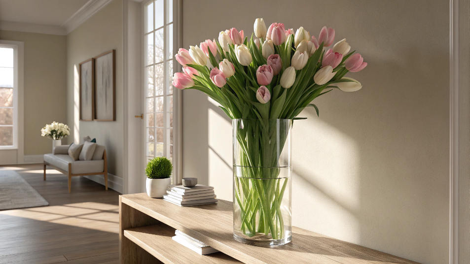
Best Vase for Tulips: A Florist's Honest Guide to Shape, Height, and Styling
LEARN MORE
41 Small Outdoor Living Spaces Ideas to Transform Even the Tiniest Patio
LEARN MORE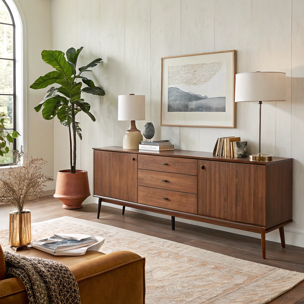
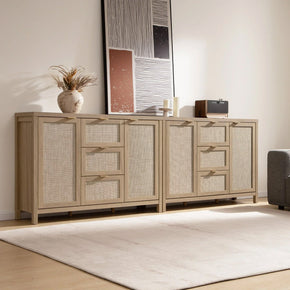
Modern Sideboard for Living Room: Complete Buying & Styling Guide
LEARN MORE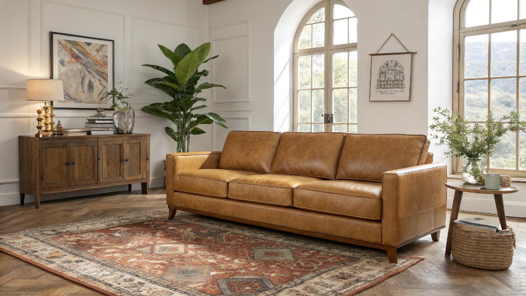
17 Camel Leather Sofa Decorating Ideas to Transform Your Living Room
LEARN MORERead more from Blogs
Looking for something else?

36 Wall Art Ideas That Make Any Room Feel Finished
LEARN MORE
What is an Ottoman? 8 Reasons Why You Need One
LEARN MORE
How to Sit in Bed With Good Posture: 10 Simple Tips
LEARN MORERead more from Blogs
You may also like


Further reading
What Is a Platform Bed? A Simple Guide to Types, Benefits, and Buying
Bed Sizes Guide: Dimensions From Twin to King