


1920’s Art Deco Interior Design: Colors, Style & Decor Ideas

There’s a version of Art Deco that shows up in mid-range hotels everywhere — gold trim on door handles, a chevron carpet, a pendant light that vaguely gestures at geometry. People walk through and think: that’s Art Deco. Then they go home, try to recreate it, and end up with a room that looks themed and slightly exhausting. What they saw wasn’t really the style. It was a budget approximation, and the gap between the two is bigger than most people expect. 1920’s Art Deco interior design, when done well, looks and feels entirely different.
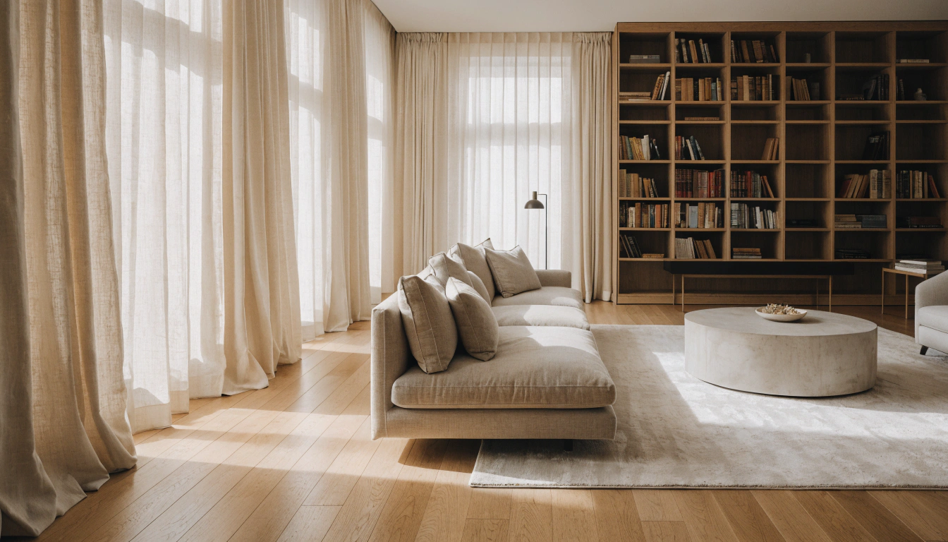
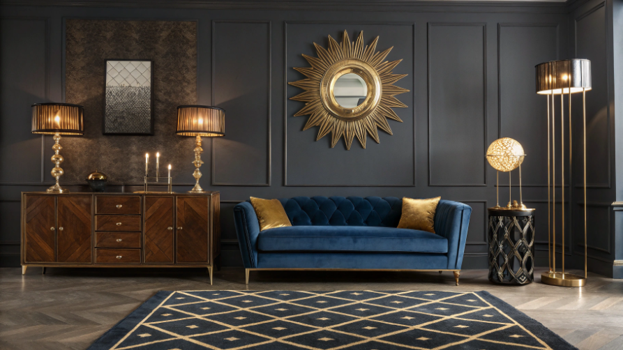
I keep coming back to a photograph of a 1920s New York apartment. Black and white, but the color reads through. Wide ebony sideboard against one wall, a brass sunburst mirror above it that’s almost aggressively oversized — and that turns out to be correct, not a mistake. Velvet seating in what must’ve been deep emerald or sapphire. Chrome floor lamps at both ends of the sofa, with frosted glass shades. A geometric rug under all of it. Nothing in that room is accidental. Every choice creates a specific contrast: dark against light, hard surface against soft fabric, metal against matte, clean edges against plush texture. Take away any one of those contrasts, and the room stops being what it is. It just becomes expensive furniture.
Art Deco came together in Paris in the early 1900s and became an internationally recognized movement after the 1925 Exposition Internationale des Arts Décoratifs et Industriels Modernes. The cultural moment mattered — post-war optimism, new urban money, a genuine hunger for something that felt modern without sacrificing richness. Most design styles lean one way or the other. Art Deco tried to be both at once, and it largely worked. The Chrysler Building. The Radio City Music Hall lobby. Those grand ocean liner staterooms. These weren’t decorative exercises. There were arguments about what the modern future should feel like.
This guide covers the full picture — the history, the color rules, the patterns, the furniture, and the practical questions around using it in a current room without making something that looks like a period museum. Products show up throughout, chosen because they fit the specific context. The FAQs at the end address the most common questions. One thing I’d put at the front: the rooms in this style that hold up best are almost always the most edited, not the most decorated. The tension between the drama Art Deco requires, and the restraint that makes that drama work — holding both at once is basically the whole job.
Art Deco at a Glance
|
Element |
What to Know |
|
Era |
1910s–1940s — peaked during the Roaring Twenties |
|
Origin |
Paris, France — named at the 1925 Exposition Internationale |
|
Core Patterns |
Chevrons, fan shapes, sunbursts, stepped forms, geometric grids |
|
Key Materials |
Chrome, brass, lacquered wood, velvet, marble, and mirrored glass |
|
Signature Colors |
Black + gold, emerald green, sapphire blue, ruby red, ivory |
|
Furniture Style |
Symmetrical, wide-format, horizontal, flat fronts, geometric hardware |
|
Modern Use |
One statement piece against a clean, neutral wall is enough |
What is 1920s Art Deco Interior Design?

Art Deco took the geometric precision of industrial modernity — the logic of machines, factories, skyscrapers — and ran it through a tradition of expensive craft that had previously belonged to aristocratic interiors. So you ended up with chrome hardware on handmade furniture, geometric patterns woven into silk and velvet, lacquered wood sitting beside marble. The whole thing felt modern and rich at the same time. No style before it had pulled that combination off, and it’s part of why it still translates to current rooms with little effort.
Where It Came From

Paris in the early 1900s was already moving away from Art Nouveau — that soft, plant-inspired style from the 1890s you still see in old iron Métro station signs. The shift toward geometry and harder materials was gradual. Then the 1925 Exposition gave it a name and a global audience. Forty countries sent designers. Within two years, the style was in American department stores. By 193,0 it was on the facade of the Chrysler Building.
The name is retroactive, by the way. During the 1920s, people called it Style Moderne. Art Deco came later — a shortening of the Exposition’s full French title — and gradually became the standard. Both names mean the same thing.
Art Nouveau vs. Art Deco
People mix these up, which is understandable. Both are early 20th-century European design movements that place a lot of emphasis on decoration. But they go in opposite directions. Art Nouveau pulled from nature — vines, insects, water, flowing asymmetrical lines. Art Deco pulled from machines, cities, and geometry. Straight lines where Art Nouveau curved. Mirror-image symmetry where Art Nouveau flowed. The cultural gap between them maps almost exactly onto what happened between the pre-war and post-war eras. Art Nouveau belonged to a world that the war ended.
Why It Still Works
Geometry doesn’t expire. A wide dresser with flat drawer fronts and brass pulls looks good now for the same reason it looked modern in 1928. The proportions are right. The contrast between warm wood and cool metal hardware is satisfying. There’s nothing about it that requires a specific historical context to make sense. Designers today pull from Art Deco constantly — not always consciously — because it solves real problems: how to make a room feel warm and sharp at the same time, how to use saturated color without making a space feel small, how to create drama without clutter.
The Visual Rules of Art Deco
Geometry Everywhere, Symmetry Underneath
In a well-done Art Deco room, almost every surface carried a pattern. Tiled floors in herringbone or diamond grids. Wallpaper in chevron repeats. Upholstery in fan or zigzag motifs. Cabinet hardware in stepped geometric forms. What held all of it together was the underlying symmetry — left side responding to right, top echoing bottom, every element across from something that answered it. Without that symmetry, the Art Deco pattern feels busy rather than bold. The geometry alone isn’t enough. It’s the mirrored arrangement that makes a room feel authoritative rather than chaotic.
Hard Against Soft — Where the Richness Comes From

If I had to identify one thing that creates the depth these interiors are known for, it’s this: polished hard surfaces placed right next to soft, yielding ones. Lacquered wood beside velvet. A marble surface under a silk runner. Chrome lamp bases against a deep wool rug. The polished surfaces catch and redirect light; the soft surfaces absorb it. Neither does much on its own. Together, they produce a texture and depth that make the room feel expensive in a way you can’t pin on any single object.
The Victoria and Albert Museum covers how Art Deco designers at the 1925 Exposition worked with high-contrast material pairings — shagreen alongside lacquered wood, ivory against chrome metalwork, exotic inlays beside polished plaster. The point was that luxury craft and industrial precision could reinforce each other. The best furniture of the era proved it.
The Color Rules
Art Deco color has more internal structure than most people realize. The jewel tones — emerald green, sapphire blue, ruby red, deep amber — were never used alone. They always sat against neutral backgrounds: black, ivory, cream, warm white. And running through everything were the metallics — gold, brass, chrome, silver — which connected the saturated tones to the neutral ones without letting either side dominate.
Remove the metallic layer, and the palette stops working. That’s the layer people most often skip, and it’s why their Art Deco rooms end up reading as colorful rooms rather than something more specific. Softer bedroom palettes often used rose pink, powder blue, or mint green instead of full jewel tones, but kept the same three-part structure. Contrast between the layers is the whole principle.
What the Furniture Actually Looked Like
People expect Art Deco furniture to be heavily ornate. It’s actually quite restrained. Chairs had smooth, rounded backs and clean arms without carved detail. Dressers had flat-panel fronts, wide proportions, and strong horizontal emphasis. Sideboards were long, low, and settled. Bed frames were simple and tall, with a fan-shaped or stepped headboard as the only decorative gesture. The richness came from materials and proportions, not from surface decoration. And that’s part of why these pieces drop into modern rooms so naturally.
Art Deco Colors: What Actually Works

Color is probably where people most often go wrong with this style. The Spruce identifies the key rule well — Art Deco colors are bold, but they almost always need a metallic anchor (brass, chrome, black, or silver) to hold together. Without it, the jewel tones just float in the room. With it, the palette has gravity.
The combinations that hold up consistently:
- Black + gold — the classic. Hardware, trim, one mirror, one lamp base, not on large wall areas.
- Emerald green + brass — warm and slightly festive. Good for dining rooms and living rooms.
- Navy blue + chrome — cooler and more focused. Better for bedrooms and home offices.
- Ivory + walnut + dark hardware — the quietest version. Works in almost any room.
- Blush pink + bronze — softer and more private. Dressing rooms and primary bedrooms.
- Deep amber + lacquered black — warm and cinematic. Particularly good with lamp lighting.
The rule underneath all of these: contrast. Art Deco never placed similar tones side by side. If a palette in this style isn’t working, it’s almost always because the contrast isn’t sharp enough.
In a bedroom, the dresser usually sets the palette before anything else, since it’s the largest piece on the largest wall. The modern bedroom dressers at Sicotas have the proportions and warm wood tones that work well in this role.
Art Deco Furniture — What to Look For

In Art Deco rooms, nothing is background furniture. The dresser anchors the bedroom wall. The sideboard sets the axis of the dining room. The nightstands on either side of the bed prove the symmetry principle that the whole style runs on. If a piece isn’t doing anything visually, it probably doesn’t belong.
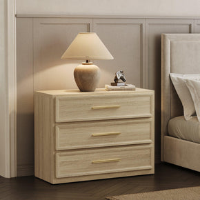
Bedroom: Dressers and Nightstands
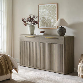
Art Deco bedroom dressers were wide, structured, and strongly horizontal—with flat drawer fronts and geometric hardware in brass or chrome. Nightstands matched in proportion and hardware and were placed identically on both sides of the bed — not sort of similar, but actually matching, at the same height and distance. That mirrored arrangement was a structural rule. You see it repeated in every surviving photograph of the era’s bedroom interiors.
For a current room, the 6-drawer wooden dresser gets the proportions right — wide flat-panel fronts, smooth-glide drawers, a clean horizontal silhouette. Set it against a dark or ivory wall with a wide mirror directly above it, and the reference lands without being a literal recreation.
For the nightstands: matching pieces, identically placed. The 3-drawer bedside nightstand has a clean stacked profile that reads as placed on purpose — exactly what Art Deco bedside furniture needed to communicate.
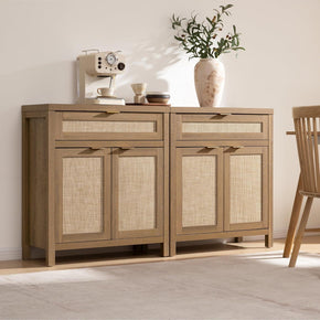
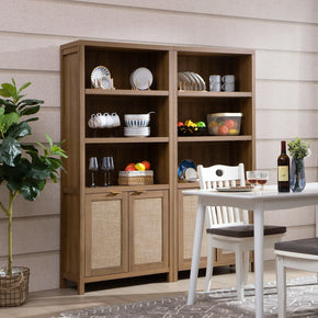
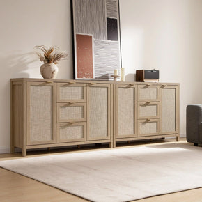
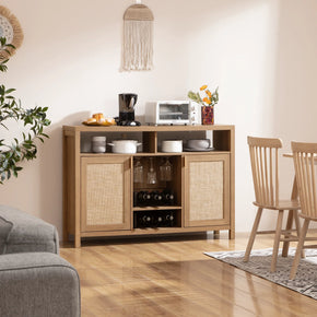
Sideboards: The Most Important Piece

The sideboard defined the Art Deco interior more than any other single piece. Wide, long, low to the ground, polished or lacquered. The top surface was a display area: a few sculptural objects, a lamp, framed pieces, arranged with space between things. In dining rooms, it competed with the table for the room’s attention. It was a statement that also included storage.
The decorative sideboard with built-in lights has the theatrical quality that Art Deco sideboards were after. The integrated lighting focuses attention on the surface, the way a gallery spotlight would—two or three objects on top, plenty of space between them. The piece carries the room.
Seating, Lamps, and Everything Else
Original Art Deco seating was generous — deep velvet sofas in jewel tones, rounded leather club chairs, cocktail tables in lacquered wood or mirrored glass. Lamps were sculptural: tiered chandeliers, chrome floor lamps with frosted globe shades, and angular brass wall sconces. Nothing in the lighting category was purely functional.
You don’t need the full room outfitted this way. One velvet armchair in a real jewel tone beside a brass floor lamp on a geometric rug — that’s a complete Art Deco reference in what can otherwise be a fairly modern room.
How to Use Art Deco in a Modern Home
The most common failure mode: someone gets excited about Art Deco, buys five things at once — sunburst mirror, patterned rug, velvet cushions, brass lamp, geometric wallpaper — and ends up with a room that looks like a moodboard rather than a room. The problem isn’t the pieces. It’s that nothing has room to be seen. Add boldly, but one thing at a time.
Get the Wall Color Right First

Art Deco elements need contrast to work. Ivory, matte black, warm cream, dove gray, deep charcoal — all create the contrast the style needs. What doesn’t work: the warm muddy mid-tones most rooms default to — beige, greige, tan. These soften everything placed against them. Gold hardware reads duller. Jewel-toned upholstery loses intensity.
Worth trying if you have good natural light: a genuinely dark wall. Deep charcoal or saturated navy. People worry it’ll shrink the room. It usually doesn’t — what it does is make the objects in front of it look more valuable and more considered.
One Dominant Piece. Stop There.
A sunburst mirror above the fireplace. A lacquered sideboard with bold hardware. A velvet sofa in a real jewel tone. Pick one and build the room around it before adding anything else. Every time you add a second strong piece before the first has room to breathe, both of them get weaker.
Layer the Surface Contrast
Art Deco rooms are never visually flat because different surface types are always in proximity. Chrome against velvet, marble against lacquered wood, frosted glass against brass trim. A tall modular dresser with smooth drawer fronts works as the hard, clean-lined anchor in a bedroom — alongside velvet cushions, a geometric mirror, and a textured rug, the contrast between surfaces creates the depth the style needs.
Edit After You Think You’re Done
Most people skip this. Once the room looks finished, take three objects off every surface. Leave gaps between things that remain. A single well-chosen object on a sideboard reads with more presence than six competing for the same space. The space around an object is part of what gives it weight.
Room-by-Room Ideas
Bedroom
Start with the headboard — a fan-shaped upholstered one, or a stepped rectangular one —to set the style before anything else goes in. Then matching nightstands on both sides, placed identically. A wide dresser on the opposite wall. One large geometric rug centered under the bed. That’s a complete Art Deco bedroom.
Color that works here: navy with brass hardware, ivory walls with walnut and black hardware, deep emerald with gold accents, blush with chrome. In every case, the metallic hardware is doing as much work as the wall color.
The Sicotas bedroom furniture collection has dressers, nightstands, and wardrobes with the wide, structured proportions this style needs.
Living Room

Scale matters more here than in most rooms. A sunburst mirror that feels almost too big above the fireplace is often exactly right. Work outward from it: velvet seating in a jewel tone, a low sideboard, a pair of sculptural floor lamps, a geometric rug. Arrange furniture symmetrically — two chairs flanking the sofa, two lamps flanking the console.
What kills most Art Deco living room attempts is not enough material contrast. The sofa, rug, and cushions end up in similar tonal ranges. The metallic layer — a brass tray, chrome lamp shafts, gold-edged frames — is the differentiator.
Dining Room and Entry

The dining room rewards full commitment. Round table with a polished top, velvet dining chairs, and a tiered geometric chandelier directly above the center. The sideboard against one wall with three objects on its surface — not six, three, with clear space between them.
In the entry: a console table under a sunburst or geometric mirror. One metallic tray, one sculptural object, nothing else on the surface. Restraint at the entrance signals care throughout the rest of the home.
What Makes Art Deco Go Wrong
Gold Everywhere
Gold works because it sits against things that aren’t gold. Make it the primary material, and you’ve eliminated the contrast that makes it effective. Keep it on hardware, one lamp base, one mirror frame, maybe a tray. If you’re questioning whether there’s too much, there almost certainly is.
Too Many Patterns
One geometric pattern per room. A strong chevron rug is a complete statement. Add a zigzag wallpaper and a diamond-grid pendant above, and now three patterns are competing in the same space, and none of them wins. Pick the one that matters most and give it full visibility.
Wrong Scale

They buy the right things in sizes that don’t register. An 18-inch sunburst mirror is a decoration. A 40-inch one is a statement. Art Deco needs the confidence of a larger scale. If something looks slightly too big when you first put it up, live with it for a day. It’s usually right.
Making It Look Like a Period Set
The version where every surface is lacquered, every chair is velvet, every lamp is frosted glass, ends up looking costumed. The style works far better mixed with contemporary pieces—one lacquered sideboard in a mostly modern dining room. The 1920s references become more interesting when they’re not the entire story.
Is 1920’s Art Deco Still Relevant?

Yes, and not in a nostalgic way. The current demand for curved furniture, statement lighting, dark-stained wood, brass and chrome hardware, and velvet in saturated colors is Art Deco vocabulary operating under different names. The sunburst mirror has been on wishlists since at least 2010. Most people using these things aren’t thinking of it as Art Deco. They’re responding to the same underlying logic that made the style work in 1928.
The Smithsonian’s Cooper Hewitt Design Museum treats Art Deco as a foundational reference in American decorative arts. This period still shapes how furniture is proportioned and how materials are contrasted. And Architectural Digest has documented how the style’s language — geometric clarity, rich contrasting materials, theatrical focal points — keeps showing up in luxury interiors because it solves the same problems it solved a century ago.
FAQs
What is the Art Deco style of the 1920s?
Look at the Chrysler Building — the geometric stainless-steel crown, the sunburst patterns on the lobby doors. Apply the same thinking to interior spaces, and you get the style: geometry as a guiding principle, expensive materials as the medium, symmetry as the organizing logic, and a specific contrast between hard, polished surfaces and soft, rich ones as the texture. It was formally named at the 1925 Paris Exposition and spread to American cities within two years. What made it new was the combination of machine-age precision with luxury craft materials. Previous luxury styles referenced the past. Art Deco referenced the present.
What is the Art Deco style in interior design?
It’s less about individual objects and more about specific relationships between them. I’ve been in rooms with every nominally Art Deco piece — sunburst mirror, velvet sofa, brass hardware, geometric rug — and the room didn’t feel like Art Deco, because the pieces weren’t talking to each other.
What makes it work: geometric patterns arranged with mirror-image symmetry across floors, walls, and textiles; hard, polished surfaces in direct contact with soft, yielding ones; jewel-toned upholstery against neutral backgrounds with metallics running through everything; and furniture that’s streamlined and horizontal rather than ornate and vertical. All of that working together — and edited down to the essential pieces — is what the style looks like when it’s done well.
What was the interior style of the 1920s?
Art Deco was the most culturally significant interior style of the decade. Colonial Revival and traditional period styles also existed, but Art Deco was where forward-thinking design was headed during the 1920s. It was called Style Moderne at the time. The Art Deco name came later, retroactively. The style stayed dominant through the early 1930s before Depression-era conditions shifted design culture toward austerity. Its core principles — geometry, contrast, symmetry, luxury materials — never disappeared from practice.
What is the 3-5-7 rule in decorating?
Objects grouped on a surface look more natural in odd numbers than even ones. Three items, five items, seven items. Even-numbered arrangements create a static symmetry where the eye stops rather than moves through the group. Odd numbers create a loose hierarchy in whichone object leads, and the others support it.
In Art Deco rooms, this matters most on sideboards and console tables. A group of three — a tall vase, a medium sculpture, a small tray — reads as placed with care. Four objects read as incomplete. Six reads as cluttered. In this style, especially, three is usually the right number.
What are the four characteristics of Art Deco?
Geometry with symmetry: chevrons, zigzags, fan shapes, and sunburst motifs used across floors, walls, and textiles in mirrored, balanced compositions. Contrasting materials: chrome and brass against lacquered wood, velvet against polished glass and marble. A color structure built on jewel tones against neutral backgrounds with metallics connecting the two. And streamlined furniture with smooth silhouettes, flat-panel fronts, horizontal emphasis, and geometric hardware. A room with all four reads as Art Deco. With two or three, it might read as dramatic or rich — but not specifically as this.
What does Art Deco look like?
The clearest single image: a large brass sunburst mirror — about 40 inches — centered on a dark charcoal wall above a wide lacquered sideboard. That one corner conveys the style more quickly than any description. Beyond that: velvet upholstery in a saturated jewel tone, polished wood furniture with flat fronts and geometric brass or chrome handles, tiered or angular lighting in frosted glass with metal trim, a bold geometric rug anchoring the seating group.
The feeling is that everything was placed on purpose. Nothing looks casual or accidental. People sometimes describe walking into a well-done Art Deco room as feeling as if it is dressed up. That quality of care and considered placement is the style’s most distinctive characteristic.
What are Art Deco colors?
The palette has three parts that need to work simultaneously. The saturated layer: jewel tones — emerald green, sapphire blue, ruby red, deep amber — on upholstery and decorative objects. The neutral layer: black, ivory, cream, or dove gray, which gives the jewel tones room to register. The metallic layer: brass, chrome, gold, and bronze on hardware, trim, lamp bases, and mirror frames.
The metallic layer is the one most people overlook, and it’s why their rooms end up feeling more colorful than anything specific. Bedroom palettes often soften the first layer — rose pink, powder blue, or mint green instead of full jewel tones — but the three-part structure stays the same.
What is 1920s interior design called?
Art Deco is the common name. Style Moderne is what people actually called it during the period. The Art Deco label came later — a retroactive shortening of the 1925 Paris Exposition’s full French title — and gradually became standard in design writing. Both names mean the same thing. The style is directly tied to the Jazz Age and the Roaring Twenties. It remained dominant through the early 1930s, and its influence on proportions, material contrast, and surface treatment is still clearly evident in current interiors.
Sources
- Encyclopedia Britannica: Art Deco — Historical origins, characteristics, key figures, and global spread 1910s–1940s.
- Victoria and Albert Museum: Introduction to Art Deco — 1925 Paris Exposition, Style Moderne, luxury craft materials.
- Cooper Hewitt, Smithsonian: Art Deco at Cooper Hewitt — Material documentation, designer references, Art Deco in American decorative arts.
- The Spruce: Art Deco Interior Design Style — Color combinations, metallic anchor rules, practical decorating tips.
- The Metropolitan Museum of Art: Decorative Arts of the 20th Century — Art Deco furniture, metalwork, and decorative objects in design history.
- Better Homes & Gardens: What Is Art Deco? — How to identify the style and room-by-room decorating suggestions.
- Decorilla: Art Deco Interior Design — Contemporary examples from professional interior designers.


Stay In The Know
Expert advice. Very good deals. The absolute best (and worst) things we've tested lately.
Looking for something else?
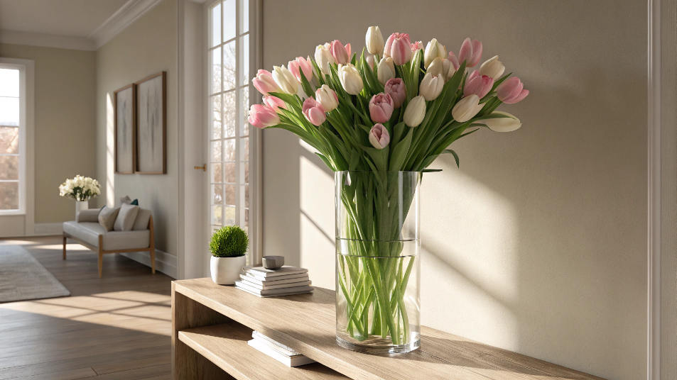
Best Vase for Tulips: A Florist's Honest Guide to Shape, Height, and Styling
LEARN MORE
41 Small Outdoor Living Spaces Ideas to Transform Even the Tiniest Patio
LEARN MORE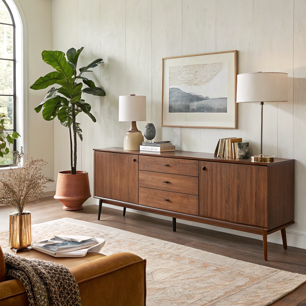
Modern Sideboard for Living Room: Complete Buying & Styling Guide
LEARN MORE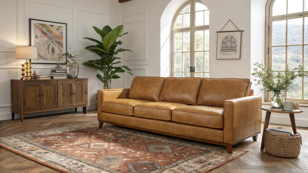
17 Camel Leather Sofa Decorating Ideas to Transform Your Living Room
LEARN MORERead more from Blogs
Looking for something else?

36 Wall Art Ideas That Make Any Room Feel Finished
LEARN MORE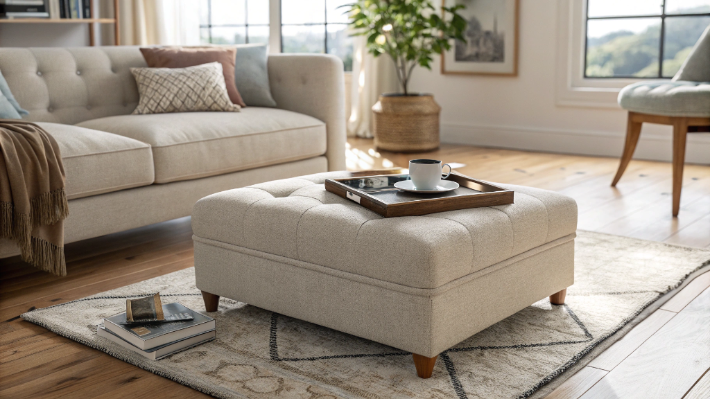
What is an Ottoman? 8 Reasons Why You Need One
LEARN MORE
How to Sit in Bed With Good Posture: 10 Simple Tips
LEARN MORERead more from Blogs
You may also like


Further reading
What Is a Platform Bed? A Simple Guide to Types, Benefits, and Buying
Bed Sizes Guide: Dimensions From Twin to King